
Points:
Time spent:
IP address:
Canary word: Present
Possible AI signals:
Original Text:
Are you sure you want to delete this comment? This cannot be undone.
Mark this comment as a review? Points will be awarded to the poster.
Your comment was posted, but it wasn’t long enough to count as a review. Reviews need about four complete sentences (at least 250 characters). Try writing another review that explains your thoughts in more detail — the author will appreciate it, and you’ll earn points for it.
141,782 Literary Works • 675,763 Reviews




Mea~
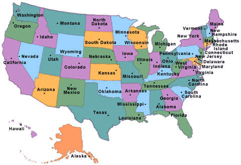 then it's curved and looks al ittle more like your map. I still think Florida needs to be down another line and a little thicker, but I understand your conundrum.
I'm a huge poetry fan, so I'm here for this! I think having it start with "Here" way over in Maine is great, and the overall shape is very US. I like that you have the lower peninsula of Michigan even in there. NOt sure what happened to the top peninsula though? Also, Florida actually extends down farther than Texas does. In terms of lines, they should probably be about even. Then Washington and those places are actually up a little higher than Maine, or at least dead bang even with it. If you look at Google Maps, which is flat, then Washington and them are higher and straight. If you look at a rounded map, like
Overall, the actual words in the poem are nice, and reminiscent of the US. They tell a good story and this is a complex build for a shape poem, so you did a good job including a nice round word choice. You recapitalization of words like "Here" and "Home" is really not what I would hold onto. I mean, it's a little confusing considering all of the words you have capitalized, and while I can sort of guess that it's because this is a shape poem and you can literally say "HERE!" like a big pin, I'm not sure what those locations actually are in terms of states or cities or anything, so it's not that valuable to me as a reader. It looks more like a typo than that there's a point to it. Considering the rest of the poem uses grammar up the wazoo, such as even including a semi-colon, I think it feels wrong to have Here and Home not follow grammatical standards.
So, overall, I think your shape is really nice, and when I looked at it, I knew exactly what it was, even though there are a few things that don't quite fit if you compare it to a map, like missing the UP of Michigan, and Florida not quite reaching far enough, and the only thing I really have to comment on in the actual poem itself is that I think you should use lowercase "here" because it doesn't really fit with the rest of the poem's grammar, which, probably was the point.
will you read and review my work, The Cowboy?
Thanks for the review!
Let me just say that I love how it looks. That's so creative and so cool how you did that, and I think it really helps to bring this poem home. The poem is beautiful and so very touching. It's so very accurate for Americans and I love how you added...what word do I want....sentimental? value to it with the lines, a kid selling lemonade on the corner and the smoke from my Grandfather's grill. Very good and a nice break from the more depressing poems I'm used to reading. Very good and I look forward to reading more of your work.