
We’re becoming WriterFeed.
The site will be unavailable for at least 2 hours starting 1pm ET on Sunday, October 25 while we make the name-change updates.
Thanks for your patience! We’ll be back as soon as we can.
Points:
Time spent:
IP address:
Canary word: Present
Possible AI signals:
Original Text:
Are you sure you want to delete this comment? This cannot be undone.
Mark this comment as a review? Points will be awarded to the poster.
Your comment was posted, but it wasn’t long enough to count as a review. Reviews need about four complete sentences (at least 250 characters). Try writing another review that explains your thoughts in more detail — the author will appreciate it, and you’ll earn points for it.
142,238 Literary Works • 677,069 Reviews




Hey Rascalover,
I'm little_lass,
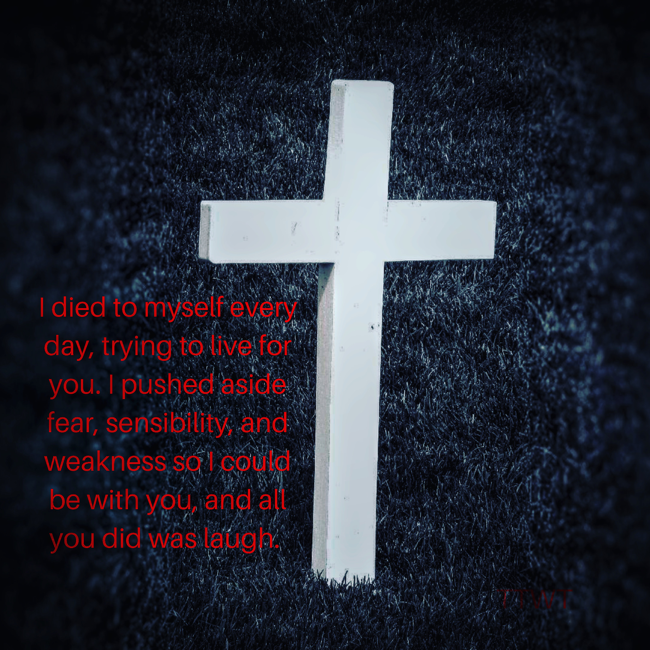
This art clearly depicts the narrators emotions clearly.I'm sorry, but I'm gonna be a little critical.
The flow of words was not in a good run.
But the emotion that words convey outstands it.
The first line says it all.
It's a humble suggestion that you could have elaborated on the first line, because what captured me was that line. Honestly saying I wanted some more emotions, through words that could've made one feel the pain of the narrator.
The color contrast of the art was a deadly combination for your work, it gives that that dark mode theme to the viewer.
Hi, Rascalover, I'm Lee!

I haven't written a review in just about a million days, so bear with me.
To begin with, it looks good, but the font and colour could be changed. It's a bit of an eyestrain at the moment, and too slender to read very comfortably.
My second thought - forgive me for this - was that it just feels very unoriginal at the moment. There's nothing making it unique from other "broken heart" quotes or something. The picture is slightly different from the others, but that's about it. The wording was frankly just cliche and it can't hurt to change.
I can see there IS emotion behind this, but the problem is that when someone sees something as standard as this, they won't bother trying to read in depth, you know? If you want people to actually take notice, you have to make it stand out. As of now, it doesn't.
I feel bad for not saying what I did like, but honesty the only thing I actually liked was the combination of colours. It caught my eye.
I apologise if my review is too critical; I'm only trying to help.
- Lee
Hello!
VioletFantasy here. This is a very deep and insightful piece of art. It shows a lot of frustration that the narrator has. They are tired of being taken advantage of and not being appreciated. One thing that I would like to mention is in this part of your message:
This doesn’t seem to flow very well. It might be better if you removed the word “to” and “myself”. Also, it would be awesome if you expanded on this. Maybe you could add more detail on the other side of the cross? It’s completely up to to though.
The design of your work really went with the theme. It’s the perfect background! Overall, this is an amazing piece of art. Keep writing!