z

Young Writers Society


16+ Mature Content

Art

by Rascalover


Warning: This work has been rated 16+ for mature content.


Note: You are not logged in, but you can still leave a comment or review. Before it shows up, a moderator will need to approve your comment (this is only a safeguard against spambots). Leave your email if you would like to be notified when your message is approved.


Is this a review?


Comments


User avatar


Points: 49
Reviews: 1

Donate
Fri Aug 28, 2020 3:42 pm
littlelass wrote a review...


Hey Rascalover,

I'm little_lass,
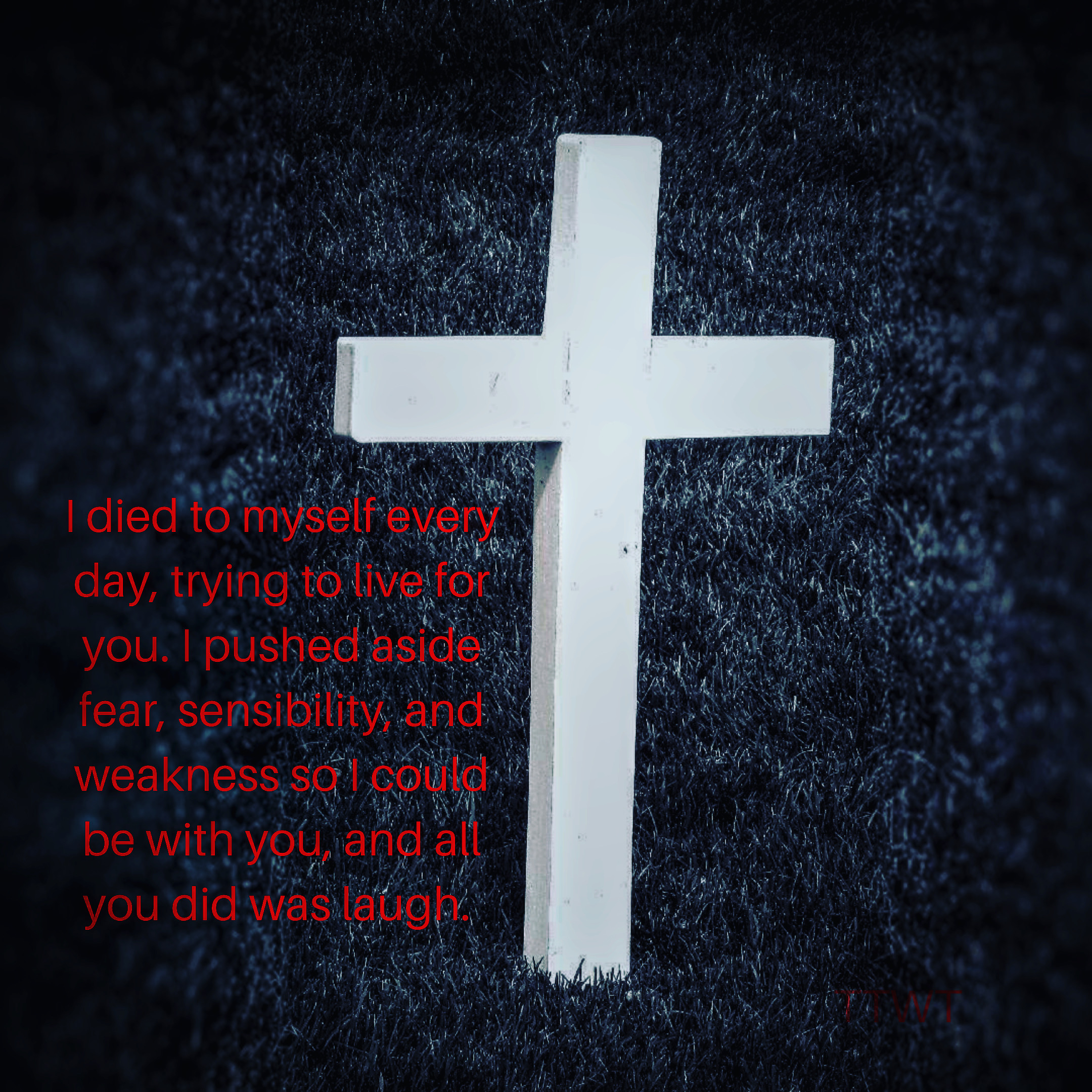
This art clearly depicts the narrators emotions clearly.I'm sorry, but I'm gonna be a little critical.
The flow of words was not in a good run.
But the emotion that words convey outstands it.
The first line says it all.
It's a humble suggestion that you could have elaborated on the first line, because what captured me was that line. Honestly saying I wanted some more emotions, through words that could've made one feel the pain of the narrator.

The color contrast of the art was a deadly combination for your work, it gives that that dark mode theme to the viewer.


User avatar
278 Reviews


Points: 18564
Reviews: 278

Donate
Sat Aug 22, 2020 3:47 am
LittleLee wrote a review...


Hi, Rascalover, I'm Lee!

I haven't written a review in just about a million days, so bear with me. :D

To begin with, it looks good, but the font and colour could be changed. It's a bit of an eyestrain at the moment, and too slender to read very comfortably.
My second thought - forgive me for this - was that it just feels very unoriginal at the moment. There's nothing making it unique from other "broken heart" quotes or something. The picture is slightly different from the others, but that's about it. The wording was frankly just cliche and it can't hurt to change.

I can see there IS emotion behind this, but the problem is that when someone sees something as standard as this, they won't bother trying to read in depth, you know? If you want people to actually take notice, you have to make it stand out. As of now, it doesn't.


I feel bad for not saying what I did like, but honesty the only thing I actually liked was the combination of colours. It caught my eye.
I apologise if my review is too critical; I'm only trying to help.

- Lee


User avatar
53 Reviews


Points: 1305
Reviews: 53

Donate
Fri Aug 21, 2020 3:36 pm
View Likes
VioletFantasy wrote a review...


Hello!

VioletFantasy here. This is a very deep and insightful piece of art. It shows a lot of frustration that the narrator has. They are tired of being taken advantage of and not being appreciated. One thing that I would like to mention is in this part of your message:

I died to myself every day


This doesn’t seem to flow very well. It might be better if you removed the word “to” and “myself”. Also, it would be awesome if you expanded on this. Maybe you could add more detail on the other side of the cross? It’s completely up to to though.

The design of your work really went with the theme. It’s the perfect background! Overall, this is an amazing piece of art. Keep writing! :D


Owning our story can be hard but not nearly as difficult as spending our lives running from it. Embracing our vulnerabilities is risky but not nearly as dangerous as giving up on love and belonging and joy—the experiences that make us the most vulnerable. Only when we are brave enough to explore the darkness will we discover the infinite power of our light.
— Brené Brown