Wolf Eye Stages + Wolf Sword + Fire And Water

54 posts1, 2, 3, 4
User avatar
Gender Female
Points 6523
Reviews 657
Hello! ^_^

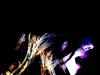
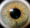
1. I love this. I don't know if it's the paper or the photograph that gives it the rainbow colors, but it's a great effect. I like the simplicity of the eyes, and how they're almost exactly the same but not quite. Great job!

2. I'm not as much of a fan of this one, though the idea is awesome. Her eyes (not the eyes on the sword) look out of proportion with her lips and face. On humans, eyes are about half way between the chin and the top of the head. On this girl, they're about a quarter from the top of her head.

If her hair is supposed to be wet, it would be less voluminous. Wet hair sticks to the head and face, and is flatter.

I don't know what's going on with her head ornament (or is it a tattoo?) Maybe you could clarify that area?

3. Wow! Fancy! I like the fire/water effect, with her hair and breath. I think this could be even better if you colored in her hair with shades of red, yellow, and orange.

4. Again, awesome. Good luck with the rest of it!

Sorry if these sound harsh. I think you're a great artist, and you should keep at it!
Jennafina's Love Your Body Already Dammit Campaign

forum353.html

(To find out what it really is, just click.)


User avatar
Gender Female
Points 890
Reviews 441
Here is the final product of my fire and water art.

Enjoy!
Attachments
Photo 154.jpg
Photo 154.jpg (99.12 KiB) Viewed 349 times


User avatar
Gender Female
Points 1609
Reviews 602
hhmm...I think I liked the original/rough draft better. This one is still really good, but the colour just looks over the top...I dunno. The hair looks much better coloured but the skin...looked better uncoloured.
everything i loved
became everything i lost.


Would you like a review?
http://www.youngwriterssociety.com/topic73903.html


User avatar
Gender Female
Points 890
Reviews 441
Thanks... But I like it the way I did it.


User avatar
Gender Female
Points 3454
Reviews 694
I like this one much better. I would, however, like the hair to fill up all the edges. The less white, the more exciting it is! Plus that's easily doable with the mullet she seems to have ;) Also, I'd color in the face a bit more and possibly use a light blue to color in the spaces in the water? If there were no white on the page at all, a serious statement would be made.
My Literary and Arts Blog

"I think I'd miss you even if we'd never met." -The Wedding Date


User avatar
Gender Female
Points 890
Reviews 441
Good suggestion... I will do that soon. :D


User avatar
Gender Female
Points 6235
Reviews 2631
I like the hair much better in this version but... you're using oil pastels right? If so, smudge the colouring on the face so that it blends better and gives a smoother tone. Also, I think a touch of dark green on the eye would look good and Via's suggestion to fill the page is an awesome one.
Writing Gooder

~Previously KittyKatSparklesExplosion15~

The light shines brightest in the darkest places.


User avatar
Gender Female
Points 890
Reviews 441


User avatar
Gender None specified
Points 1040
Reviews 14
This is a good start; the shape is pretty good. Try shading it in lightly wile leaving the darker lines in the pupil to give more depth. :)


It's hard to enjoy practical jokes when your whole life feels like one.
— Rick Riordan, The Last Olympian