It's pretty cool in a cartoony kind of way. The nose to mouth transition is a little off, and I'd really like to see it filled in. As it is, it kind of looks like a coloring book page outlined with different colors. Try using pastels on it and see where it gets you?
It's certainly very stylised which isn't necessary a bad thing, just not my sort of art. Also, I agree with Via that the nose to mouth bit is a little off as are the proportions of the face. I think she needs to have more of a forehead and the eye should have an eyelid. Good colours though and I think it will look better when you've shaded/coloured it more.
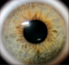
The detail on this pair of eyes is better but I quite liked the luminous blue colour of the others. Very nice though and just do the fur like you did last time but don't have it so neat. Have it go out of the face boundary lines if you know what I mean.
Cool eyes Gwen!
I also like the one you posted before the eyes, but the Wolf Sword was still by far my favourite. I agree with kitty15 though; the eyes look lonely without fur behind them. The colour is great though! I love how you mixed blue and green!
I like them, very origainl and nifty looking. I disagree about the eye thing Kim said earlier. Simply because you can fix things later as long as you use pencil. Art is like writing in that you can always go back and fix things. Most of the time. Don't hold me to that.
Also, don't use your thread for conversations. Stick to the topic. Otherwise use the chat or PM each other.
"Maybe Senpai ate Yuka-tan's last bon-bon?" ----Stupei, Ace Defective


 I thought the green was blue. And then I started to colour. and it all went wrong!