
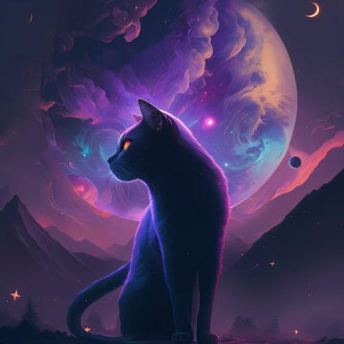
Hi! Welcome to CATS' Art Gallery Part Three!!! Here I'll be posting some of my art (watercolors, shading) because I couldn't get all of them in. Yea, these are some! I'm not very skilled or a professional, so if you think you are an advanced artist, feel free to drop a few suggestions or tips to improve. Of course, you can also comment/review. Let's get into it!
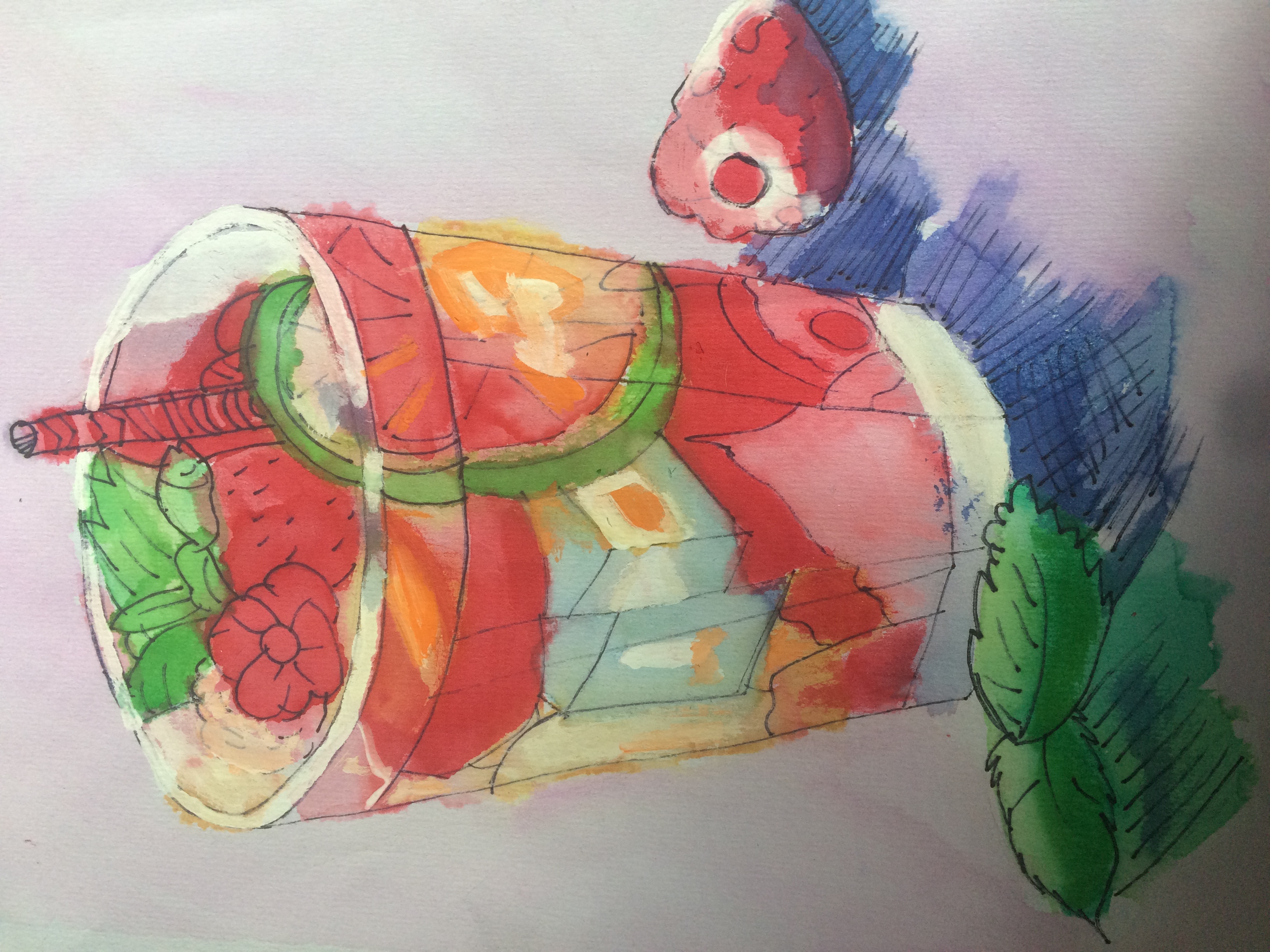 Tropical Drink: I don't think this was done really well, but it is one of my favorites. This was done a few years back, so these are old art.
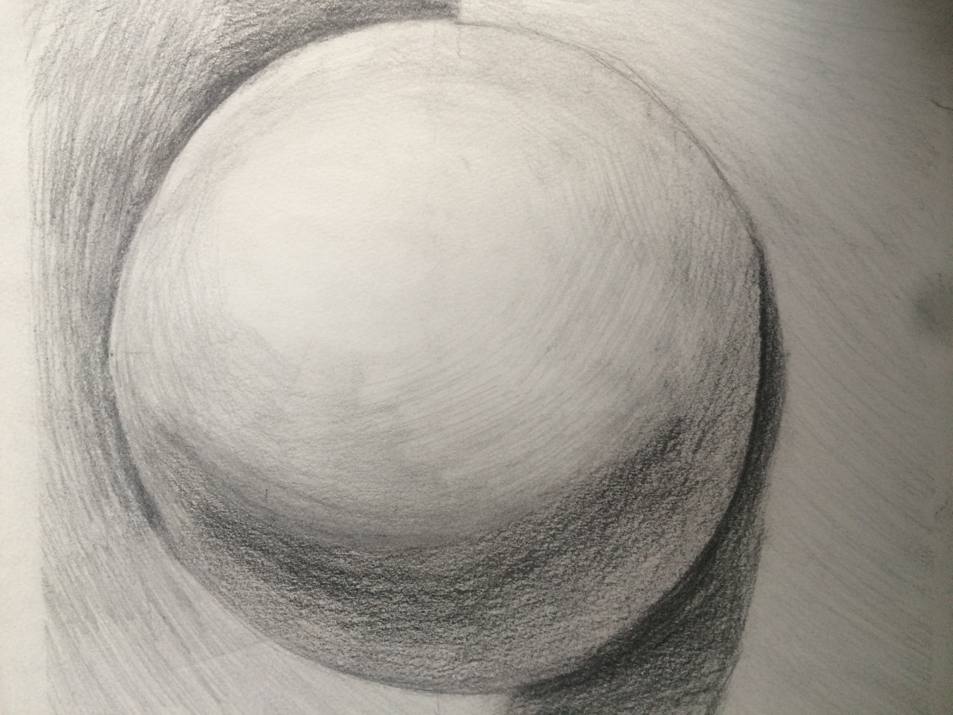 Sphere Shading: I used to hate this because I wanted to shade ACTUAL animals and stuff. And I still hate doing it, but it turned out pretty good.
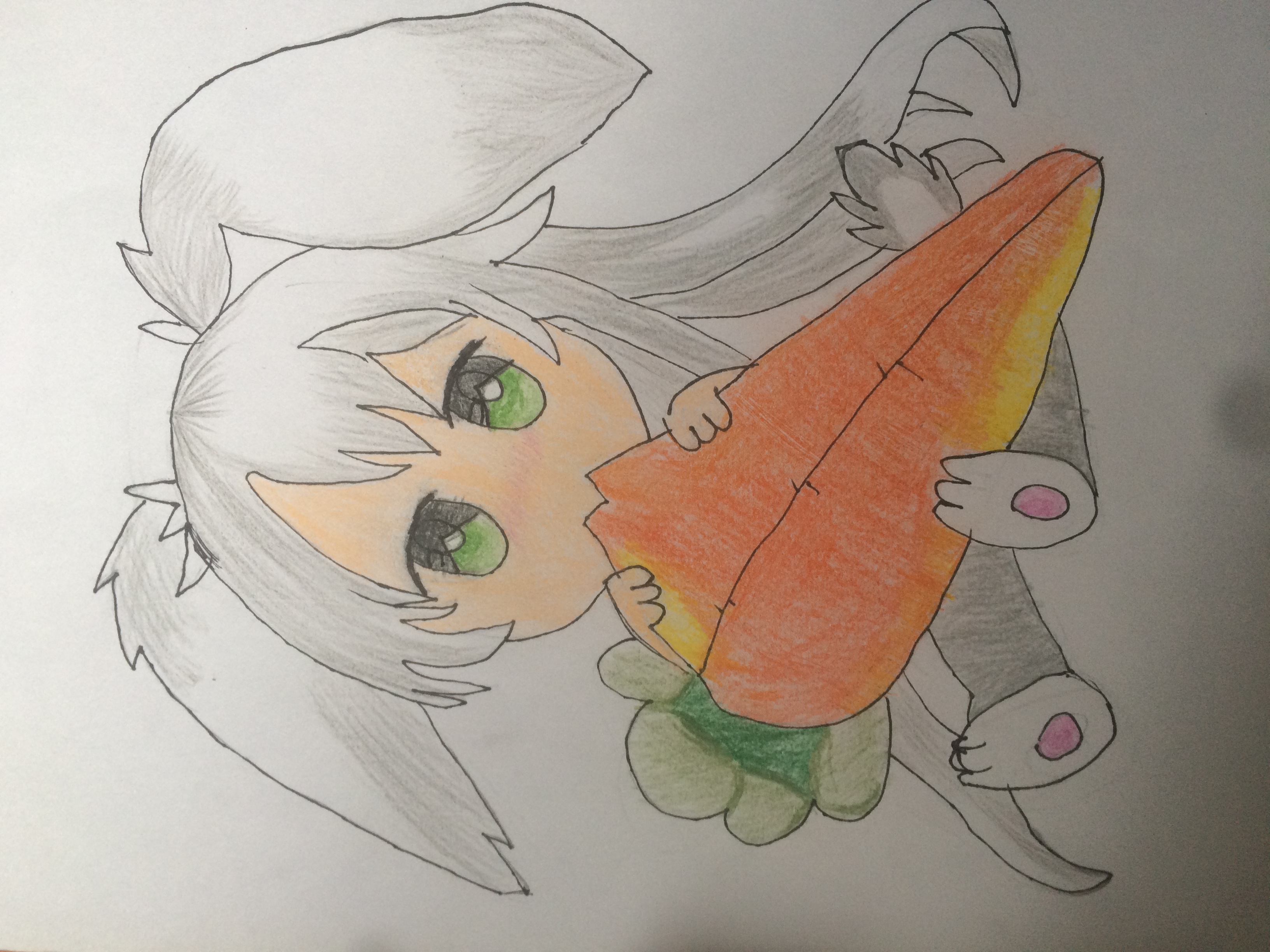 Bunny Girl: Haha, this one reminds me of Hop! Of course, she is NOT. I repeat NOT cute. We are both NOTNOTNOT cute. But this was really fun to draw! Hmm...I shall look up some inspiration and draw something related to this!
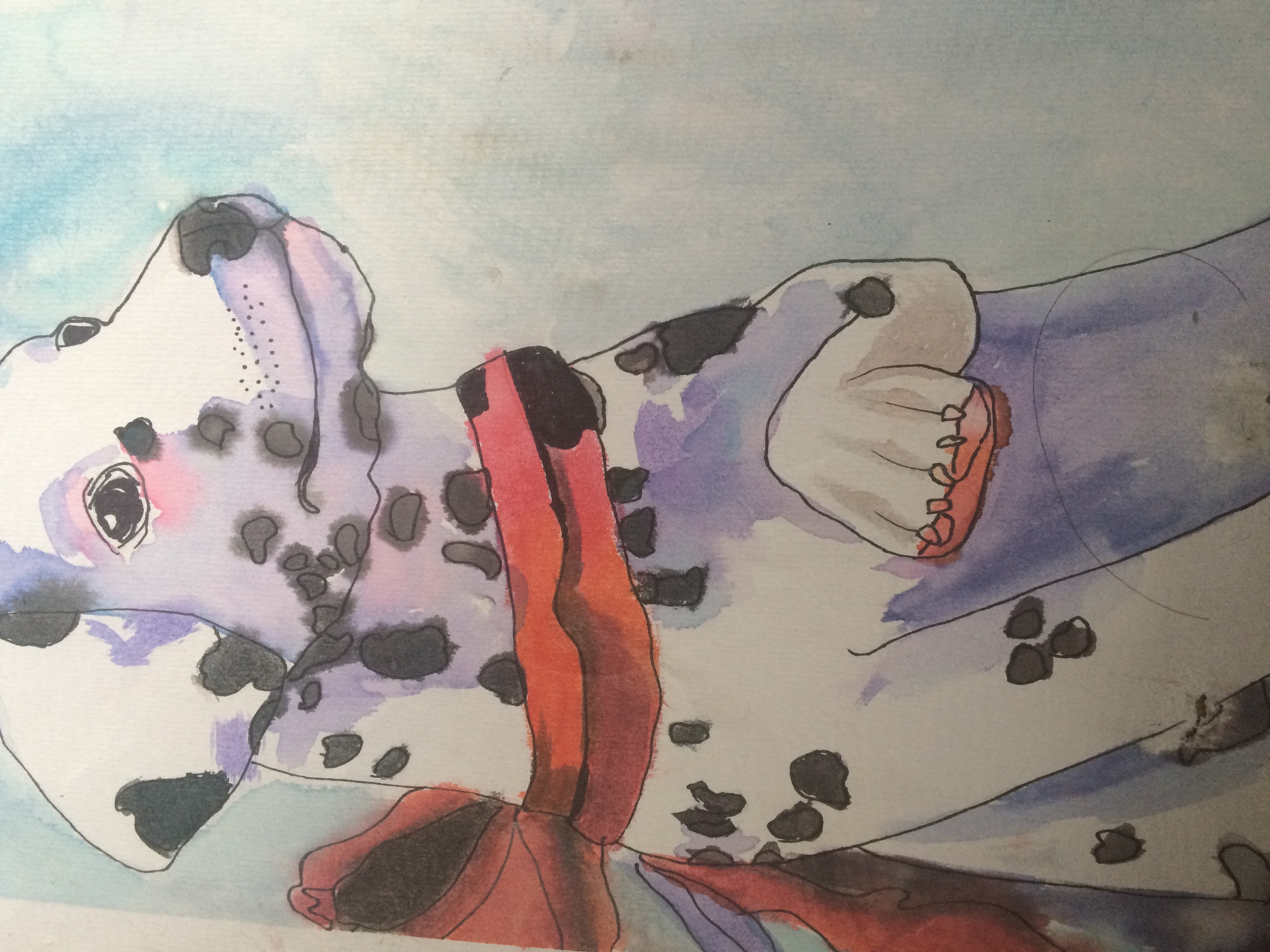 Dalamation Puppy: I'm not sure if that's how you spell Dalamation, but who cares. I added purple and dark blue for the shading.
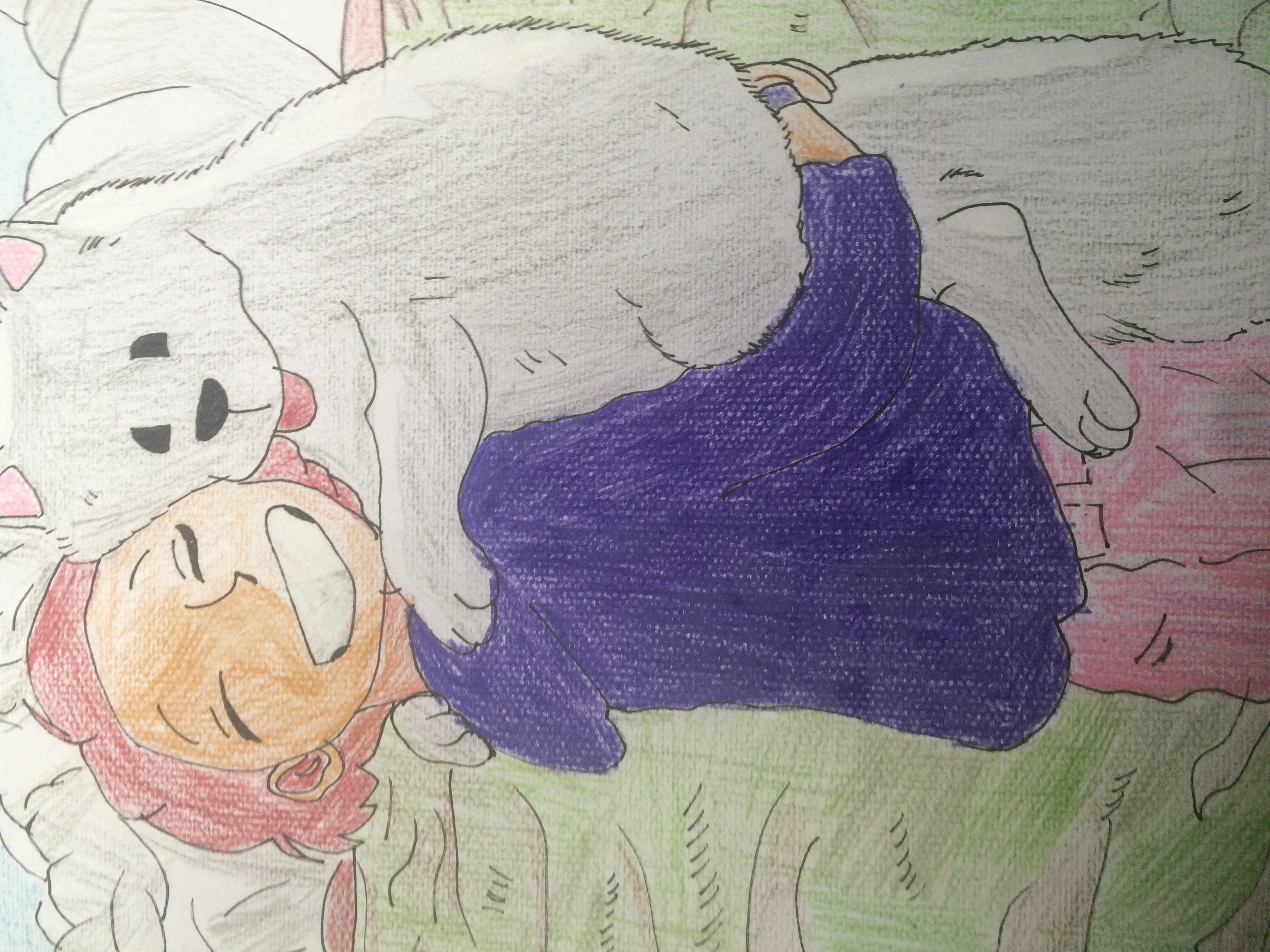
Girl With Dog: This is one of my favorites because of that adorable fluffy dog. The girl is also nice! As I say, I don't do professional art, but I do it for fun or like a hobby of mine.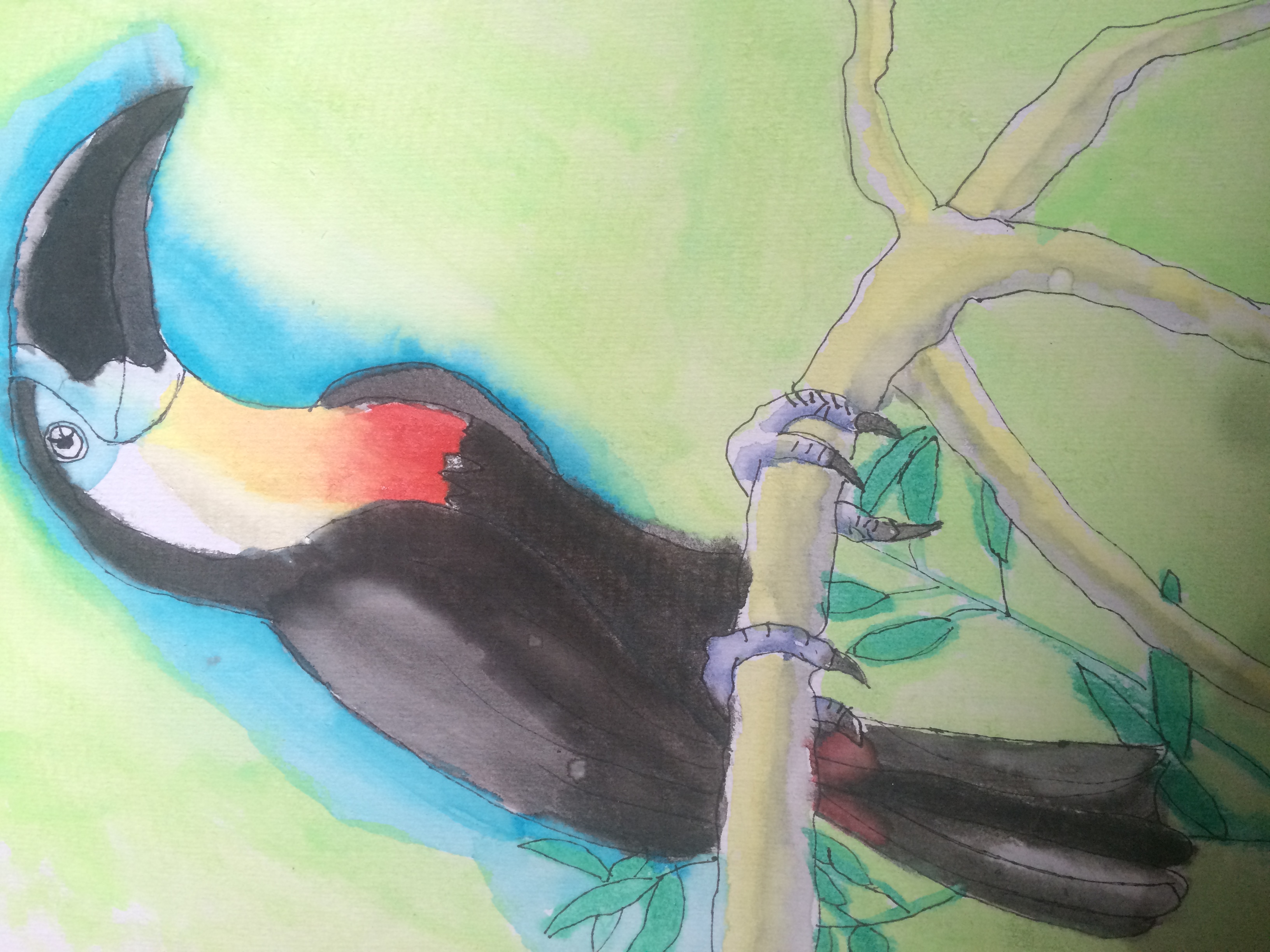
Toucan Tropic: I loved blending this and it was very fun to paint! Easy, and didn't take much time either.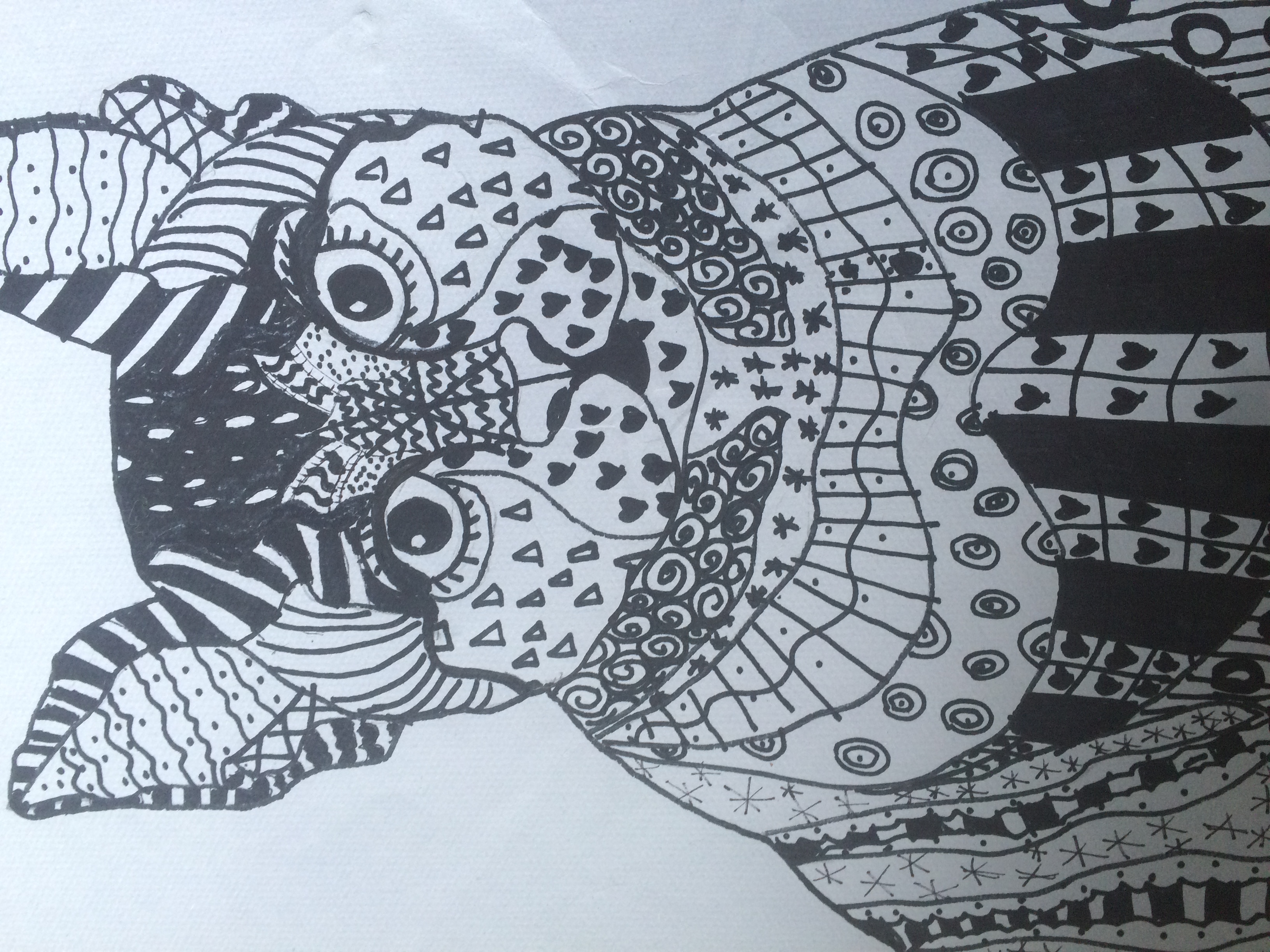
Zentangle Cat: Not my best work. I think it might be the worst. I messed up the eyes ToT it looks creepy. But I love zentangling because you can use different shapes and patterns. Reminds me of myself...hehe
Anyways, this was really fun to paint and draw and shade, and I can't wait to share more with you guys. I hope you enjoyed, even if it's just for a little :)
Have an AWESOME DAY!!!
Love,
CATS
Points:
Time spent:
IP address:
Canary word: Present
Possible AI signals:
Original Text:
Are you sure you want to delete this comment? This cannot be undone.
Mark this comment as a review? Points will be awarded to the poster.
Your comment was posted, but it wasn’t long enough to count as a review. Reviews need about four complete sentences (at least 250 characters). Try writing another review that explains your thoughts in more detail — the author will appreciate it, and you’ll earn points for it.
141,521 Literary Works • 674,838 Reviews



hi! i loved this art a lot, i personally loved the Dalmatian, i struggle with perspective but i think you did really well with it, the colors are very well blended. the toucans background had a nice green, i found the blue kind of distracting but that's just my opinion. the cup in the beginning was very colorful which i loved, so much detail like the lime's reflection on the glass and the different colored shadows. overall, awesome art, i loved looking at it. c:
AAA THANK YOU for taking a look! These are some older works of mine, as I was taking lessons at the time. I’ll try to learn how colors look on one another (such as the blue) to make it blend well <33 THANK YOUUU
hi its me i have not much time and this will also be my 40th review which is insane to think about so i hope it's a great review because im not in a super review-ey mood but i thought i might review anyway but i should probably actually review now because im doing a lot of talking here.
i really like your art, and i think it's really good for age 13 (i'm 13 too haha so i know)
i really (aww i said really again im too repetitive) like the cat at the end and the toucan. have you studied colour theory? i think it's very interesting and helpful for artists. i see you tested it out on the puppy and i have to say it looks great! using blues and reds for shading is the best because it helps make it pop and it also gives it character. it is a case by case basis however.
i think the bunny girl is also super duper adorable and i love her haha.
anyway i have to go but i love you and your art keep arting!
love kiki <33
this is a lot shorter than i thought it was it took me like 30 minutes aww
THATS OKAYYYY BBY
THANK YOUUUU I APPRECIATE U TKAING A LOOK AF MY ARTTT
Hey CATS!!


You’re my first ever review!
Ok so, while I am by no means a professional artist, I do know a little bit about it, and I have some very skilled artist friends, so let me see if I can give some tips. Just scrolling through these, though, they’re quite impressive!
Tropical Drink: As I think one of your earlier comments said, I absolutely love the colors in this one. The pale red is such a tropical vibe, even more so than, I would say, a richer or deeper red. The oranges and yellows are the same, pale, summery shade (pale colors are more "relaxed"). I really like the mixing of colors, whether intentional or unintentional, especially of the center section of the glass with the green, orange, and blue. The shadows are just as colorful as the objects that cast them, and the linework brings together the laid-back feel. Truly, this encapsulates a sweet, summer drink perfectly.
For some constructive feedback, it really depends on what you’re going for. If you would like your art to be more realistic while keeping the style, I would suggest making the perspective a little more uniform. The cup is from a slightly above, centered perspective, but the straw is from a straight on perspective (as if your eyes were level with the table the cup is sitting on instead of above it), which flattens the image a bit. Keeping the lines/crosshatching in the shadows parallel would also help. Again, I love the color of the shadows, but some of their shapes confuse the eye. Based off of the shadows, it seems the light is coming from slightly behind the cup and to the left, but, on the bottom edge of the glass, the highlight is on the right side (whereas it should be on the back left facing the light). In addition, there seems to be some extra shadow coming from behind the cup (between the cup and the strawberry).
Overall, a beautiful piece! The way you did the top rim of the glass is especially nice.
Sphere Shading: An uncannily perfect circle. Very round. Very nice. The shading is a smooth gradient, despite the fact that you are using graphite (I think?), which is impressive.
One comment I have is the lighting. Because such a huge majority of the sphere is in the light (a good ¾ of it is in pretty strong highlighting), it feels like the light source is either very wide or very strong. In any case, the large amount of white or near-white space on the paper could use some balancing out. Contrast the shadows more, make them darker. The darkness of the shadow on the floor is darker than the darkness on the sphere, and that is also mildly confusing to the eye because both areas should be getting the same amount of light-that is, none. Dig in that pencil a bit more OR! Try a 4B. It was life changing for me when I discovered darker pencils, so maybe it will be for you too.
As a general tip, high contrast is a great way to make things look 3D. Another tip, when striving for realism, besides have logical shading according to your lighting, making sure the shape of your shadows make sense really helps. Great job on this one!
Bunny Girl: Not a style I’m well versed in, she’s a cutie, and….yep. Keep having fun with your art
Dalamation Puppy: Wow. This one is really good. My biggest comment is that it’s spelled Dalmation. The proportions and figure of the dog are super accurate. The angle of the nose and eyes matches that of the head, the spots are the perfect amount of varied and balanced, and the purple shading is beautiful.
I don’t have many things to say besides that. Here’s another example where choosing a direction that the light source is coming from and then doing all of the shadows based off of that would help the realism. On a separate note, the perspective on the paw is a bit off, but I totally get it, I can never get those right either. Like, how do you make it seem like it’s coming towards you?? How to convey that it's folded behind?? Unfortunately, this is where some experimentation (or more professional help) might need to happen. Try shortening the line from the wrist into the elbow a bit, or curving that line a bit more up? Also, dog paws are different and have that little thumb, so looking at a reference might help.
Beautiful painting!
Girl With Dog: This is one of my favorites too. So cute!! The style is very consistent. If you wanted to make this more realistic you could, but honestly, that would be very complicated, and I rather like the way the dog looks the way it is.
Toucan Tropic: Another very impressive piece! Just like with the Dalmation, realistic, proportional, very good shading, beautiful colors. On this one, I can tell where the light source is coming from because of the shadows on the talons and on the branch. They are all in the same direction, and so it adds a strong sense of 3D-ness to the whole piece, which is especially helpful with the Toucan because so much of it is white or black. Your watercolor is gorgeous with the red and yellow and the blue on the face. Love the style. No comments.
Zentangle Cat: I have actually never heard of zentangling before and now I must do it because it looks so cool and exactly the kind of thing I would do. Thank you for introducing me to this! I wouldn’t worry too much about the eyes, especially since there are so many other, similar shapes around it. Very cool idea! And you can still find shape and contrast within the patterns (*two thumbs up*)
CATS, you are a very talented artist!! This is all super impressive, and I absolutely adore your watercolor style. I’m so glad you have fun doing these, because they’re fun for me to look at (and it seems like your other reviewers also had a blast). Keep doing your amazing art!
- Mauster
OMGGG WELCOME TO YWS!! I%u2019m so shocked at such a long review; it%u2019s literally your first and you are rocking it! I%u2019m so glad you enjoyed it, and you%u2019ve made my entire day <333
Uuh… I don’t have as much to say as other people NOT because I don’t find it as good but alas, I am a person of few words at times.
So let’s make them matter shall we?
First off, I adore all your watercolour pieces. I think it’s your strongest medium. When I/someone else use water colours I often find it hard to feel the vivid beauty from marker and oil, but you just do it.
Your composition is good, balanced and warm sometimes (ex: the girl and dog one)
And look: I’m a sucker for colour, ok? So no surprise the first one is my absolute fave. You consciously/subconsciously used colour theory to give life to it and all I’ve got to say is that I’m a big fan.
Keep on drawing/painting/colouring… how about we just say arting?
Keep on arting CATS! If this is not ‘very skilled’ I’m terrified to see what good practice plus plus this talent will do for you.
This rocks.
TANKS SO MUCH FOR THE WONDERFUL REVIEW!!!
hi, majuli here to review your art!!
firstly, *i do not know anything about art*. so don't take my comments too seriously.
first piece: my favourite from this collection. it's a splash of colour and at first glass it looks badly drawn. but a closer look reveals the details. the softness of the colour yet the vibrant nature made it my top favourite. i just think the straw could have been longer and a contrasting colour. also the shadows are really interesting, because they're coloured. coloured shadows? that's new but creative. also LOVE the refraction in the drawing.
second piece: the sphere is nice, perfectly round. the shading looks streaky but personally, that's exactly how i like it.
third piece: cute. really cute. love the yellow at the bottom of the carrots. i just think the legs are a bit disproportionate to the head? idk.
fourth piece: my SECOND favourite. it's just too cute. and the blue/purple shade (??) is such a contrast but it fits really well. the pads of the feet being pink is too cute.
fifth piece: SO CUTE. i love that the hair of the girl is the same colour as the dog's tongue. they both look so happy too!!
sixth piece: my favourite part is the branch. HELLO?? the talent IS in the room with us. the little spot of red in the start of the tail, the feet so perfectly around the branch and the branch itself. perfection.
seventh piece: no comment. just straight up admiration for you.
this was my FIRST art review. hope this made you smile. keep drawing!!
lots of love!!
Of course it made me smile! Thanks SOOO much!!!! I%u2019m experimenting with different art styles, like anime, manga, cartoon, and realism! There is room for improvement, and sometimes, it%u2019s mice to have someone who isn%u2019t an artist tell me how it is, because, it%u2019s just really good for improvement!!!
Thanks a lot,
CATS
Okay! Hi!!! Hop here with a review!! I have come to haunt you, and I am in your walls <33 Today I am feeling scared to review so I am reviewing your art since I know you will not judge me and you like to hear what I have to say. I also just really want to spam you since I am such a sweet little bunny <3 Anyways, let's not let my ADHD take over and get to the actual review since I am already like 5 sentences in <3333
Okay, so (omg naur i said okay ToT) I really just want to start off with this- I have really noticed how much you have improved and I think that's crazy. It has been only a few months, and I can see a major difference. You were already crazy good when you started posting your art and you STILL keep getting better.
The first artwork: It kind of reminds me of that internet trend with like the strawberry milk and like the ice and fruits and all of that. I don't know what it's called and can't find it online. I looked for it too. I really like how you used your watercolors. You did your shading very nice, and it gives the illusion that it is three dimensional. It looks very appetizing, and I really want to eat it. That is a good thing. It is also so impressive that this was a few years back, like dang girl. You got those magic fingers~~~ This was one of my favorites <33333
The second artwork: That sphere is really good. It shows the volume really well. I like the type of hatching lines you used to create the illusion of shadows. It looks like parallel hatching although I could be wrong on that lol! I like how in the background you also gave it some more shading. It really helps define the shape of the sphere and makes the art pop more, even if it is just graphite being used. This one was really nice to look at and it was very satisfying seeing how well it was drawn <33333333
The third artwork: Okay, now this one is my actual favorite. I think this one is so not cute and I'm so happy that you thought of me <3 that made me smile when I read that. I really like the eyes; they are done really well. The ears are like folded and hung down like an actual bunny. I think it is so cool how you made her actually eat the carrot lol!! It is really hard to do that without it looking weird and yet somehow you still figured it out and did it really well. I love her hair; the little bangs are amazing and honestly look like mine a little! But yeah, I really do adore this one maybe I might make it my pfp sometime if you let me. Ofc, I will give you credit because you deserve the world.
The fourth artwork: Okay, this is actually so cool. This is like what I expect a professional artist to draw. And no, I am not saying this to make you feel good about your art, or saying this because you're my best friend, I am saying it because it is my actual opinion on this. This is like some of the artwork I want hung up in my room. The way you drew the dalmatian is amazing and seriously talented. It is very hard to draw dogs even in a cartoon, but you did it realistically? Wow. Just wow. How. Just how. The watercolors are also amazing. You made some of it bleed which really exaggerates the pop of color and shows major creativity. It really looks overall amazing and so splendid. Paws are hard to do and you even added little claws ahhhhhhh!!! I like how you made a note how the spots are not perfect circles and not placed in perfect columns. It really helps the watercolor look defined and natural- not forced at all. (Also love the bandana, that dog is so cute I just want to squish it.)
The fifth artwork: I think you did this one very well! You are really well at drawing people! I really like her hoodie! I think you did well on that! Her face proportions are really nice, and I love the big smile. I do think that maybe you could add some shading to where she and the dog are touching each other's face! But then again, it doesn't really need that and still looks really good overall! I also really think you did a good job on the dog- It's really hard to draw a dog already and now you are doing a dog being carried. Omg you seriously have amazing potential, and I totally think you could go professional if you wanted. It seems as if you just want to keep this a hobby and that is also perfectly fine. I just hope you know that you do have that skill level, cats.
The sixth artwork: The toucan is amazing. I am so surprised this didn't take too long. It's nicely detailed but still gives off that not-too-overwhelming feeling where you don't know where to look. I like how you made the toucan so bright and highlighted it with blue around it. That was smart and it really helps bring the attention to it. This is outstanding.
The seventh artwork: This is an amazing zentangle. I suck at drawing animals, and I think it's so cool that it comes to you so easily. I think you might be being too hard on yourself because this is still truly impressive. This looks like it took some time and it does not look creepy. I think it's like a mesmerizing stare at you. I really like the rhythm and pattern of this. Using sharpie really makes the cat POP!
Overall, you are a really good artist and I love and adore every single art piece here. You are seriously talented and I can't wait to see more! Hope you like my review! This took so long to type! But anyways, I hope you have a good day and as always...
Stay amazing and stay writing (or drawing lol!!!)
Love,
Hop
Omgggggg thanks so muchhh!!! I haven%u2019t seen a review in like what...months???
But seriously, you are like an angel from heaven which warmed my day with posting on my wall and ckngratulating me toooooooo and giving me a review?!?! Girl, you are a QUEEN. I%u2019m so glad that you loved it, and will continue (I%u2019ll try) to continue the artwork since you like it heheh
Maybe one day I%u2019ll be a pro...for now, I have many job opportunities open, and I%u2019m not yet that old, so we will see!!!!!!
Love ya hop!!
Your bestie,
CATS <33333333333