I really like these photos. Your great at this! I love the stop sign one! It just looks so much like an old horror book cover=]. I love horror books and pictures. The first one of the tree is also cute. But the stop sign one is what really gets me. I think you should photograph more. Your really, really good! Well, I hope to see if you do photograph more, becasue i would probally love them. Scratch that I WILL love them. Bye!
I love the tree. But if you have Photoshop, play around with it a little! Darken the tree leaves, makes the textures stand out, you know? And as for the stop sign picture, I would cut out the background and focus on the sign. The rest is distracting, and the STOP is clearly meant to be the focus point of the photograph.
Hope I helped. Oh, and for a first attempt these are great.
So, for pictures, especially for a first attempt, these are pretty good. Some comments:
Tree- Try to get the whole subject in the frame. Sometimes cutting works for a picture, but other times it doesn't. For this picture, I think a little too much was cut from the sides. The point of the picture is to really show the scale of the tree, but with the cut sides that's not happening.
Stop sign- I think the subject isn't in exactly the right place. It feels a little too high and too centered. The rule of thirds says to divide your view screen into thirds (horizontally and vertically) and put your subject at one of those locations.
In general, I liked how hazy these pictures were. The black and white also left us with some imagination. We've all seen trees and stop signs, so seeing them in a slightly new light was interesting. It really made one focus on the composition of the piece. The composition wasn't exactly spot on, but it was good none the less.
Nice work! PM me with questions. ^^
~Rosey
A writer is a world trapped in a person— Victor Hugo
Ink is blood. Paper is bandages. The wounded press books to their heart to know they're not alone.
Thank you for the reviews. That is a lot of help because I don't even know how to do photography haha. I took those pictures with my digital camera so I needed to put color or they looked bad. Anyway I will upload more later.
My reality comes to a close as I once again realize that you don't love me, and even if I love you with my everything you will never care.
These are really good photos, I really like the third one with the stop sign in it. My only advice is to make multiple prints - sepia, color, black and white. That way you get to see which ones looks the best.
All our dreams can come true — if we have the courage to pursue them. -- Walt Disney
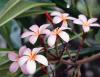
Hi Flower! Figured I'd do a review on the new picture.
This one is alright. My eye feels a bit lost with the subject being in the center, and that really detracts from the picture. I'd like to see more to the bottom left of the page, so there's more of a story in the picture. What I mean is, if the subject weren't central, then we could see the rest of the field and see that this bale of hay is part of many others.
Also, an inch or so off the bottom could be cropped. It's a bit too much going on that doesn't really play into the picture, I find.
PM me with questions!
~Rosey
A writer is a world trapped in a person— Victor Hugo
Ink is blood. Paper is bandages. The wounded press books to their heart to know they're not alone.
Thank you for the reviews. I would go back and take the picture again, but those hay things are gone. Anyway here is my next picture in sepia as requested.
My reality comes to a close as I once again realize that you don't love me, and even if I love you with my everything you will never care.
This is very, very beautiful. I'm really glad you decided to take my advice. After all, you are amazing for a budding photographer. I love the sepia tone and how you took the picture of the nature and that. It makes me think of the fields in the first section of the wizard of oz
All our dreams can come true — if we have the courage to pursue them. -- Walt Disney
okay for my reviewe, i will review on the composition:
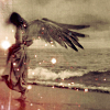
the first picture of the tree shows a good sense of a strong central figure. The middle part o0f teh tree is easily seen while the sides are blurry. The second picture of the stop again shows anotehr central figure but tehre is a competition on the central image between the stop sign and the bush but at most it is the stop sign that is the dominant image. The third pictue is my favourite. Unlike the first two, it shows movement or is it???
anyway, it gives a sense that the figure is actually moving and that makes it a beautiful image. It makes the viewer ponder on firstly what is it and second, is it moving or not...that is good and i like the picture over all.
Overall, it is good picture and you really are nice at art. Question??
how did you get the filter??
John McClane: Drop it. It's the police. Tony: You won't hurt me. John McClane: Oh, yeah? Why not? Tony: Because you're a policeman. There are rules for policemen. John McClane: Yeah. That's what my captain keeps telling me
Hello there! These are wonderful. You seem to like your grey a lot! Do you have any pictures that are colourful? They are a little gloomy, but then they're beautiful as well! You have a real talent! I would try playing around with the focus now!
Thank you for posting! You're so good at this, makes me want to go out and buy a decent camera! Mine's awful! xD
~ Roon
The worst tragedy for a poet is to be admired through being misunderstood.