I really like the background, and the way the entire think is sort of soft.
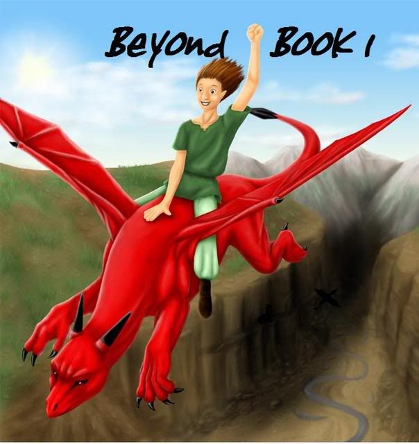
I don't think the dragon would be able to hold itself up, its wings are too small and its body looks really heavy.
The boy's shirt would be scrunched around his shoulder unless it's really stiff. Also, not just his hair would be blown back by the wind, all his clothes would be blown backwards as well.
Really nice job on the arms and the wrinkles in his tunic. I like the dragon's muscles as well.
I think you should make 'Book 1' smaller than 'Beyond' so it's obvious which is the title.
I like the tiny black dragon in the cavern.
Thanks for posting. -Jenna
Jennafina's Love Your Body Already Dammit Campaign
Yeah, the wings look small. But you can fix that, no problem! The red dragon reminds me of one of my old characters, lol.
And... be careful about submitting artwork to the publishers, as far as book covers with your story go. They might ignore your artwork completely.
Ubi caritas est vera, Deus ibi est.
"The mark of your ignorance is the depth of your belief in injustice and tragedy. What the caterpillar calls the end of the world, the Master calls the butterfly." ~ Richard Bach
Thats really nice,but the river should have some blue water and i wish the boys lips weren't so black.Also adding some more greenary(grass) at the sides would make it more colorful.
The scenary and the dragon is nice.
"A good plot is like a dream.If you dont write down your dream on paper the moment you wake up,the chances are you'll forget it and it'll be gone forever"-Roald Dalh.
Hey, pretty good. The only suggestion I can think of is to make "Book 1" smaller, or in a different part of the image. So that it doesn't look like "Beyond book 1... book 2!"
I like this cover. I think the dragon is fantastic and really stands out. The only thing i would change is the positioning of the titles and book 1 because at the moment it looks like all one title.
Ok here we go. The background seems to well "blah"; its boring and very common in books and such. Not very eye catching (I know the eye should be drawn to the main part of the art *in this case the boy and the dragon*, but the background should complement it. Right now it seems just like something you threw together without much time and care when compared to the dragon and the boy).
Also the lighting is odd, because on the dragon it shows to becoming from directly in-front of it, where as in the canyon it is coming from the side. Also if it was coming from a ways in-front of it there would be a shadow on the canyon floor.
Good job with the clouds, but they lack depth/3-dness.
The head of the dragon looks quite a bit like the head of a charizard (pokémon, some may know what i am talking about...), the wings are too small to be of any use too, so you would definitely need to make them bigger. The dragon kinda looks like a dog, with horns and wing-a-ling-things....
The boy's hair is a little to glue stiff, it would be more wavy and such due to the way the wind bends around the skull. Also if the hair is going to be that far blown back then the clothes should follow suit, right now they're acting as if there is a nice small breeze coming from the east.
Umm... I hope that was a little bit helpful.
-DQ
Life's a B*tch, slap it upside the head.
Dargquon Ql'deleodna: (n) "Dar-qu-on Kel-del-ode-na" something i made up that sounded cool, partially based off of the Drow Drizzt Do'Urden's name style
Add a lightning scar to his forehead and guess what??? you've got harry potter...well that's what it looks like to me. Apart from that I agree with everything Necromancer says. And if you plan on having the book published, be warned unless you have a really good agent most publishers wont even care to look at your design, its all about theirs.
Good luck with your story, and the artwork as well!
But that is not the question. Why we are here, that is the question. And we are blessed in this, that we happen to know the answer. Yes, in this immense confusion one thing alone is clear. We are waiting for Godot to come. -Beckett
I won't spend too long on the drawing technicalities, there are just two things I want to mention: first, his hair is a little too stiff; second, the fingers on his right hand (the one on the dragon) should be splayed, not stuck together.
Now, from a graphic design-y POV.
The most obvious problem is that this is just the front, and while that works online, if you were to ever actually print the book with that cover, you'd have no sides or back. That's easy to fix, though. (You'd also need it in CMYK and not RGB, and at least 150dpi for print.)
Now, from a graphic design standpoint, your biggest problem is your typography.
First, I'm not sure how well that font fits the theme of your book. I'm judging by the cover, though, so I really don't know.
Second, the title should not be touching your character. It should be to the side.
Third, I think "Book 1" should be smaller, and beneath the main title. I'm also not sure I'd use "1" but instead I'd go with "I" or "one," but that's just a personal preference.
Finally, my eyes are drawn to the cave/cavern/thing in the background, which is probably not supposed to be the focal point.
All of that being said, you're a better artist than I am and you're five years younger. Keep up the good work, matey.
Its a really cool background but it seems to remind me of countless books about dragon riders........and the kid look like Peter Pan lol srry jsut throwing that out there. Good job!