
cccccc
c ch
h
hi
                   h
 i
h h
                   h
      r
                r
           r
          __  I   __
   s   i    ii
       r
   eh                h
  r
         s                r
  r
           h             r
   r
          r            r
     h
       r s __ e
h ___ h
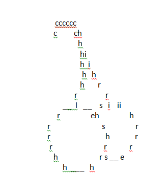
Originally looked like this:
Points:
Time spent:
IP address:
Canary word: Present
Possible AI signals:
Original Text:
Are you sure you want to delete this comment? This cannot be undone.
Mark this comment as a review? Points will be awarded to the poster.
Your comment was posted, but it wasn’t long enough to count as a review. Reviews need about four complete sentences (at least 250 characters). Try writing another review that explains your thoughts in more detail — the author will appreciate it, and you’ll earn points for it.
141,249 Literary Works • 674,329 Reviews



This is old but it deserves a review anyway.
Firstly because:
It is the only thing in this magical "art" section which I didn't even know existed and I have no idea how...
I like the way that the original was distorted in which it created a sort of sideways infinity sign. This might represent the dilemma in your life that is rotating to infinity. The dilemma could be somehow associated with cherries, perhaps cherries spark a traumatizing moment in your history that you choose not to remember so that in order to release the frustration you drew cherries using the letters but in showing your true self the cherries morphed into a sideways infinity sign which further represents both how the problem is infinite and also how it is turned sideways and out of control.
In the clean version I do not like the use of "eh" near the top of the front cherry no the use of "ii" at the top of the back cherry. these two clash and should be fixed.
Thank you for listening.
I think this could be improved if you used Cherries in order, for instance, if you had C's on top for 1/9th, then h, then e etc, all the way down. This would make it easier to read cherries. You could do that, or have it just be a repetition of the letters in order. This might not improve your picture, but it would improve the 'poetry' aspect of it. Right now, it's just made with the letters that make up cherries, but it actually is in a random order for whichever fits best in that place. I can tell this because you have H and I right next to one another, when cherries does not. This is in the stem. You also have E and H next to one another in that order, instead of H and E.
Meh.
It's a throwaway project.
Huh. This is probably something that can't be put into a review, for art is merely opinion, but I suppose I'll try to say something. This shouldn't be left in the Green Room to rot, so I will try to do something about that!
The only thing I can say right now is that I would replace the letters with the word. For example. The stem would be connected with words instead of letters. The word would be stem. That way, it's easier to figure out what it is.
Anyways, that's it. It's a short review, but only because art can't really be forced. It's just a like a poem. It needs to show a message or in art, what the art is about. It can't be forced either or else it won't show beauty.
This is great. The only thing that I would do different is that I would completely delete the messy cherry above the one that looks way better and more like a cherry. This is only because I had no idea what it was. Was it a cherry? Probably, but it doesn't look like one.... Then, I looked at the other cherry, and, after a while, I finally shaped the odd cherry just a bit. You don't have to really, but I'm just saying that as a review.
In some capacity, I am making a statement about Nate's new submission form. He said it "should" preserve whitespace, so I was testing it. That's why I leave the results of the test up; as proof I tried before just using an image.
Oh ok. Thanks for your explanation!
That's really cool. I like the original one though, the one at the bottom. The top one just looked weird to me and didn't look like cherries at all.
-panda
The top one is what it looked like when I tried to copy it from word into the YWS submission editor.
Cool!
Awww!! This is so sweet!!
hahaha its still good