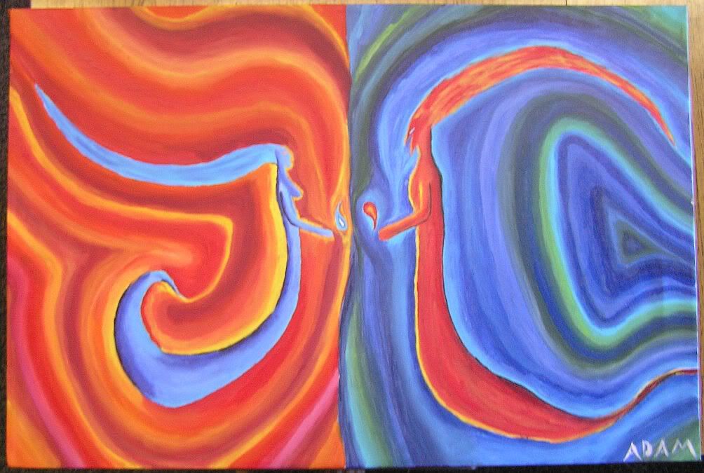
The first reminds me of representation of Water and Ice/ Hell and Heaven/ Good and Bad. I love it! It's perfect... if you are selling it, I'll totally make an offer. (Kidding!)
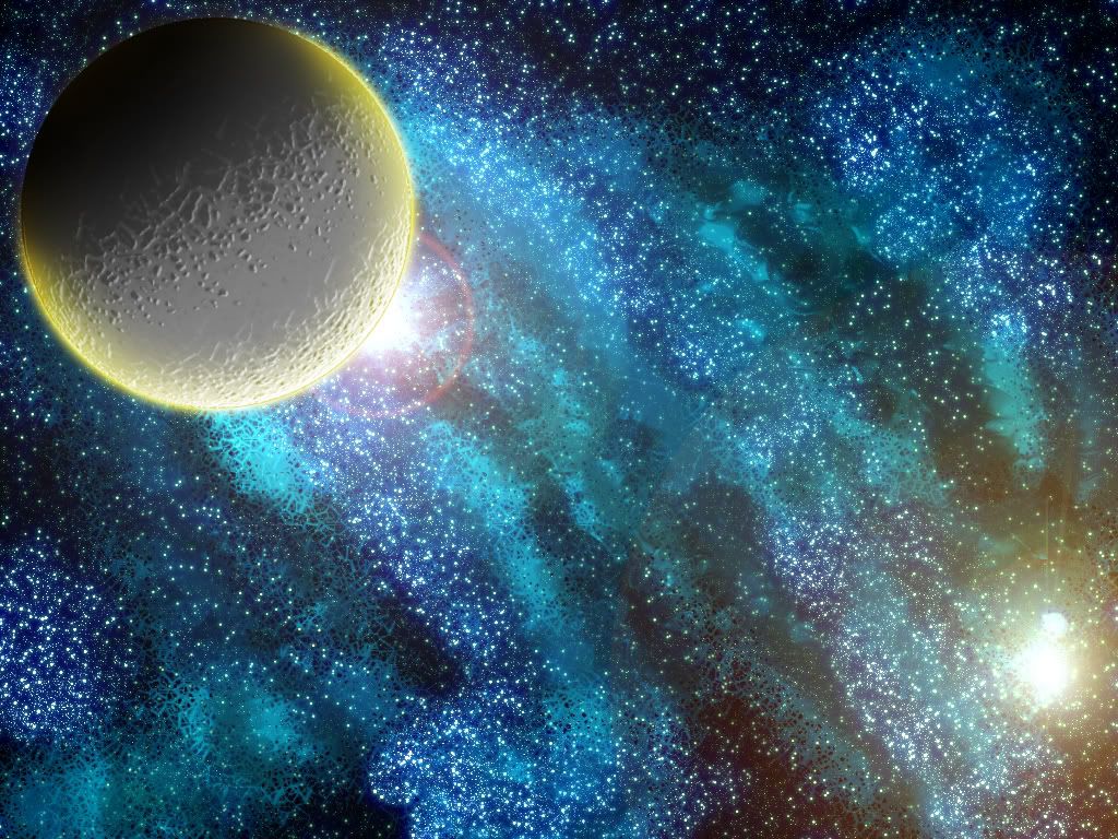
Your graphic is way awesome. WAYYYYYYYYYY AWESOME. I mean, it rocks major socks. I've seen plenty of night sky/celestial graphics but I haven't seen one as good as this.
You must share more of your talented awesome work Adam, I love it!
June
"I'd steal somebody's purse if I could google it and then download it." -- Firestarter
I quite like the first picture Adam. It does well in representing the idea that fire and water cannot be together since water puts out the fire. However, I thought the face of the water entity seems a bit too small. I think it should had been a bit bigger.
For the second picture, wow, just wow. What programme did you used for it? It looks so beautiful.
Good work Adam "Gold stars".
Andy.
"To the edge of the universe and back. Endure and survive."
The contrast between the warm and cold colouring in the first was really effective. And also, I liked the swirls and the way it flowed. And it kind of led my eyes around in circles. The blue figure looks almost 3d. I think the only improvement I can spot was the tail in the red one could be more curly. But thats me bieng pnickity.
The second one is like wow. Did you use a tablet? I want a Wacom Tablet but they're like £350!!! but the blues and bright yellows and whites were immense.
xxx
I just hit my computer
Because it was being slow
I need my daily Smallville fix
And it will not load the video.
Amazing, as always, Adam. ^_^ Was really impressed with the first one with the elements. I liked how you pulled in the yin-yan with what they're holding, as well at the reversal of shpes in their hair, the girl's going down and up, the man's going up and down. Very nice.
The star scape is beautiful, but it feels lacking in the bottom-left corner-ish center-ish area. Between the two suns, there's just an empte space with background and tinye stars. With the upper right, you've got something coming into the frame, and it's so cool that it all but sucks the life away from the rest of the work. Not suggesting another one, of course. That'd be overkill. Just... something to liven up that space a bit.


Gender:
Points: 9022
Reviews: 647