Soulless [Main Character]

5 posts
User avatar
Gender Male
Points 1145
Reviews 32
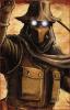
Hey everyone! This is the "raw" idea for the main character of my novel "Soulless". Hope you like it, check out the novel if interested ;) (feel free to rip this thing apart if you must) The colors look alot more smudged and lighter in this picture, try to imagine it blacker.

-Pervy.
Attachments
SOULLESS 3.jpg
SOULLESS 3.jpg (96.71 KiB) Viewed 166 times
Last edited by Perviguana on Fri Jan 21, 2011 6:31 pm, edited 1 time in total.
I'm bringing sexyback


User avatar
Gender Female
Points 1030
Reviews 1260
Hi there!

So, this is an interesting picture. I wonder, is the paper brown like that it the lighting of the room that you're in? I wonder because the color of the paper seem to match the tone of the image. You've also done a nice job of blending and shading the drawing, and it was hard to tell initially that this was done on graph paper. One thing, though -- how are you holding the paper when you take the picture? Right now it's all curved and it sort of takes away from the quality of the image -- make sure you set your sketchbook or piece of paper on a flat surface, and make sure things like holes or notebook rings and edges of pages aren't visible. Now, as for the image itself, it's interesting! I like your style and how he's a mix of being somewhat surreal and abstract and very realistic at the same time. I like how we can't see his eyes, and your line work is just incredible.

However, there were a few things that were a little off-putting in this drawing for me. First, what's all of the gunk around him supposed to be? Clouds? Fog? Grass? I can't tell. I like where you were trying to go with it, and it somewhat adds to the mystery and surreality I can tell the character is supposed to have, but there's too much. It looks like he barely has room to breath, and that makes the image somewhat uncomfortable to look at. You can spread it out a little too. That will make the moon seem less bare and will blend more into the image. Now, this is just a personal thing, but I've never been a fan of writing in images unless it's relevant. What you have is distracting and takes away from your picture -- it's your work, is it not? Why you do you need to write down what it is?

Thirdly, your shading is messy. Throughout your picture, there's no variation in it, which gives it somewhat of a clunky feel. It's hard to tell what is what. Since the bottom of his jacket is the same color as his pants, I couldn't initially see any separation and I thought either his pants were too big or for some reason you decided to give him spider-like legs. The hat and the top of the jacket are shaded exactly the same, and while that was easier to pick out, it's still confusing. Even if you won't be coloring this, it's probably a nice idea to get an idea what the colors would be. That way everything will be clear and you can shade accordingly, instead of deciding, "this will be light, this will be dark." It also might be a good idea to look at some books or websites about shading and light sources; think about what parts of the body the light source would hit. As you go farther away from it, the shading will get darker. Also, there are areas of our body that are more secluded from light then others, such as the bottoms of our nose and lips.

I hope this helps -- I really did like this picture and I can see you have a lot of talent as an artist. Feel free to message me if you want anything clarified.

~ Elinor

All our dreams can come true — if we have the courage to pursue them.

-- Walt Disney


User avatar
Gender Female
Points 32546
Reviews 739
Hiya!

I really like this. It's clear that you put a lot of thought into the shading and the whole design in general. I love the outfit you gave him.

The sword and the shoe are very nicely drawn. I can see ridges on the edge of the blade and there is a lot of detail to the handle.

The bottom half body, the part below his torso, seems unfinished. I can't quite tell if he's wearing a cape over his legs or if it was all attached to his pants. The shading is all of the same tone around that area, and it makes your lines less clear.

His right arm and hand, the one not holding the sword, seems very stiff. I would imagine that his palm would be down on the ground, but instead his fingertips hover slightly over the grass. To me, it would be awkward to hold myself in this position. And even if his arm is straight, I think you need some indication of the joint of his elbow. A few folds in the cloth, or a small size change as you go from forearm to shoulder. Right now it just looks to straight. Give it a bit of a natural bend.

I didn't even notice you had it drawn on graph paper until Elinor pointed it out. So that means the drawing itself really grabbed my attention :D

One last thing, is it just me, or is the coloring much darker at the bottom than at the top? Maybe it has to do with the way you took the picture.

Anyways, awesome job on this. It really makes me want to read your novel, which I probably will :)
The bad news is we don't have any control.
The good news is we can't make any mistakes.
-Chuck Palahniuk


User avatar
Gender None specified
Points 1290
Reviews 7
hay loving it

i like how the shading makes it bold and how it gets you looking at the whole picture not just parts

i love the outfit and the sword, i rely enjoy the dark look of the main character and would love to see you do more of this style of art work

would love to see colour that will blend with the dark like a blue or somthing

keep it up


User avatar
Gender Female
Points 1155
Reviews 58
I absolutely love this. It has a lot of contrast and feeling in it. Keep this kinda of work coming.
You are more than the choices that you've made, you are more than the sum of your past mistakes. You are more than the problems you create, You'v been remade.

http://writemeaway.blogspot.com/


See, we could have been called The Shoes.
— Paul McCartney