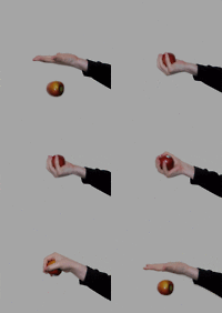
Wow this is gorgeous! I used to do this with my pictures all the time. My only suggestion would be to fade the color of the crystal a little bit, because right now, the original color of the crystal is making it pop out way too much and it looks like it's been cut and pasted into your picture. Other than that, great job! *like*
Embee
One good thing about music, when it hits you, you feel no pain. - Bob Marley
This is so cool! I agree with Embee, though--fade the crystal.
I also didn't really like the way the pointer and middle fingers faded out against the background. I know the focus is supposed to be the crystal, but it still distracted me. Maybe if there was a bit more contrast?
Wait...you didn't edit the color!? That's gorgeous!
What kind of stone is that because I absolutely love the color And I agree with everyone, tone down the crystal just a smige. The black and white really does it make pop though and I love thise picture!
If I had a facebook and could "like" this I would!!
Keep up the awesometasticalwork!
- Irish
I know that you believe you understand what you think I said, but I'm not sure you realize that what you heard is not what I meant. - Robert McCloskey
Teacher: What do we, in the U.S enjoy from places like Mexico? Student: Wait, legally?
Wow! Great picture to color splash! The crystal's color is really intense, isn't it? Yes, toning the color down would help a lot. Also the white on the bottom left of the crystal really bugs me...it stands out like a sore thumb. Even if it may be intentional, it looks like a mistake. To me, at least. Hope I helped-
Beautiful work! I want a crystal like that. I suggest just about only what other people have said: perhaps tone down the crystal, or at least the gleam. A deeper color would add o the drama more. Also, I think that the stark contrast is very... hard for the eye to take in. Personally, I think it would look cool with the ground under the hand being black. That's a personal opinion, though.
Well, aside form toning down the crystal colours, I find my eye constantly being shifted to the very exposed patch just above it. I would suggest you to edit that bit, so that focus is on the crystal. And, the background; it starts out okay but sort of blurs as we move up.I would suggest a mild blur along the bottom to even things up. Also; I love the way the last two fingers are bent.
Good job. ~Lava
~ Pretending in words was too tentative, too vulnerable, too embarrassing to let anyone know. - Ian McEwan in Atonement
I would dark the over-exposed patch right above the crystal. Right now, it seems a bit... white and it doesn't really have neat contrast, as is with the hand and other parts of the crystal. Otherwise, I love the color contrast between the crystal and the white hand.
Ubi caritas est vera, Deus ibi est.
"The mark of your ignorance is the depth of your belief in injustice and tragedy. What the caterpillar calls the end of the world, the Master calls the butterfly." ~ Richard Bach
I haven't done a review or anything in a while... but I really love the simplicity of this picture. It captures the meaning. I also Love the colors and the resolution of the picture. It is very nice. Excellent Job:) ~Skyy.
Come sail the stars with me Through the sky not through the sea Come sail the stars with me Take me hand and make believe Come sail the stars with me Through the sky not through the sea Come sail the stars with me Take me hand and make believe~JT Lloyd
I love how the background effect was greyscale and the center focus was the crystal! It was really nice. Maybe a better angle could solve the problem and try not to increase your focal statement towards the crystal 'cause it would really look it was edited and it stands out more... but really, I like the idea of it. Keep up!
Peace out!
"Life is a poem keep it in the present tense."-Sherrel Wigal
I liked this. I always find I like the pieces where it's black and white and then there's one pop of color. But I agree with Yuri, I think a better angle would increase its awesomeness by like, a million times. Maybe if you somehow made the coloring of the crystal subtler, it would be absolutely stunning. And there's something about that background that bugs me. But it is pretty.
hey, Jude, don't make it bad take a sad song and make it better remember to let it into your heart then you can start to make it better.
I really don't know how to review pictures so I'll just say the things I like and things I don't. I like the colors of the crystal. I like the black and whiteness of everything other than the crystal. I agree with Dreamy, it would look prettytastic if you make the floor completely black I don't really like how shocking the colors are at the same time as liking it. It's just too much for the eye. I think I just contradicted myself...I should stop before I give myself a headache... All right then, I like this It's pretty.
~Jasmine Bells~
I am nothing but a mouthful of 'sorry's, half-hearted apologies that roll of my tongue, smoothquick, like 'r's or maybe like pocket candy that's just a bit too sweet.