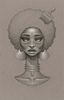
I like the colors! It's hard sometimes, I think, to make colors that are all sort of in the same general palette work together this well, but you did a nice job. I think throwing the brown in made a difference. The only thing that bugged me a little is that her face is sort of manly. Maybe it's the mouth?
Regardless, it looks cool - certainly far better than anything I could produce!
Got YWS?
"Most of us have far more courage than we ever dreamed we possessed."
- Dale Carnegie
Wow...I've seen all your other versions of this girl, and you've improved SO much!
Hair- 9.5/10 Very nice. I love the crisscross strands of hair on her forehead, and how her hair gets darker in some places. For some reason, all the repeating white lines that are supposed to show glossiness bug me a bit. Face- 10/10 Love it. Wings 'n Tail- 10/10 Good choice of texture for the wings. Like the glossy tail. Arms 'n Legs- 8.5/10 Really like how glossy her skin is! The hand on her neck is missing one finger. It doesn't stand out, though...I'm guessing that you did that on purpose? You messed up on proportions here. Both arms aren't the same length; the one on the left that is bent is shorter. Clothing- 10/10 Great choice of colors. The dress suits her well, especially with the white waist thing. (Lol,what should I call it?) Prop- 10/10 Very interesting, love the shape; it works with her perfectly.
Overall: *likes* Great job! In my opinion, this is professional quality, or at least very close to it. Like Areida said, good color pallet. I'm glad you outlined this whole piece in orange, since it seemed to help the piece a lot. Hope I helped. Keep up the good work-
Oh my goodness, this is beautiful! It looks so polished, almost like you could slap this character on a TV or a page and she'd be part of a cartoon or comic book. Areida already said mostly everything I wanted to say, but I just had two quick comments.
First, this needs to be resized. It can be quite a pain to scroll down and not see everything in the browser at once. If you don't know how to resize, I wrote an article about it here!
Secondly, I don't like how she's kind of floating in white with no background. No matter how plain a place may be, we're always somewhere in our worlds, and it's never just white. The white background seems to make the girl stand out in a negative way. The background can be anything you want! It will just help her blend in and make the image seem more realistic to us.
Keep drawing, and PM me if you have any questions! You're a great artist and I would hate to see someone like you quit.
-Elinor xo
All our dreams can come true — if we have the courage to pursue them. -- Walt Disney
Well, I like this *overall*, but there are some things that I think need a little detail:
Shoes: I can't tell if those black things are socks or boots or what. Maybe add a little texture to them, instead of one single color?
Gloves: Again, a little texture would accentuate the curves of her hands and make it more realistic.
Horns/tail: I don't like the horns or the tail. The horns seem crooked and childish, and the tail isn't very realistic.
Wings: I think these would have a better effect on the person looking at them if they were longer and wider. Also, the background you chose to color them looks like a carpet.
That's really it, though. I generally like the idea.
-Knightley
"You laugh at me because I'm different. I laugh at you because you're all the same."
Just to warn you, don't take my review too seriously! I have no idea about computer art and all of that, so I can't really critique very professionally at all.
Someone mentioned there being other versions of this girl, but I haven't seen any of them so I can't compare. I must say though, I love this! I especially love the hair, mostly because of the colour, I think. Come to think of it, I like all of the colours you've used. They work very well together.
My only real critique is some of the finer details. The horns, for example. I'm not sure what it is exactly, but compared to the rest of the picture, they kind of look amateur? I don't know. They don't seem to fit in with the rest of the picture. The same goes for the tail, although that's not as bad. This might just be me being paranoid though!
I also agree with Knightley's comment on the gloves and shoes. To me, the shoes kind of look like slippers! I think that you should do what he suggested, maybe add some texture or a bit of shading into the gloves and shoes.
Nit-picks aside, I really liked this! I thought that it was pretty original and it's ten times better than anything I could ever produce.
Keep drawing, or computer graphicing... or whatever you call it
thanks everyone n//n a few things to note 1. this is a png file, which just posts her and uses the background color of what the site it example= http://Maki121.deviantart.com/art/Kurenai-3-161878490 2. lol, I noticed the arms just now. sigh TT^TT I still have a long ways to go 3. the horns are kinda lazy. I tried to give her ram horns but it just didn't work out 4. lol the wings do look like a carpet thing *will fix in another pic* 5. the gloves, >_> will work on that 6. those are boots. lol guess they do kinda look like slippers. *will work on that* 7. gonna make those wings longer >_< 8. must work on tail. 9. must work on the shine for hair *still a novice to that*
Thanks everyone for your comments. I really am happy ^_^ I hope to improve and do my best with the next one.
i like it. couple issues though: her right hand is missing a digit. i don't know if its too late to fix this or not. the colours are very striking and i get completely absorbed in her emotion. her expression was really convincing. however, the wings are flat and her body is turned to the side. this makes the wings look like they're not quite a part of her. unless this was intentional...
argh. In the sketch, her right hand look perfect, it's at an angle where the thumb cannot be seen, but now that it isn't a sketch anymore it looks like she is missing her thumb TT^TT