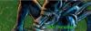
Welcome to YWS! First off, you've done a very good job in reducing the size of the picture.
So now, onto it. I'm a fan of greyscale and this is very good. The 'Darkside' typed doesn't fit in with the picture. You'll need to change the font, maybe something bols and graffiti-ish and give a slight transparency to it. Besides that, nothing much.
Keep it up. Cheers, ~Lava
~ Pretending in words was too tentative, too vulnerable, too embarrassing to let anyone know. - Ian McEwan in Atonement
This was a very nice picture. May I ask what medium you used to create this? I like the slightly rugged feel of the truck, but there were parts of this where it smudged a little too much, like on the windows of the truck. I also agree with lava that the "Darkside" in the picture kind of sticks out like a sore thumb. If you must keep it in, do change the font.
Thanks, and good luck. PM me if you ever post anything new.
-Elinor
All our dreams can come true — if we have the courage to pursue them. -- Walt Disney
The thins that grabs me is that I'm left wondering if all that's really been done here is a grayscale, sketch effect with some layered text on top? Don't get me wrong, it's a good outcome -- besides the idea of perhaps changing the text a little and changing the opacity to 40 - 60% or something. It just seems a little simplistic. Sometimes that can be good but here I feel like you're lacking something. Besides that I love the bluntness of the truck and the smudge rugged feels, I think it makes it look cartoony and in your face, which I love.