First time ever-Cover Page Art Thingy

6 posts
User avatar
Gender Female
Points 805
Reviews 336
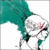
So I was looking through the lounge and I realized how so many people are making avvies and cover pages and collages (which are awesome) and I thought why not make a cover page for my story? So I decided to look through Google (a wonderful thing) Images and see if I can make myself a cover. Remember this is my first time so I'm pretty sure they all suck. I'm not exactly done with them, I just got frustrated with the sharpening and the brightening and the saturating and such. It's for my in-progress story Beast Is Dead about sibling rivalry gone deadly. The main character Annette is a dorky blonde high-school twin who kills her popular twin sister Serena and takes over her (Serena's) life. All is well for a while then the creepy texts and letters start coming in. The second part with the letters will probably be a second part. Like Part 1 is the murder and the taking over then Part 2 is the letters and the killing of the witnesses. Then Part 3 will be god knows what so far, but I know I'l have three parts to this story. :) Yeah, so here are the pics, don't be afraid to be harsh but please don't flame me. Please pick which is best and I'll work on that one the most. I don't want to work on all of them if there is one that seems to be better.

Number 1:
Her hair looks a bit dark here which I don't like and Beast Is Dead and Jasmine Bells barely shows.
Image

Number 2:
I think the Jasmine Bells and the knife needs to be shown more in this one or sharpened.
Image

Number 3:
I need to put Jasmine Bells somewhere on this one and I don't like the font of Beast Is Dead.

Image

Number 4:
Is essentially Number 2 with a bit of a change.

Image


Thanks for reviewing...well thanks for reviewing if your going to review! :)

I am nothing
but a mouthful of 'sorry's, half-hearted
apologies that roll of my tongue, smoothquick, like 'r's
or maybe like pocket candy
that's just a bit too sweet.

~*~


User avatar
Gender Male
Points 13307
Reviews 350
Hey Jasmine, you could probably try it with a white background, but you might not want that if you think the black will create a dark and mysterious mood. Now, with a black background, a red font would be best (in my opinion) but would be almost invisible with the red shirt she has. You can A) get a new picture with a different colored shirt or B) use the 'color replacement' tool (if you have Photoshop) and change it manually. I not sure what color you would chose, but definitely not red, as it blurs out the title.
Also, try making it bigger, since that would help us, the reviewers.
Peace out,
Jenth
-ж-Ж-ж-


User avatar
Gender Female
Points 805
Reviews 336
It was originally a white backround but I really hated it white and changed it to black manually using paint but which one do you think is best out of the four, which one should I really work on becasue they are all different.m :) Thanks for the review!


~Jasmine Bells~
Peace, Love, Writing and Insanity
I am nothing
but a mouthful of 'sorry's, half-hearted
apologies that roll of my tongue, smoothquick, like 'r's
or maybe like pocket candy
that's just a bit too sweet.

~*~


User avatar
Gender Female
Points 12621
Reviews 83
I like the first one the best! I don't know, it's just the one that looks the most natural (ironically). If you cranked down the blurring and cranked up the text's legability, they could be awesome, so keep trying! Also, work on your cutting out, because I can see you've cut some of her arm off. Try zooming in and cutting carefully, it helps me.

Well done otherwise!

~Durrie :smt023
{Insert witty and/or memorable movie quotes here} [Give credit so I don't die by lawyer]

{Follow up with mention of worth-while activity that betters the YWS community}

{Insert link to activity}

{Insert well-humoured internet bribery to entice viewers to join in the activity}


User avatar
Gender Female
Points 6630
Reviews 43
Hi, I think you should use a lighter background. Or, you can make the font color stand out more. I didn't see Jasminebell in any of these, so I don't think they will make a good cover page. The best one was the third one because there us generally more light around the girl. Maybe you can also change her shirt color to make the words stand out. I could only see Beast is Dead in one of those pictures. It's pretty dramatic, though.
Please follow me on all my writing quests by clicking "Follow" on my Profile. Thanks!

Popularity Wars Chapter Three is now here:
http://www.youngwriterssociety.com/post735878.html#p735878

Please review!! Love ya!


User avatar
Gender Female
Points 44360
Reviews 1087
Hey :)

I agree with WritingWords, the third on is my favourite. It's the clearest one and I prefer the way you've used the colours on it. Although, I do have to agree on the fact that the colours you're using aren't too good. Mostly because I hate it when someone puts red and pink together... :xd: The girls top is pink and the writing is red; unless I'm colour blind, that is.

Maybe you could change the girls top so that it's a different colour. To be honest, I think that white would be a good colour to use. That way, you'd have a black, white and red colour theme. Those colours work really well, in my opinion. Maybe you should try that? :wink:

Keep drawing,

xoxo Skins
I didn't know what to put here so I put this.


“I am not worried, Harry," said Dumbledore, his voice a little stronger despite the freezing water. "I am with you.”
— Albus Dumbledore, Harry Potter and the Half-Blood Prince