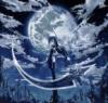
They are really well done, I don't have very much to say. One leaf in the bottom corner on the first drawing looks too dark and has too much. The color pencil goes outside of the lines a little but the other one I really like.
Hey, Mo! This is going to be a quick review because I'm a little rushed, I just thought that these were nice drawings!
The first one is definitely my favourite of the two. I think that the shading you've got there is really nice, espeically the background. However, I think you could possibly do something more with the leaves, because at the moment they're pretty much white all over which is a little bland.
The second one I don't like so much, simply because it doesn't have the same light touch as the first one does. The black pen makes the drawing look slightly less mature. In addition, your background takes away form it because the pen is going in different directions which creates a kind of scrappy, messy background that draws the eye away from the leaves, which should be the main focus. I think that if you're going to do it in black and white you should leave the background white and perhaps use a thinner pen (perhaps a fineliner) so that it still looks neat and detailed.
But it was great!
~Amy
"It is curious how often you humans manage to obtain that which you do not want."
At first glance, the darker one looks like a silhouette of a woman. Haha, I wouldn't have guessed that these are leaves.
But, this is cool! Rather abstract look going on here, and that's awesome. In the second one, I'd recommend photoshopping to even out those marker lines and make it pop more...
I like the softness of the colors in the first as well. Keep drawing, Mo. Your work is interesting.
June
"I'd steal somebody's purse if I could google it and then download it." -- Firestarter
These are very beautiful. I love how they're almost abstract. The soft colors in the first one look so good together, and I like your bold, confident lines. The space is divided up nicely, too, between foreground and background. Another thing I really like is how the leaves aren't perfect. The tears in them are a nice touch.
If you were going to change anything in them, I think the second one would look even better if you used paint or a brush and black ink to get rid of the marker lines. They're pretty distracting. Also, sign your work!
Thanks for posting these, and I'd love to see more of your artwork. PM me if you post anything more, okay?
Jennafina's Love Your Body Already Dammit Campaign
Mo, hello! These were both very beautiful drawings, and I adore them greatly. However, just let me give you my nitpicks on them and then leave
1st Photo This one was alright, and I liked it substantially better then the second one. It was colorful, but maybe a little too colorful. Try shading darker. Oh, and there are some parts where you color out of the lines.
2nd Photo This one was better, as it reminded me of the illustrations in the old books I used to you read. However, I don't really understand the point of the dots. Why are they there? What are they supposed to represent.
Good Job, and I'll be looking forward to reviewing more of your artwork in the future.
All our dreams can come true — if we have the courage to pursue them. -- Walt Disney
Hi, Mo! I need to get my review count up, so here I am.
For the first picture, I absolutely love the colors! Maybe you could've blended them a little more, though...but anyway, everything else was great! My fav of the two.
Second picture was certainly in deep contrast to the one above it. And good job with the making the two pictures' leaves exactly the same. Well, almost. I'm not sure the dots really added to the picture, though, and I think the coloring-in marks of the black marker sorta shows through.
Hey, great job though! I can't wait to see (and review...) more of your work! Please keep drawing. SiSi
"We're all born with selfish desires, so we can all relate to those feelings in others. But kindness is something made individually by each person...so it's easy to misunderstand when others are trying to be kind to you." --Fruits Basket Book 1, page 134
The thing about plummeting downhill at fifty miles an hour on a snack platter - if you realize it's a bad idea when you're halfway down, it's too late. — Rick Riordan, The Son of Neptune



 mwahahaha

 I'm not sure the dots really added to the picture, though, and I think the coloring-in marks of the black marker sorta shows through.