Nope, the two-to-one review ratio applies to all forums, poetry, literature, art, scripts, etc. Storybooks are the only exception. ^^
Anyway, the hair is very well done! I like it a lot. The eyes are lovely, as well. ^^
And speaking as a totally novice artist, the hands are pretty good! I can't draw hands for beans. The thumbs always look like they have tumors and the fingers are always identical lengths -.-
[/offtopic] Anyway, I think you've done a great job! =D
-Saint Razorblade
The Official YWS Pirate
"2-4-6-8! I like to delegate!" -Meshugenah "Teague: Stomping on your dreams since 1992." -Sachiko "So I'm looking at FLT and am reminded of a sandwich." -Jabber
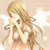
Very sweet! The arms do look weird, a bit broken-esque. And the feet look a bit chubby for the rest of her body. But the shading is great, the hair is really great. And the outlining gives it an amazing affect.
I'd like to see a bit more detail in the wings, however. They are just kind of bland and there...and not moving at all (I mean, obviously not moving...but you can give the affects haha).
This is really good! I love the shading and how her hair catches the light.
Feet: Not only are they too wide, but they both look the same. I can't tell that one is the left and one is the right.
Arms: The sleeves are a bit clunky, methinks, and the shading on them is a little odd. It suggests that they are shaped strangely.
Hands: I think the fingers need to be longer.
Face: The eyes are really pretty and the shading and proportions are really nice. But I feel like all her features are smushed into the bottom half of her face and the whole top half is hair--it looks a little strange to me. Then again, that might be the anime style, I'm not very studied-up on the matter.
Wings: Again, I agree with Via that the wings could use more detail. Maybe little swirly patterns of a different blue or something...?
I think that this is really good, except for two things. The hands and the background. Obviously the hands are rough.... But the background is dull. There's nothing there but darkness. Also, sorry, forgot about this earlier, the wings are boring. You need to put something there besides just blue.
Other than that, this is great... if you can draw this well on a computer, it would be amazing to see what you can draw by hand.
I couldn't draw anything half this well with a pencil--on the computer, my stuff looks terrible.
Nice! This does look very good. I mean, there are of course little things that could be improved--but taken holistically, this is a fantastic piece. I agree that the wings could use a little more detail, and her arms are a bit awkward, but I didn't think there was anything too wrong with the hands and feet; that could be me projecting though, lol, as I can't draw them for pants. I really liked the colors of the whole thing, too.
Wow! This is great! *pouts* I don't know how to do that correctly! My friends tease me about it because they all know how to and won't teach me! I draw anime alot but can't do THAT!! Grr!
The color and shading in this look very professional; something you would see in an anime. However, the actual line-art could use some work. The pose is bland, the arms and legs, as well as the hands and feet, seem to lack skeletal structure. The detail in the sleeves is excellent--however, that detail only emphasizes the *lack* of detail in the dress she wears. Similarly, the shading of her body and clothing is excellent, but the lack of shines on her wings makes it look as though they were added as an afterthought.
If you are looking to improve the quality of this piece overall, I would start from scratch, and find a pose you believe suits the character well. A strong, dynamic pose can make a drawing excellent, when it is only above average.
If you are looking to merely experiment with your inking abilities, well done. This is excellent.