
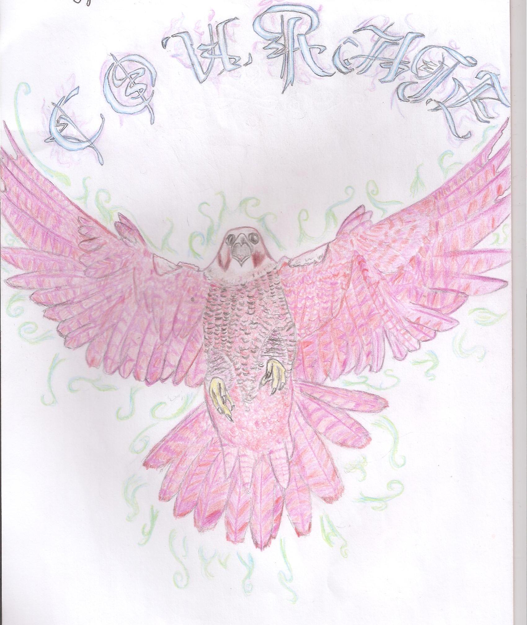
Note: My scanner reflected the white a bit too brightly, and I wasn't sure how to tone it down.
Points:
Time spent:
IP address:
Canary word: Present
Possible AI signals:
Original Text:
Are you sure you want to delete this comment? This cannot be undone.
Mark this comment as a review? Points will be awarded to the poster.
Your comment was posted, but it wasn’t long enough to count as a review. Reviews need about four complete sentences (at least 250 characters). Try writing another review that explains your thoughts in more detail — the author will appreciate it, and you’ll earn points for it.
140,755 Literary Works • 673,687 Reviews



Hi there!

So, first off, I love the concept behind your art. I agree, the peregrine falcon is certainly a graceful, courageous bird. But I think there are a few elements in the picture that take away a bit from the idea.
The bird itself:
Overall, he seems to be proportioned correctly, except that his head is just a bit off-center. And his chest feels flat, not rounded and fluffy, as are the feathers on a peregrine's chest. Also, I noticed the talons seem like they are attached straight at the body. I think this is because you drew the legs much like you drew the chest; not much roundness or dimension there. I know at the angle you drew, the legs are difficult to capture, but I think a bit more could have been done to show his feet protruding from his body.
Also, his eyes... peregrines, like most falcons, have a definite brow ridge, but I'm not seeing that here. His eyes appear wide and almost frightened, not determined and bold like a falcon's should. Again, I think this is due to the lack of a brow ridge.
One more thing: the coloring of the feathers on his cheek. Peregrines have a dark splash of feathers on either side of their faces, almost like the earpieces of a medieval helmet or something. But I only see one cheek filled in with color. I think it needs to be consistent; either fill in the cheek or leave a dark circle, not both.
The letters: awesome calligraphy work here! I love the way the letters are encircled in a kind of purple flame. Wow! But I did notice they were a bit crammed at the end of the word, like wisegirl22 said. Also, I noticed the arch of the letters was a bit off... Other than that... great job!
I hope my nitpicks helped (and they were that, just nitpicks). Great picture here, well done! Keep drawing!
~WritingforHim99
Etherealember, you are one of few who can become a writer and illustrator. I loved how the falcon is spreading its wings like it's flying with courage, hence the name. To me, although I loved the lettering, it seemed as though the letters were widely spaced, but ou discovered you didn't have enough space so you smushed the rest together. Might wanna see what I mean. I love this; I hope you draw more!
-wisegirl22
Thanks a lot wisegirl22! Yes, that is actually what happened hehe... I sat there for several minutes trying to decide if I was about to erase all the letters and start from scratch. Pretty much decided "nope." But I'll take it as a lesson for the next piece, to map out positions of letters before drawing them
Well, good luck!
woah this is cool. i've never actually seen this kind of art on here. (i'm new.)
I love the lettering a lot! wish I could write those. kinda like calligraphy, right?
any inspiration for this sketch?
Hi Nov! My favourite source of inspiration is Google Images! I drew the bird from a photograph chosen out of at least 50 peregrine falcon stills. The lettering was indeed adapted from a cool calligraphy text. It took a lot of patience, but I'm glad I did it! Thanks for your comment
Hey there! Hadj here to review your art!
Criticism
Anatomy
First off, the tail of your bird is off center. With his wings so perfectly symmetrical, it looks awkward to have one side of his tail lifted and more spread out than the other side, as if he were turning. I noticed that the feet were also imbalanced. Everything waist down looks as though he has coming at an angle, but his top half is head on. This results in a generally awkward position. I understand that the picture you modeled it after, looked incredibly similar to this, however, we can here that the birds tail feathers are pointed back based on the shading beneath his feet. (Thus my next topic)
Lighting
In your picture, there is little shading to show how the wings expand, in fact, the center of your bird was the darkest part, as if a series of undefined light sources are placed around him, but none directly pointing at his center. I'm assuming the general source of light in this situation would be the sun, so try to lighten up the top half of your bird while darkening the areas that would be blocked by his broad chest and feet.
Text and Design
I love your font used, and the fiery designs were a great balance, but I wish they could have been cleaner and more full. I think that a full flame rather than individual curls around the bird would have had a more drastic effect on the image. If you really did want just individual curling lines, I would recommend making each line curve in only one direction, as this would look much cleaner. Secondly, your text "COURAGE" wasn't properly centered. I would recommend drawing faint boxes for each letter before writing them in to be sure that you won't have to squeeze your last few letters together.
Praise
Overall, great work. You did a good job mimicking the shape of the falcon and I love what you did with the colors. You are a truly talented artist and I can't wait to see more of your work!
Keep on drawing!
Hadj
How beautiful!
Hi I'm fallen from the team the mystery machine coming to review your artwork so lets get started.
I really like your red hawk i think your lines and shading is amazing. Your talons are well done and well detailed( extremely hard to do.) I like how you don't over detail which is hard not to do. The only negative i had was that i didn't know whether the lines were air or flames coming off your hawk or falcon. Another thing i liked was that the words 'courage' and the font you used is really nice and pretty, it reminds me of the medieval days with knights. Overall, Really nice job and i cant wait to see more artwork from you.
~Fallen ( courgage)
You have a really good plan here using the green to balance with the red color of the bird. It's a good idea for the design.
One of the things that makes drawing or painting easier is trying not to add too much detail. In this case, I think what you've done is good, but you're trying to draw too many of the feathers at once and you're trying to be too exact with the plumage of those feathers. The better thing to focus on would be lights and darks on the bird to get a rounder pronounce shape and figure to the drawing. To get this, you have to layer some things lighter, and some things heavier than each other in order to get the depth of the colors you want, and the darkness.
If we take a look at your reference image here we can see that the lightest areas are between the feathers. The best way to go about trying to get this affect, would be to first sketch it out with a light color, like a yellow or a tan, something that's not going to show up later. Then layer the area of the bird with the basic color, lightly, just so it's a ghost of a color. Avoid the spots that you want the whitest white. Also do your background, in this case, a green color would be good, and put it right up against the edge of the bird. Put darks where the highlights are going to be on the bird, so make your green above the bird, darker, and make the "Courage" on top a purple that's mixing with the green it the area, and the actual text white, so it's a negative. [just an idea] then start building up your darker areas. Start with a basic coloring of everywhere that is in shadow, that includes most of the wings, aside from just the top, and then Don't worry about the design until the very end. Where the wings connect to the body is where your darkest color would be. That area, on your picture, should be a darker color, like burgundy which you can get through mixing a little blue in with a brown, and a layer of red. The next darkest area is the center of the chest, but don't forget to leave room for the highlights going down to the feet from the neck of the bird. Bring the darker burgundy brown color in through the area to make it look darker, as well as building up more shades through a little more pressure on your pencil, and more times over the area. This will give you the dimension you're missing right now and let you really make the bird pop.
Firstly, you found the source image??? What wizardry is this! 8-O
Thank you for the review haha. You're right! What's missing is contrast in shading. I have one question though, in creating a burgundy effect, which direction do I shade in? Do I follow the pattern of the feathers? Or do I follow the outline of the bird?
About the decreasing the detail though, isn't that a style choice? It seemed counter-intuitive to me to reduce detail. I have seen many amazing works of art where the thing that strikes me most about them is the level of detail, and I wanted to attempt the same. (also as an exercise in patience lol) Can you use your wizardry to show me an example of a piece of art which demonstrates your point?
You really know your stuff! Thanks again.
Well the direction really depends on how you're drawing. If you're going for a smooth look, it might be best to crosshatch instead of just picking one direction, so going either in the direction of the feathers or the direction of the outline wouldn't matter because you'd eventually be covering every direction with your pencil.
As for the detail, it comes later. It's a process called blocking in. Basically what you do is you make layers of color, like you were doing a paper cut out, and each layer you add in new details and with those details, you work in smaller and smaller areas. If you try to do the detail, or focus on the detail too soon, then you end up not getting the overall shape of the animal right, or, in this case, not getting the shading deep enough to really push the form. Since you've already got the detail, you just need to go back in and block in the darker areas and build up the base. You can then go over the detail again, afterwards.
Here are some examples of the blocking in process I'm trying to encourage:
here
In this one they use a very neutral color to do the sketch and when that's finished, they include only a basic outline of the areas, and shadows that they want to emphasize later.
Next they went in and colored the undertones, or the colors that are not the color you see, but the color that's going to make the area look rich because it's affecting the color that you see. To find that color is tricky.
Basically, look at an area and pretend that if you had to say a color that was there, and you couldn't say what color you actually are seeing, like if you look at a green apple, you can't say green, then what would you say? Well, green has blue and yellow, but I bet that in that shadow there's probably some red which is making the shadow because red and green contrast, making dark.
Last, she goes in with the basic color, and the detail making it look as lifelike as possible.
here
In this one first they outline what they want to color in, and what they don't want to color in. All of these areas are darker than the lightest light, so they automatically went in with the contrasting color, and colored the whole area they wanted darker than white with a less contrasting color at the top [yellow] and a more contrasting color at the bottom [green].
After that, they began to move in with the final touches darkening up the stuff and making it red, and then darkening up the areas that they needed to be brown/red for the sphere shape, then the final details.
and here.
Yeah, um, these people are crazy.
I thought this was cool.
They too start with a basic blocking in process, but after that, they uh, jump into so much detail that I couldn't be bothered with it XD I think it's best with this to notice how the white eyeball isn't white, and how they left the areas for the shine green.
>> Does that help?
Yup, that helps! Thanks. And that eye is so good, it's creepy...