

Warning: This work has been rated 18+ for language.
T/W: homophobia
Points:
Time spent:
Canary word: Present
Possible AI signals:
Original Text:
Are you sure you want to delete this comment? This cannot be undone.
Mark this comment as a review? Points will be awarded to the poster.
Your comment was posted, but it wasn’t long enough to count as a review. Reviews need about four complete sentences (at least 250 characters). Try writing another review that explains your thoughts in more detail — the author will appreciate it, and you’ll earn points for it.

125,005 Literary Works • 672,805 Reviews


Aaaah Shady <3
You are so so valid and you are completely right, the people saying these things are the fucked up ones and not you in the slightest. It's awful that you have to tolerate people close to you saying stuff like this, and I'm sending so much love your way, you wonderful human bean <3
or(swearing)
Spoiler
Okay, that said, after reading this work I really really wanted to leave a review for you, so this is that!
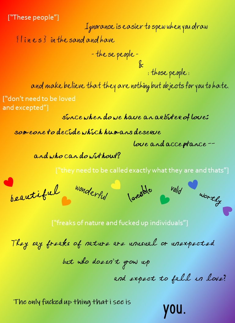
>> One thing that struck me as I was reading this is that for the most part, the language here is quite literal. The only kind of metaphorical imagery that I see is the "lines in the sand" idea, but I actually think this works well for a poem like this. It's about something very real, and very awful, and I don't think frilly or abstract imagery is the way to go for something like this! So I like how you chose to stay quite literal, and I think this also made the swearing feel more literal and raw and impactful as well.
To me, the tone of the narrator comes across as very fed-up but also like they're trying to explain themselves and educate the white-text person for the majority of the poem. That is, until the very end, when there's a slightly more ~aggressive~ twist. I like how it starts as mostly calm and then ends up kinda irate, but I'd love love love it even more if there was a subtle progression and build-up to the "you're so f*cked up" mentality, ya know? One way to do this I think would be to gradually used more charged language throughout, and/or sprinkle subtle imagery that gets more and more intense up until the end. Definitely something you could fiddle around with and see what you think works! c:
>> Visually, there's a lot going on, and I like! The rainbow background and the rainbow hearts are *chef's kiss* At first I was wondering why you used so many different handwritten fonts for the black text (which I'm assuming is all from the narrator's point of view), but I feel like it kind of reflects how many different LGBTQ+ identities there are, and how they all face the same "you're screwed up" sentiments? Especially the section where you have "beautiful" "wonderful" "loveable" "valid" and "worthy" all in different fonts, that seems to fit the different identities ( / different experiences) interpretation!
One random question that struck me while reading, is why did you choose black for the narrator and white for the outside comments? I think I would've chosen the opposite, since black is typically matched with "dark / bad" ideas and white with "enlightened / good" ones. Additionally, white reflects all the colours back at your eyes, which seems kind of fitting to me? Whereas black sucks them all in and steals them. However, maybe you were wanting to invert the black = bad, white = good stereotype as well, which I'm totally down for! Anyway, all that to say, if you had a reason for the font colours I'd love to hear it!
>> Formatting-wise, I'm liking it! I especially like how the white text tends to be fairly unbroken and simply formatted, so it feels like the outside comments are uncomplex and poorly-thought-out ideas almost, whereas the black text seems like it has more movement, more complexity, more depth to it. I also like how the adjectives&hearts section in the middle breaks the pattern of straight lines (pun not particularly intended haha) and becomes kind of light and all over the place; it feels like a slight break in the tension and intensity and like a "here, we all need some good vibes" moment which is lovely <333
One teensy suggestion is for the part where you've got "-these people- / & / :those people:" (-> love the dashes and colons, by the way!! it's a bit like the two types of people are being put in boxes, but visually!) is that instead of having the lines move diagonally downwards, you have them either move starkly horizontal or starkly vertical. In other words, it'd be:
I just feel like that'd convey a sharp division of two groups more effective? Whereas right now it feels like they're just tumbling down after each other. (We've also already got a fair bit of "tumbly" formatting so I think horizontal or vertical formatting would provide some lovely contrast, as well!)
That's an incredibly small formatting thing though, and definitely up to your taste! ^^
>> Nitpicks ~
"thats" -> "that's"
Also, re: capitalization -> it's not super consistent? I think it'd be cool if the white text used one type of capitalization (ex typical 'correct' capitalization), and the black text was all lowercase or something, to show their contrasting viewpoints, but right now it's kind of inconsistent within text colours. Like most sentences start with a capitalized letter, while "since when do we..." doesn't seem to (unless it's just hard to tell in the font). And then the 'normal' capitalization would suggest you'd capitalize the proper pronoun "I", but then ya don't in "The only f*cked up thing that i see is". Definitely not a huge deal at all, but thought I'd mention it since this poem is already so wonderful and polished <333
Altogether, this is such a powerful poem and I'm really glad you wrote it. The language, the formatting, the visual elements, are all quite effective! I hope you know just how fantabulously awesome a person and poet you are :)
I hope this was helpful, and if you've got any questions about anything I brought up feel free to let me know ^^
-whatcha
Ahhhh thank you so much for this LOVELY review <33
ahaha it is i, i is it xD I was trying to gradually unpack and dismantle the attacks and was getting progressively more and more agitated, and then I was reading the last line trying to think of a rebuttal and my brain went "you know what? there's nothing wrong with me -- fuck you" and I just kinda went with it xD But I agree that this would work well if I sprinkled in more of frustration and charged language before we get to that point
or if I ever calm down about this and write a less charged ending xDAhah, I had no depth to the color choices. The white was just really hurting my eyes, especially with the yellow background (that's why I broke the second comment into two lines so it wouldn't overlap xD) and I cared more about the narrator being readable than I cared about the hatred being easily-read. More just readability than any deeper meaning lol
Ooh! I like that idea! I initially had them on the same line and wasn't vibing with it, but I think the directly over each other would have a nice effect like you mentioned ^-^
Fair points! I actually intended to make all the black text lowercase and then... I guess my prose brain took over xD I'll definitely go through and edit that ^^
The white text is actually the direct quote of what my brother said to me (although I did miss that pesky apostrophe xD)^-^ This review made me so happy, I appreciate it a lot <33
<33
Well, first of all, great formatting and colors!

I agree that labelling people based on a certain aspect of themselves is the result of human bigotry and ignorance, and that it is unfortunately what many people say, whether based on their beliefs, culture, or just personal opinion. But that does not excuse the fact that it is wrong. The way you said 'since when do have a arbiter of love', shows how love is determined by the people who give it, and 'who can do without' represents the unnatural hate towards the LGBTQ community that is present in today's words. The last passage was a good-but strong attack against the people who feel hate towards LGBTQ people and certainly uses facts and logic and goes out with a bang. But i think the world is making some progress-a couple decades ago, in many countries it was illegal to have same-sex marriage and/or even relationships, and in some, you would be jailed or even punished. I feel that people in a couple decades will look back here and say, wow, how barbaric we were.
I give it a 11/10
Thanks for the review!
np
This poem was amazing. <3 <3
Thank you <33
<33
<33