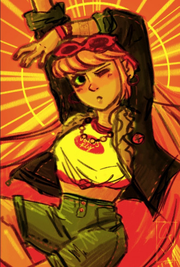
A/N- Critique is highly requested! Specifically the colors, values, and composition of the piece, but if you find something that needs work/improvement (whose art doesn't?) then I'd love to hear it!
Points:
Time spent:
Canary word: Present
Possible AI signals:
Original Text:
Are you sure you want to delete this comment? This cannot be undone.
Mark this comment as a review? Points will be awarded to the poster.
Your comment was posted, but it wasn’t long enough to count as a review. Reviews need about four complete sentences (at least 250 characters). Try writing another review that explains your thoughts in more detail — the author will appreciate it, and you’ll earn points for it.

125,007 Literary Works • 672,816 Reviews


Hi there! majuli here.
firstly, **I AM NOT AN ARTIST AND I KNOW NOTHING ABOUT ART** i just came across this piece and wanted to give my first thoughts from a non-art perspective.
the colours are SO vibrant, wow! have i ever imagined an orange background looking good? no. now that i see it, do i like it? HELL YEAH the orange makes the person pop out so well i think you did an amazing job in the colours. the yellow lines provide like a halo, but also a cartoon animation effect thingy, which is so interesting!
i feel like the girl herself looks a little disproportionate, as in her lower and upper body ratio doesnt really seem right, but really good regardless.
i think you're an amazing artist. keep drawing!!
i think this is really good, and you are a crazy amazing artist! the only things are make her legs a bit longer, and i think it would look good with a little bit of blue somewhere. maybe on her shirt? other then that, it is AMAZING! i wish i could draw like you can! i can't draw a nose. you should be a professional artist! that's all for now. keep drawing!
Momo
Hi there IconspicuouslyAlpacaing (man, I hope I spelled that right)! This is one of my first art reviews, so bear with me if it's not the most helpful review you've ever received, but I'll still do my best to give you some legitimate feedback.

I'd like to preface this by saying that I have very little artistic ability and have always considered myself a terrible artist. Part of this is actually connected to some medical and neurological conditions I have (so suck on that, every art teacher who brutally critiqued my work). That being said, I still enjoy art, and I hope that my perspective as a non-artist can be helpful to you.
I found the textures of the fabric, specifically the pants, and the volume and texture of the character's bangs to be my favorite part of this art. The coloring of the pants was fantastically realistic and created a nice balance to the background and color of the shirt. I also enjoyed the stroke-like motions (almost like brushwork?) was also a nice stylistic touch to this that made it feel alive and real as opposed to a sterile picture.
I agree with your other reviewers that it was difficult to tell the length of the character's hair. It wasn't one of my first impressions, but it is hard to tell if she has a short-cropped bob or if her hair extends longer but is hidden by the rest of her body. While I did enjoy the vivid orange, yellow, and red that were prominent in your piece, I felt as if it could have been better balanced by including some cooler colors in your piece. That was part of the reason that I enjoyed the army-green pants; it created a sense of balance in terms of color and contrast.
The dark, rounded lines that you had in the middle of the work, near the silhouette of the body, also made it difficult for me to distinguish between the background and the character. These lines caused my brain to divide the post into different sections, so unless that was your intention, I would reconsider the presence of those lines.
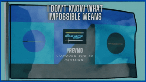
That's all I have for you today! It was overall a stunning piece, very deserving of the literary spotlight, and I hope that some of my critiques were helpful to you. If there's anything else I can provide that would be of use to you, or if you have any questions about this review, please feel free to reach out. It seems fitting to leave you with perhaps the only artistic work I've done these past few months -- my custom RevMo banner.
This makes me think of Chandra from Magic the Gathering, if she lived in modern times, XD
Hey Alpacaing

WOW I love the eye-popping colors! That vivid yellow and pink are probably my favorite thing about this- though the pose and expression come close.
I think Liminality and Gravitem have covered almost everything, so this review won't be super long, but hopefully it helps. The anatomy looks great for the most part (that hand! <3) and I love the style, composition, pose, expression, and colors. As Liminality said, the sun motif is really pleasing to look at and does a great job of directing the viewer's eye immediately to the face.
Regarding improvement, one of the only things I'd point out are that the lineart is a bit messy. This honestly isn't a huge deal and could be a stylistic choice, but Liminality made a good point that it's difficult to tell at first glance where the character's hair begins and ends. I also thought the character had short-cropped hair until I read Liminality's review. If you didn't want to change the golden sunset-colored backdrop to something else (probably a deep, saturated blue for contrast, to really make her pop out from the background), I think having cleaner, more distinct lineart would make the hair easier to distinguish from the rest of the picture. Adding some kind of gradient or shading in the backdrop might also make it blend less with the character.
Otherwise, Gravitem pointed out something off in the hips and abdomen. I agree that this area stuck out to me the most as something that might need improvement. While the anatomy of the upper half of her body is great, her legs, torso, and abdomen/waist area are a bit too short and her crotch is placed very high. I drew over it here to show what it would look like if it was lower and if her legs were longer: https://imgur.com/a/DRa9OAO
I think that's all I have to say about it. This looks awesome, and I hope that my nitpicks can be at least a little bit helpful to you in the future. Good luck and keep drawing
- Aly
Hi there! I'm no expert, but this piece just happened to catch my eye, so I thought I'd attempt a review. This drawing is certainly very dramatic and the concept is interesting.

1. I really like how you've drawn the outfit! I always love it when an artist can capture different fabric textures, and you've certainly done that here. I particularly like the fabric folds on the tied shirt; I think it looks pretty realistic. Additionally, I admire how detailed you've made the outfit, with the stitch of the clothing being drawn in and the little ring of what I think might be henna on the wrist.
2. A higher colour contrast between foreground and background could make it more dramatic and clearer. I get focusing on the golden light source, but at this stage it's a bit difficult to see where the character ends and the background begins. For instance, I thought the character had short hair at first; that the strokes in the background were hair wasn't immediately clear to me. I'd also love it if there were more shadows in this piece, especially darker shadows, which could help differentiate the character from the shadowless sky background.
3. Speaking of the background, I really like the circle + lines design you have. I think it's a sun motif? Regardless, it draws attention to the face and makes the piece stand out a LOT.
4. I also like how much energy the drawing radiates. The pose is active and visually interesting, and the stylised lines of the fingers help to create more motion. How the jacket flares up is also a nice touch.
That's about all I have to say, hehe. Once again, this piece is attention-grabbing. It looks like something you could put on a poster. I just think it could only get better if there was more dramatic contrasts in colour. Hopefully you find some of this helpful and keep on attempting art!
Cheers,
Liminality
Hey! It's Myth here with a review so let's get started without further ado.

Personally, I don't do as good art like that so if anything I say doesn't make sense to you, do correct me, but I think you have exceptional skill with those lines 'cause damn they're smooth. That's some superior line detail but there's some missing near the abdomen. That's probably the only thing missing in this entire piece.
There are some things wrong with it, however. The shading near the jaw exaggerates the depth a little and could be toned down. The ear folds lack the realism that's present in the rest of the piece and stand out a little. You could maybe arch the back a little instead of having it protrude right out of the hips. Maybe a small curve would do the trick. That's actually all that's visibly wrong really. The lack of curves around the abdominal region.
Apart from those things, this is a masterpiece and you should keep up the good work. I hope to see more of your art soon, so keep doing what you do
Yours sincerely,
Myth
__|_|__
Featuring a banner by @harryhardy