Points:
Time spent:
Canary word: Present
Possible AI signals:
Original Text:
Are you sure you want to delete this comment? This cannot be undone.
Mark this comment as a review? Points will be awarded to the poster.
Your comment was posted, but it wasn’t long enough to count as a review. Reviews need about four complete sentences (at least 250 characters). Try writing another review that explains your thoughts in more detail — the author will appreciate it, and you’ll earn points for it.

125,027 Literary Works • 672,774 Reviews

Hey there ForeverYoung299. I’m just dropping by to give you a quick review after spotting your piece in the Green Room.
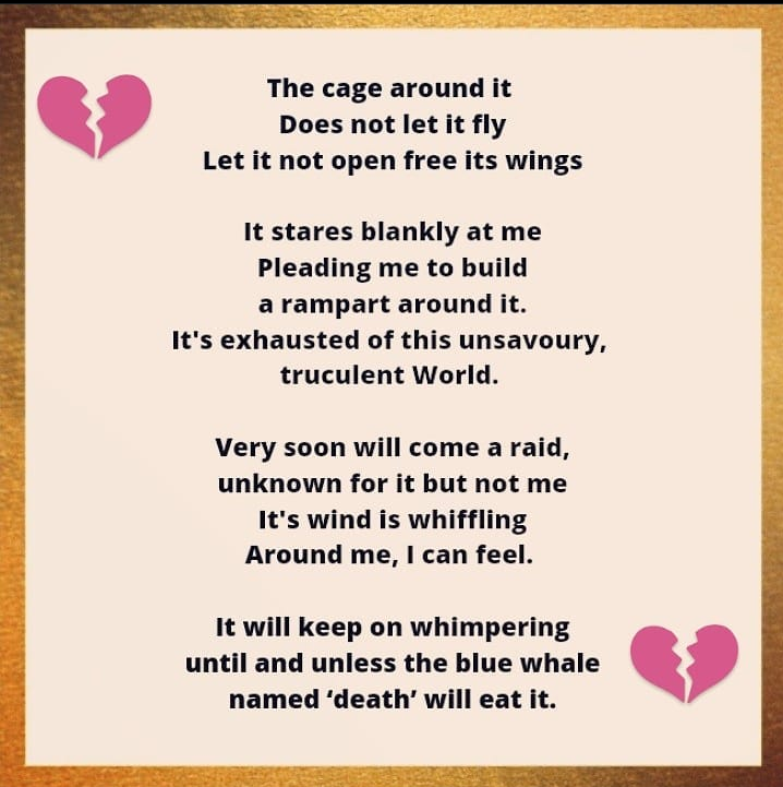
There is a lot going on in this poem. Most of it is focused in the formatting and I do love when writers choose to put their poems in some sort of picture form. I think that having the icons on the edges along with a shiny background might be distracting from the actual content. Having a simpler border, one where the colors aren’t so bold, would still add some flair without the sparkling of the gold.
The other thing about formatting in this poem is the inconsistencies with capitalization and punctuation. I thought at first that you were capitalizing every line, which is an understandable choice, but then the method switches up. This is something else where you may want to be consistent with it for the sake of presentation. It’s all about making people focus on the content of the poem rather than any particulars that may cause a distraction.
My one other thing before I start talking about the poem in a more qualitative way is some of the word choice. “Whiffling” is the main word that stuck out to me as i wasn’t aware the word could be used in that form. It seems like there may be other words that could give the same effect without causing any confusion.
The actual poem itself is rather confusing to me. I think you’re trying to go in some very important directions and then trying to tie it all together. Bringing it in with the promise of death seems almost like a cheap ending to me when you could extend on some of your metaphors to create a more thorough experience for yourself and the reader. First drafts are often vent poems for ourselves while what we present to public readers will be in a very different form.
I think that this poem is in between the first few stages where some changes to word choice would make for something clearer and more interesting. Of course i go back to the presentation where working more on the content of the poem might take away the need for a border and clip art.
This is a good start.
It just needs some more work.
Happy August.
- Armand
Hey! Thank you so much for the review. I get what you meant. This poem was written a long ago and yeah, I actually edited it but was too lazy to post it there. I agree with you in the formatting thing.
This is absolutely amazing!!!! Thank you so much for sharing. I really joyed reading your poem!!
What I especially love is that this poem could be taken so many different ways. I can apply it to my personal life and I feel like anyone else would be able to as well.
I love the last verse because it stands out to me the most. Thank you so much for sharing!
Have an awesomely fantabulous day!!
-AilahEvelynMae