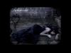
I like the idea of your cover, and the title is rather catchy. However, I think maybe a little photoshop will help. Make it a little bit more interesting to draw the eye in. I know you aren't supposed to judge a book by its cover, but some people do...>.> *points to self* Ahem...um, anyway, I think adjusting the color a little will draw in the eye. Also, blurring the background could help to put a bit more emphasis on the girl.
I'm not a wiz at photoshop, with luck you are, or you know someone that is XD
Best of luck! You're way farther than I am! I've got about 5000 words so far >.<
--meow
Climb inside my belly button beanbag plastic world!
Ok last page I do like but it isn't as good as the others, I think it is all that white space, looks more amateaur than the rest. Hmm...back covers are always difficult...I do love the front though with the girl its super