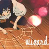
I don't know if the title quite fits the picture, but oh well x) I drew this pretty fast so there are bound to be mistakes. The first is the final colored version, and the last is the bare sketch done with mechanical pencil. The middle is just another version, edited on Gimp.
The bad news is we don't have any control. The good news is we can't make any mistakes. -Chuck Palahniuk
Alright, I need to say it -- I love the colouring. I just, mmph, love it. Especially on the pants, I think you've really got the hang of shading/highlighting.
A few things are bothering me, though. His left arm, for one. It's kind of like with your other drawing I commented on -- it's a bit too long. With this one, though, I think I can see why. His bicep seems to start right after the sleeve, which is not only anatomically wrong, but it makes the arm look like it's bent weirdly. Like, it looks floppy. I don't know, but the bicep should start somewhere in his sleeve, like on the right arm (which looks correct, it's just the left one that's odd.) Also regarding the left hand, I'm not really sure...what's going on. I think it's supposed to be, like, he's resting his forehead on it, but it looks like he bent it back like he's about to throw something. The neck is another thing that's bothersome, though I'm not really sure if it's a stylistic thing or not. The skin underneath his chin looks like it starts being pulled back into the neck way too soon, which kind of makes it look webbed or something. And (oh dear, I feel a bit bad for ripping this apart even further -- I do like it!), his torso seems a bit too turned for that pose.
Other than that, I really do like it. As I mentioned, I love the colouring, and the detail you put into the clothes is very nice. So all in all, it's not a bad drawing, though it could use some work.
Eh, I started this, and then got interupted, so I probably said some stuff the user above me already said... >.>
Okay, you're going to get this a lot, and sorry, but the first impression I got of this was "Sasuke." From Naruto. Nothing wrong with that, it's just you're probably going to be a little annoyed when lot'sa people say the same thing ;^_^
The only thing I would say is that it seems like his neck slops down too close to his chin. I know that his head is tilted down, and that will kind of bring the skin together, but maybe there should be a little space where his chin is in the air and not connected to his neck? Am I making any sense? Anyways, it's such a small thing I don't know why I'm even mentioning it.
Going along with that, the neck seems just maybe a little too thick. His adam's apple kind of adds a certain roundness to this neck that makes it look kind of off.
His torso is a little oddly shaped too.
Love the jeans, though. The legs are shaped really well! Anyways! I like the texture especially in this piece. The jeans, the hair, boots, background. It really gives the whole thing a nice, sort of faded feeling. His face looks really good with a nice expression.
So~ that's all from me. Sorry for the ranting...
-Dai
Oh, I wish I was punk-rocker with flowers in my hair.
Some people are hourglass shaped, some people are apple shaped, some people are pear shaped, some people are even bean pole shaped, but if we’re not careful we all become banana shaped. This is your gentle posture reminder. — Ranger




 Anyways, it's such a small thing I don't know why I'm even mentioning it.