Hey there! First off let me say how much I like this. I enjoy how it gives off a kind of spooky, eerie feel. (This may be a dumb question though- what is this for exactly? Is it for a yearbook or a novel? Forgive me for the stupidity- I was just curious). The only "criticism" I can give is that the shading on the letters makes the words a little hard to read. Other than that great work!
Books are the ultimate Dumpees: put them down and they'll wait for you forever; pay attention to them and they always love you back. -John Green (An Abundance of Katherines)
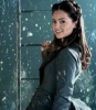
I really like the picture you used. The colors really go well with the author's "steampunk" desire. I also agree with the other reviewer, its smokiness and darkness kind of gives of an eerie feeling, kind of wants you to open it and see what it actually about.
I think my only criticism would have to be that it doesn't actually look like the cover of a legitimate book. I think the actual title should be larger and it should stand out more. Also, because of the smokey shadow behind it, it's somewhat hard to read which is not good for the title of a book.
I think if you just altered those things, then it'd be really great!
If there's a 50/50 chance of getting something wrong go for it anyway because there is also a 50/50 chance of getting it right
I became insane, with long intervals of horrible sanity. ~Edgar Allen Poe
Well I obviously need to learn how to use Gimp. Everything I do in it looks like crap. See now you mad me feel bad! No just joking. This is really good and a little spooky. Is this for a novel or a yearbook? Is that like a boat? Really awesome!!!!!!!!!!!!!!!!!!!!!!!!!!!!!!
~dasiamari!!
Know that she's back in the atmosphere I'm afraid that she'll think of me as a plain old Jain told a story 'bout a man who was to afraid to fly so he never did land. ~Train
I think the top and the bottom drag on for too long. I would suggest cropping it a little on the top and a little more on the bottom, right now it's just too much. Honestly, after you do that, this will be a wonderful cover. The font choice was great, it corresponds well with the photo. Nice work
"So the writer who breeds more words than he needs, is making a chore for the reader who reads." — Dr. Seuss
So... Hey there Unless I'm mistaken, this hasn't popped up in my entries area yet *raises eyebrows*, so why not, huh? It's awesome. I like the spooky and eerie feel to it, I'm really sorry that I haven't got anything up of my story to use as reference when making the cover, it's meant to be top secret-ish and will be released all in one go, with the winning entries' cover included. I wish the best of luck to you, I sincerely hope you do well. Sorry this hasn't been much of review but I felt I needed to let you know to submit your entry for the best chance of winning.
As always, love Beth x
"The world existed to be read. And I read it." - L.S Schwartz, Ruined by Reading