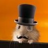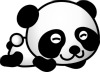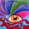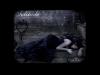
I love the shading in the second one. The first one has bold, bright colors that enunciate the texture which I love <3 Don't be afraid to go dark! Create contrast between the dark spots and light spots.
The final piece was undoubtedly your best work of art. I applaud your usage of the glaring bright green and the near-identical eyes. The wide-open mouth seems to point to some inner hunger. Ahem. You could have made the entire bird fit if you'd scaled the entire image down some. However, we would have been unable to see the detail your put into the feathers. I can imagine, after such a technique, that your fingers must have been very dirty. Oil pastels are never the cleanest of instruments. Still, it was very much worth it, giving the bird a very soft, feathery feel. The portrait was a bit strange, mostly for the very long nose bridge. The hair was not given very much body at all, and seems quite 2D. try adding several 'layers' of shadows and light to it. As for your single eye, I would suggest that you don't put it in the center of a very large piece of paper. Wastes paper, for one thing...

PM me if you've got any problems or complaints, Jenth
I'm not really one for commenting on art but I think you are naturally and artist!
I like your first drawing a lot. Personally, I find it hard to work with oil pastels so that makes me admire your work even more. i love the colours you chose, the pink and orange which really blend well, but they contrast as well. I like the face and neck of the bird too. It's a shame it didn't all fit
I think the picture of the person was really good. According to me, that was your best piece. I like the detail you have here. Her hair is nice, I love how it kind of falls over her shoulder and I really admire her eyes, which also kinda connects with the next picture.
Eyes are hard to draw. (In my opinion.) I think you did a very good job at that. I love the detail and I think this is your second best drawing (coming close to the person). There is not a detail in my eye that I think you missed in your drawing.
And finally the face. I don't think this is one of your best. I think, actually its my least favourite in all this art you've done. I like how the face in neon green, so I know you really know the difference between dark and light colours. This clearly shows that. But I can't imagine an interesting story behind this picture or anything. That is why I don't like it as much...
Anyway, I hope this helps ( a little at least!)
Deanie x
Trust in God and all else follows.
Deanie, dominating the world since it was cool @Pompadour, 2014 Your username reminds me of a hotdog @Stegosaurus, 2015 Tried to make puns out of your username, but every attempt has been Deanied @Candywizard, 2015
I love all of these drawing heaps and all of them were a pleasure to look over and enjoy. I like the range of colors and the different things that you drew pictures of. I don't really have a favorite picture because all of these were amazing. now I'll go into some detail about each one and tell you what I liked. Hopefully you don't find my review harsh at all, I actually really liked all of these pictures!
Okay the colors in the first one are honestly beautiful. it made me smile because the color combination just worked for this one and it looked absolutely magical and very artistic. There are however a few things I would recommend next time you do something like this though. First of all try and give the creature more of an expressive face because at the moment I can only identify two main facial features and there are so many things you could have done with the face. Next, try and make the blending of the pastels more natural, it looks a bit messy at the moment. Apart form that thought this picture was great.
The shading in the second picture was great, it was so powerful and the collar bone looked very realistic. The only thing that I'd recommend for this one would be to try and portion this a bit better because everything was a little out of portion. The other thing would be trying to give the hair more volume so it looks less limp and 2-D. This one was great as well though.
The third picture was amazing and I like the angle of the eye on the page and the direction it was looking. I also like the depth which was created by the shading and the detail of the eye. The only constructive criticism I have is to emphasize the eyebrow, it was one of the best of the bunch as far.
The last one just looked like a couple of colorful circles to me but I'll admit it was rather cute and amusing. I'm not gonna' go into detail, I don't think you expected much feedback on this one anyway! Overall though I liked the idea, but you could try and do more with it!
Overall these were fantastic pictures and I think you have a natural artistic talent and i really hope you post some more stuff, I haven't seen any of your art before and I would like to see it around more, so get posting! Anyway these were awesome and a pleasure to review. If you have any questions or would like another review then please PM me and i will happily respond! Keep up the great work.
Hey there! Firstly, I'd like to thank you for telling us the media that you used, a lot of people don't do that and it just makes it easier to look at when you know what they're using. The first one, the lines could have been a bit stronger. Oil pastels will be the death of me, considering I can't get the right results for the life of me, so its also something I have to improve on =] WIth the second one, you had a lot of really nice shading throughout the face, you gave us good idea of the shape of her nose, without actually drawing the shape like kids used to when they're in preschool. so thats nice =] I would have shaded the hair a bit more to make it go with the face a bit more. You have this well done impressionist face thats really beautiful for a character sketch, and the hair isn't quite up to par with it. Maybe go back and make it a bit thicker, use different shades to show the lighting on the hair. Other than that, that piece is really nice =]
I really like what you did with the eye, the angle is really neat and the way that you drew out the bottom of the eye was really interesting to me, you made it stand out a lot and that gives the onlooker something to look at.
And, you're masterpiece, was funny. You really a really good job on these. Keep it up =]
Hi! First of all, I would like to know whether the bird is a phoenix because it definitely seems like it to me. Anyway, I like the shades and the smudging you did to show its feathers. I wouldn't say much about it, just that it's really eye-catching. The second picture: I really like the eyes. They seem faraway and lost in thought. Love the shading, of course. And I can detect the tiny glint on her lips. That's cool! You're good at this. The third one: The eye's nice. It looks so real to me except for the eye lashes. You still have to work on that. (Darkening it a bit) But on the whole, it's very real. The last one's definitely your masterpiece. Good drawings. You obviously have what it takes to become a great artist someday.
You can wish for death... but you can't wish it away
This is awesome! I love the bird and the person and the epic green person! I can't see the eye, though... *sad* I love eyes... I'm not going to waste much room here since I can't review art, but awesome job!
"We need not to be let alone. We need to be really bothered once in a while. How long is it since you were really bothered? About something important, about something real?"
So, I don't touch animals XD my expertise (if you can even call it that) is on people, and more specifically girls/women. So, with that said, I'm heading off to the next picture!
So the biggest thing is the eyes are too high up on the face here. What I always do after drawing the head shape is lightly draw a cross over the face. One vertical right down the center of the face, and one horizontally at the middle as well. The middle of the eyes should fall right on the horizontal line. You have them spaced out far enough apart, and the nose and lips are in the correct place so it's sort of hard to notice this fact. The hair, I would say, is actually fine. I don't really think it's limp. Generally, I try and not let it come off too far from the head, or else it sometimes looks funny. I think the only thing to do to make the hair look a little fuller is by adding darker lines for shading as it goes into the back of the hair. You did a great job with shading the rest of the character, so the next step in shading is to add the hair into the mix, which is really easy when you decide where you want the hair to start looking farther back.
Lastly, I'd like to mention the shoulder. It's a little obvious that it's not exactly proportioned correctly, but I like the way it looks for this pic. I think it adds a sort of old fashioned style to it that works in with the shading style and adds a nice touch. I'm not sure if it was intentional or not, but i liked it either way =)
Climb inside my belly button beanbag plastic world!