Hidden Flame

5 posts
User avatar
Gender Female
Points 5063
Reviews 228
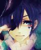
I was writing this novel and I've posted it by the name of 'Hidden Flame: A dragon's secret' and I was having a little trouble with the cover page. The scan wasn't as good as I'd expected. It makes half of the girl's head look bigger since my sketch book didn't quite fit the scanner. It was a bit tilted and the colors aren't as bright as the original but that's not important.

I just wanted ideas for the empty dragon on the side. I couldn't come up with the right color so I was wondering if anyone could give me some advice here... :)

Before
Image

Corrected picture
Image

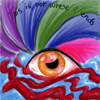
I've corrected the picture. Doesn't it look better? I need someone to give me an idea about the empty space behind the dragon.

Last edited by Twinkle4ever on Sun Aug 21, 2011 5:32 pm, edited 1 time in total.
You can wish for death... but you can't wish it away


User avatar
Gender Female
Points 3733
Reviews 1417
Hi there!

The dragon on the side is great. Honestly though, I didn't notice it until you mentioned it (I looked at the picture before reading your post before it). The color is great and makes the dragon seem mysterious. I also like the fact that it's not the main focus of this cover.

Good job with this! Keep drawing!
Noelle is the name, reviewing and writing cliffhangers is the game.

Writer of fantasy, action/adventure, and magic. Huzzah!

* * *

"I'm writing a book. I've got the page numbers done." -- Steven Wright

YWS is life


User avatar
Gender Female
Points 13890
Reviews 133
aww I just lost! (You posted first xD) :backtotopic: Your drawing skills are really awesome. I love the girl's face although her head is too big but I then realized it was a scanning issue. The portrait, I can say, is very well drawn. I loved the girl's eyes the most. They are just beautiful as well as they give that fear impression.
As for the font, I loved the way you have written the title, although I wish if you would use a dark ink pen to for outlining.
You asked for suggestions considering the dragon, I suggest using some fire colours ( like a mixture of yellow, orange, red). Also I suggest adding more colours to the background especially in the area where the title is written.
★L9


User avatar
Gender Female
Points 22451
Reviews 498
Hello there. :)

I like the second picture better... Of course, colors are more attractive to the human's eye. ;) Also, I think your proportions are quiet great, and you've put on more colors to the girl's face, wich is better. I don't really like the way you've written 'Hidden flame', it seems a little bit taky, but it's still well done. :)

For the backgroud where the dragon is... You could just put some flat color there, which would do the trick. I think it'd be better if you changed the way you wrote 'Hidden Flame', therefor getting rid of the flames, and then incorporate them behind the dragon instead of in the writting. It might be what you are searching for, since the red and orange will make a contrast with the blue, and will make him pop out. :)

Keep up the good work!

-Other One
Behind every mask, lies a man that can't live in his own skin. - Woe is Me <3
Need a reviewer? I don't bite, I promise. :) ---> viewtopic.php?f=188&t=76466


User avatar
Gender Female
Points 32546
Reviews 739
Hey Twinkle! I've finally gotten around to reviewing some art for you! :D

Honestly, I love this.

The second pic is definitely better. I immediately noticed the color to her skin, and the refined text. Those changes really made it look more professional, and made the girl look a little less ghostly :) I don't think her head looks too big really, it just looks like maybe she has a funky hairstyle. Her expression is gorgeous. I even think you did a great job on her purple shirt!

As for the dragon, it's drawn very well. As for coloring, I was picturing simple shades of blue, dark to icy. I also thought that instead of having a white background behind it, you should color it black! It would make the dragon stand out more, i think.

So this is beautiful! I think I'll go check out the novel when I have time. The only 'mistake' i see in this would be the blue background behind the girl. I don't really like how it fades to white under the tips of her hair, around the neck. I think that should be colored in.

Hopfully this helped, keep drawing! You're amazing!
black
The bad news is we don't have any control.
The good news is we can't make any mistakes.
-Chuck Palahniuk


I wish literally anything else I ever said made it into the quote generator.
— CowLogic