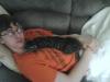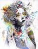
STOP & STARE novel cover.

10 posts
User avatar
Gender Female
Points 13890
Reviews 133
So I' am finally done with Skin's novel cover, or almost done! I haven't done any editing to this novel except for adding images together. Those photographs are not mine of course, I have been looking for images in different photo search engines and it took me two days to find the appropriate ones. While doing the cover, I thought of those six important elements Skins have mentioned in his contest page, which are crime, drama, secrets, depression, love & death. I tried to keep the cover as simple as possible without any sophisticated edits. Still, I am not done with it. What do think? Does it need some editing or would I leave it as simple as it looks?
I would really appreciate you help.
Thanks.
Attachments
Starlightdesigns.jpg
Starlightdesigns.jpg (56.74 KiB) Viewed 237 times
★L9


User avatar
Gender Male
Points 1322
Reviews 41
I can't review art like this because, well, it takes and artist to critique art; so I'll just give my simple input.

I like what you have so far, but the title seems so.. flat. Maybe it's the red on gray, I don't know. Try to make it close to the same color, but find a way to make it stand out at the same time? Sorry if you don't understand what I mean, I can't explain it..

This also feels like there should be a bird somewhere.. Either a bald eagle or a vulture. I'm not sure why, just an eccentricity that I have.

This probably wasn't very helpful at all, but that's what I have to say.
.We don't exist.


Random avatar
Gender Female
Points 2647
Reviews 313
Hey! I entered this contest too =] Its nice to see the different entries and different styles. I really like this a lot, I'm still absolutely amazed at how you got the two characters on there, but I'm sort of new to this kind of art. So, very well done I think =] You have a really bold style, that I sometimes go for with my paintings, but have yet to try with photo edits. Nicely done =]
TylynTyrannosaurus<3 (tydecker777)


User avatar
Gender None specified
Points 15914
Reviews 204
I like the graphics and color choices. It does seem very mysterious and secretive. The guy with a hoodie looks like a mobster, which is perfect because of the crime theme. I think you could change the background to a slightly darker shade though, the girl's face kind of merges into it and there isn't a ton of contrast. My eye keeps drawing to the guy in the hoodie. Should it be doing that? Is he the main focal point? I don't know where to look. Maybe you could put Skins name/blood thing in the bottom right corner. I think it'd give the cover more of a balance and help the viewer not to want to look everywhere.You could go for a more crimson blood red and a creepier font for a chilling effect. I think you did a really good job with the picture selections though. The people have just the right expressions. Hope I helped. Good luck on Skins' contest!

-Cress
Please take care to use good grammar when making a post!

"grammer" 1519 matches on YWS *twitches*

Rydia is the ruler of the world. :(


User avatar
Gender Male
Points 688
Reviews 21
Hmmm...

Nice.

If this was my project, I would definitely use 'Stop and Stare' in place of 'Stop & Stare'. When I read '&' I tend to pronounce it 'n' as in 'Rock 'n Roll'. I also think that you should make 'and' smaller, and sandwich it between the other words so that you see 'Stop Stare' at first glance, since those are the important words.

Do you think you could turn the creepy-knife-carrying-criminally-minded person into a silhouette, with only the knife distinguishable? I'm not sure if it would work. The above mentioned creepy dude almost seems to be smiling... Sorry. I know you had a hard time finding those pictures, but I just don't think he's menacing enough.

A font that looks more like hand writing would be nice, and it would catch your attention more. Something cursive and slanted. Yeah.

It might be a trick of my eyes, but the light gray line around the edge seems to change color at the blood splatter around Skins. Does it? Is it supposed to look like it isn't there?

Eye-catching. Or at least, as eye-catching as you can get for something you have to scroll to see all of. I'm not the author, but I think you did a pretty good job interpreting the themes. For all it's worth, I would suggest a raven if they weren't so over-used.

Maybe I should read 'Stop & Stare'. I know! I could write a review and tell Skins to put a vulture or an eagle or a crow in her story! Then you would be forced to put one on your cover!

Just kidding. You would really have to redesign the cover to include a bird. Since there isn't anything about a bird in the themes, I'd just leave it out. Don't get me wrong, Brandon, I think it's a great idea, but there really isn't room on the cover for something like that. If there was a lot of dead space, I would definitely say that it needs one, but there isn't. Then again, if you did a really small silhouette of a bird in flight, in the empty space to the left of her eye...

Hmmm...

Nice. You did a great job.
I write for my King.

[Warning! User seldom appears on YWS!]


User avatar
Gender Female
Points 10554
Reviews 272
Hey Starlight :)

There is something odd with this cover. I really want to like it loads but there is just something slightly off with it and I'm trying to put my finger on exactly what that is. I think I like the grey on red however I think maybe the overall colour of the piece should be slightly darker but be careful when doing this. What I mean by that is if you make it darker make sure you keep some contrast in there otherwise it will look too dull.

I can't decide if I like the text on the face or not. It seems quite interesting. I think that the girls face might be a bit too big and it makes the overall composition a little unsettling.

I'm probably not being too helpful. Perhaps the problem is that there are too many elements to look at and they aren't quaite meshing together well and there is no focal point.

So maybe try to redress the balance between the elements that you already have. Just play around with the sizes and the placing of the different elements. Sometimes I find when I do this I accidentally come up with something that really works.

Hope that helped a little bit! :)

Bex x
'The creation of a single world comes from a huge number of fragments and chaos.' - Hayao Miyazaki


User avatar
Gender Female
Points 58538
Reviews 553
Hey Star, I am here to review you again! :) I read that you've posted another of the edition for the cover and was really intrigued to see how you've come up with that one, so here I am.


To be really honest, I don't really see a need for you to go and make the other cover, which I reviewed first. This one in itself is so unique and apt for the novel in every ways that with a bit of tweaking, you can make this one the perfect one.

Aside the font, I really like the pictures you've used and the way you've highlighted them. Also, I like your concept of different sizes. The girl seems like Zoey and the boy is very much like I have imagined Charlie. With that blood splashing thing around the font, you've made this one an awesome cover, filling up on feelings for even the other cover.

It feels alive, and if I were to pick a novel with this as the cover, I am one hundred percent sure that I'd start reading the book. And if you can instil that feeling in a reader, then half your job is already done.

What I'd like you to maybe change or work out on is the font for the title of the novel. It's placed at a really correct and attracting place, but the style of the font is kind of boring. I won't expect you to find some elaborate font because that might shift reader's attention and might cancel the balance of the cover's impact. SO find something more attractive, but still simple. What I don't like about it now is that it's way too common, and nothing in it is drawing my attention. :)Same goes for 'Skins'. What you've done around it is really unique and cool, but when a person would see inside that so-called circle, they could get disappointed.

Anyways, I hope this helped. I'll give this one a thumbs up and wish you all the luck for the contest, dear rival. Hehe! :D

~Mia
"Next time you point a finger
I might have to bend it back
Or break it, break it off
Next time you point a finger
I'll point you to the mirror"

— Paramore


User avatar
Gender Female
Points 13890
Reviews 133
View Image.jpg
View Image.jpg (124.8 KiB) Viewed 128 times


The was the final editing for this novel cover. I've changed the font styles, a little make up to the girl's face so that it wouldn't appear too dark and some changes to the brightness of the image.
★L9


User avatar
Gender None specified
Points 974
Reviews 53
I guess I'll review the final version since it is the final version.

What I don't see is the drama see is the drama aspect of it. I found the crime, and secrets easily within the font, the knife, and the hooded figure. I also found that when you wrote: A novel by: Skins, I felt that it wasn't right. If you are going to have some sort of funky font for the author's name, it should reappear somewhere else. It just seemed out of place. Death is also hard to read in this cover. There is a small sense of it when looking at the font, but if I didn't know that the cover was supposed to show death, I wouldn't have taken that away from looking at it.

Then again, depression is adequately read in the body language of the hooded figure. And finally love. Now, me as a reader finds the love element in the made up look of the lips and the coloring of only the eyes and the lips. love death deppression

Overall, I would buy this book if this were the cover. Even though it doesn't show all of the elements you had in mind, I don't know that when buying the book. It is an interesting cover and it makes the reader wonder what will happen in the novel. Good job.

~Brook


User avatar
Gender Female
Points 58538
Reviews 553
Hey Star! :)

Thanks for informing me about the edit. I'd be glad to help again. :)

I'll give a quick review.

1.) The lipstick:Well, when I looked at the edited pictures and read that you've highlighted the girl's lips, my emotions were totally mixed. I didn't understand if it was a good thing you were doing or not. At first, I thought it might take away the excellence and brilliance from the font and rest of the things, but then thought that it might 'add' more effect and funkiness to the cover. But my final decision came out to be in a total different area. Zoey is fifteen, so applying so much lipstick might not look great. The girl in the picture already look a bit mature than I had expect Zoey and getting her wear lipstick might make her character look more strange and relative.

2.) The font for the title of the novel is just what I wanted you to have. It's funky, attractive and most importantly bold. That's mainly what you need for a title. Something that can draw in people even from feet apart. But what I don't like is the font for 'Skins'. All this while you've got bold and formal font, but the name 'Skins' has oddly a funky fun part to it. I am not sure if you wanted to highlight her personality, but I am sure if you wanted to there are other ways and you can leave font out of it. I don't see any harm in keeping 'Skins' in the same font as its counterparts. Rest, of course, is upto you.

3.) I like where you've 'A Novel by Skins' now. It's more noticeable unlike before where one had to stretch their gaze 'up' to look. When we look at something we start from the middle and end at the lower portion. Our eyes don't generally go to the upper portion until there's something striking there. So, I really think you made a good decision.


I am sure liking the edited version and I hope this review helped you. Any questions, doubts to be cleared you know where I am. :3

Keep Photoshopping,
Mia
"Next time you point a finger
I might have to bend it back
Or break it, break it off
Next time you point a finger
I'll point you to the mirror"

— Paramore


Democracy! Bah! When I hear that word I reach for my feather Boa!
— Allen Ginsburg