Super Honeymoon

6 posts
User avatar
Gender Female
Points 3175
Reviews 141
I listened to the new Owl City album 'All Things Bright and Beautiful' while drawing all of these, so I guess that's my inspiration...

Image

This is posted somewhere else as 'Gold Fire,' but I thought I'd post it here, 'cause it goes with the next one...
Image

Image

I love this one:
Image

Image

Thanks for your time! *bows*
-Suki
Oh, I wish I was punk-rocker with flowers in my hair.


User avatar
Gender Female
Points 1305
Reviews 170
Boo here!

Your really good at drawing for starters! My favorite is the girl with blue hair and the leaf. Not much to say, but the hilt of the sword on the boy looks a little bent.

PM me if you have any questions!

-Boo
Milestiba uzvar visu, Milestiba ir upuris.


User avatar
Gender Female
Points 3420
Reviews 126
Daaaaaaaaaaaaiiiiii!!!!!!!!!!! Heyy ;D

Gosh you're really good at hands. I never noticed that before, but you really are. Do you look at references to help you out, or are you just that good? ;P I think my favorites would be the first three. I really like that leaf! That leaf. Is. Awesome. Did you use pastels? Because it looks so smooth an.... oil pastelly XD

I also like how the leaf pictures has... sparkles? Are they sparkles or did you just put in small dots around the heart? Because it looks like sparkles and it's pretty :3 I also love how there's so many different shades just in that one leaf all blended together. It looks so cool X3

Now my other two favorites:
Where did you get that shiny gold marker thingy? It looks awesome O.O and how did you manage to shade over it? That eye. Looks. Real. ;P And I think it was a great idea to use it on the hair, making it looks like sparks. And the smoke is cool too, love the idea that her hair is fire.
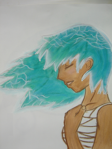
You're so creative! I think it's so cool that you made a fire one AND and ice one. Love it. I think the ice hair is amazing. It's making me cold ;P There are so many different colors in that one too. You're good at blending. I also love both expressions. They look awesome.

One comment I have on the girl with the kimono, there's something about her head that's... off. I think you either made her chin too close to her neck, or her mouth too close to the side. I think it's more the chin one though. Try extending it a bit more next time you do something in a similar position. I think you shaded perfectly on that kimono, though. It looks amazing, I love it.

Ahhh Dai, you're so good at shading :3 I love all of these! Good job! <3
If there's a 50/50 chance of getting something wrong go for it anyway because there is also a 50/50 chance of getting it right

I became insane, with long intervals of horrible sanity. ~Edgar Allen Poe


User avatar
Gender Female
Points 3175
Reviews 141
Thaaaank you for the awesome review, Micki!!

Gosh you're really good at hands. I never noticed that before, but you really are. Do you look at references to help you out, or are you just that good?

Haha, thank you! I just look at my own hands for reference. It's actually kind of a pain 'cause I have to stop drawing, change my hand position, stare at it a while, then continue. >.<

Did you use pastels? Because it looks so smooth an.... oil pastelly XD I also like how the leaf pictures has... sparkles? Are they sparkles or did you just put in small dots around the heart?

Yeah, chalk pastels. They're sort of passed down from my mum. And I was trying to get the lead to look like it was burnt in the shape of a heart, so the little dots were pastel that was supposed to be glowing little embers or somthin'.

Where did you get that shiny gold marker thingy? It looks awesome O.O and how did you manage to shade over it? That eye. Looks. Real.

It's glitter glue :3 This is a photo of the drawing, so in some way... it is real. The lighting turned out just right so that the glue glowed.

Thanks for the review!! I will improve her head next time XD
-Suki
Oh, I wish I was punk-rocker with flowers in my hair.


User avatar
Gender Female
Points 32546
Reviews 739
Is it weird to say that I thought the first drawing was a real leaf? XP On first glance, I thought it was real, and that you had burned a heart shaped hole through it! So congrats on making it look real! Did you trace it or just use reference?

The gold fire girl is definitey my favorite. I really do love this one!!! I don't think you could've done it without the glitter, that stuff looks absolutely amazing, really. The hair has beautiful movement, and great colors. I love her tanned skin tone and her smiling expression. Even the earrings were a nice touch! Two critiques: I would've really liked to see the whites to her eyes. and some detail on the irises or something. The gold color is perfect, but it makes her eye look like a bit of a blob. It looks unfinished. Second, the cloths she's wearing look blocky, like you drew them just as straight crisscrossed lines. There should be some shading to tell us the flow of the cloth, because the zig zags are a bit confusing to where they overlap each other. At least to me.

Lovely pose! Nice blue colors on the hair, they are very pretty. Again, I like the skin tons and expression, the hand is awesome, and the dress a bit blocky. Great job with drawing profile, it's great to practice that. I see that you drew her bangs with white tips, this is just me, but I would've gone with a darker shade of blue. The white just looks a little thick. I love the cracks on the edge of the other strands. Could you try a background for this one? Or maybe draw a few of those wind squigglies in glitter? x)

The kimono looks so soft! and the colors are amazing (I am a color freak after all) The teal goes perfectly with the sunny accessories. It seems like her feet are missing, though. And again I see on your hair that it gets lighter towards the tips, wheras I do the opposite x) Totally your choice, it's just something I've now noticed.

I really like the blue to the front of his hair, it made me do a double take but I really like it. Great hand, you shaded it wonderfully. I love the design for this one, but I think it could've used more detail. The sword in the back doesn't have straight lines. His eyes look a little unfocused. I imagine him looking straight at us with some kind of determined eyes, but instead it looks like he's staring off in space somewhere. The smirk is great! Lovely colors, whatever tools you used to draw these pics are very good and everything has a very soft look to it.

See, I told you! You are totally improving ^_^ Doesn't it feel great lol?
The bad news is we don't have any control.
The good news is we can't make any mistakes.
-Chuck Palahniuk


User avatar
Gender Female
Points 4822
Reviews 220
Hey, nice work. This is chalk pastel I assume? But really nice work. Did you use fixative as a finish? Because fixative is a must for chalks,unless you want your colors to go everywhere.

1. The colorings is really nice and the glitter is a great little touch. I have a feeling this looks a lot better in real life. Although the colors where very nice I had a feeling you did not 'think' about them. If you want to do a great leaf I suggest you just look up a picture of a leaf and note down the tones and the shades of color that go along the veins of the leaf. I understand its hard to put detail in chalk pastel drawings but its just a time for next time. Also the spikes decorative swirls would have been placed better, they probably should also be a little shorter, to me they look a little awkward.

2. I really like this. The eyeshadow looks amazing, really 3D. The face is generally well done, the proportions could do with a little fixing but that's fine. A little more detail around the jaw line and in general. The curve of the neck thing should be placed a little further up and away from the collarbone but It is a cartoon so these things are not the most important. The hair is pretty cool too. Your skin tone is a little flat, maybe some shading around around the muscles would add a little more realism and definition. The clothes could also do with a little more detail. When in doubt about the way things look, use your self as a model.

3. The same things as two. The hair is awesome but could look a little more real, maybe some shine or more obvious strands.

4. I have never drawn a kimono before, although I have worn one, but it seems like a nicely drawn dress. The pastel is quite nice in this. The face could do with a little bit of tweaking though its a little squashed , lengthen and smooth out. The proportions could also do with a little tweak, the features are to big for the face.
Think with tone rather than line.

5. More detail and tone would be nice. Kudos on the hand and the general foreshortening. The eyes are also a little uneven.... I'm staring to get lazy : (

Anyway, great work!
Stay gold, Ponyboy - S.E. Hinton


if ya mention chickens, i have to show up, that is the law.
— alliyah