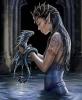
This is a work in progress, so any reviews are greatly appreciated! As you can see, the front cover is on the right, the spine in the middle, and the back cover on the left.
Okay, so I've edited this using the critiques I've received.
book cover1.PNG (60.76 KiB) Viewed 78 times
book cover1.PNG (60.76 KiB) Viewed 78 times
Attachments
book cover1.PNG (354.69 KiB) Viewed 205 times
Last edited by sarebear on Mon Jun 27, 2011 6:56 pm, edited 2 times in total.
Give a man a fish, he'll eat for a day. Teach a man to fish, he'll eat for a lifetime. Talk to a hungry man about fish, and you're a psychologist.
Whoa! What program did you use to make the cover? I think it's awesome, though I have to admit I don't know the first thing when it comes to designing book covers, lol. I really like the back, black with the white cursive and then the star-like bubble things lol. I don't like the front quite as much. Does it really have to say "...a novel"? It's kind of redundant. And then I know they say "don't judge a book by its cover" but I can't help but doing it most of the time. The picture on the front isn't that intriguing, it doesn't really pull me in and say "open me and find out why I look like this" or promise for the exciting story laying inside it. Otherwise I really enjoyed it. I didn't get a chance to look at the contest you have it entered in but good luck and keep up the good work!
~Dakota Knight
What is important is to know fear and yet take a step forward. Rosette Christopher
Firstly, it is very awesome looking. You might want to reconsider the spacing of the bigger circle-emanating-rays because it looks a little awkward, especially in the smaller view. Being under the text doesn't seem to be too much of a problem because I can still read it fine though. Also, you could split up the credits so that they're not in a little block at the bottom, and spread them out instead? Of course, this sort of depends on where you would place the thingy if you decide to change it. I would also suggest making the '...a novel' a little easier to read, maybe by changing the outline of the text? And possibly a border for the picture, although that's definitely optional. The fonts and lines are really nice, and I like the little photo on the spine. The big photo's also really nice, but I think you could do without the added sun. I don't think it quite works out. Lastly, it is very awesome looking.
Hello there =]. Okays, so I think this looked really great. But myone concern is that the cover of the story doesn't match the time period that the story takes place. Unless its a modern fairytale, I have no idea. But it Does look fantastic, and I totally want to know what program you used! Nicely done =]
It looks wonderful, but would there be copyright problems? I mean, I know it's for that contest, but I was just thinking that if she seriously wanted to publish her novel, she might not be able to use this. I don't know.
It looks great, though!
-Dai
Oh, I wish I was punk-rocker with flowers in my hair.
This planet has - or rather had - a problem, which was this: most of the people living on it were unhappy for pretty much all of the time. Many solutions were suggested for this problem, but most of these were largely concerned with the movement of small green pieces of paper, which was odd because on the whole it wasn't the small green pieces of paper that were unhappy. — Douglas Adams, The Hitchhiker's Guide to the Galaxy