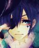
Something I have been working on, need help with the hair ( which is not meant to look real, more like water) and the eyes. I took this with my lousy camera, so there is a little shine and the quality is not good. The grey lead also created some shine, so it's significant;y lighter in some parts.Thanks for reviewing!
I just love this drawing! & especially the hair and the red highlights in it. but try to make some more emphasis on the eye, lets say you can use black ink or whatever you would like to use to make some more emphasis on the eye lashes, & some of the 'fire' colors you used in the hair to make some shades above the eye. and use some colors to do the shading part in the face instead of the grey. You have done an awesome job, Jennya, keep it up!
This is glorious, Jenn! Like really brilliant! There are some very lovely techniques in here that really do astound me greatly. For that, I congratulate you!
Firstly, though, I would like to say I generally liked how the hair looked so simple and not really overdone. Its bright, vibrant, and creates a counterbalance to the face being so well-detailed so that not all of the emphasis is directed towards the middle of the page. That being said, really interestingly done.
A few things you might find will help make this piece shine, though, would be these;
1.The Forehead and Chin
One thing I noticed right off the bat was that you have a very well drawn face. The lips are by far my favorite and the eyes, as well, are also quite lovely, whether or not your camera gave the picture you were hoping people to see. I genuinely liked how it turned out.
Either way, the face, though well drawn, appears to be pinched in, not because of how you drew it but because of the space of the chin and the forehead. The forehead is far too large. There needs to be definite space between the forehead and the eyebrows, but don't overdue it in the act of dodging the often critical mistake of under-doing. The chin, as well, is large and generally shapeless. It gives the impression that her features are all pressed up close together.
So trim to forehead and chin down a bit. I'm sure you'll find it'll help a lot, feature wise.
2.The hairline
Now, you have a very definite hairline. Generally, that's a good thing. Here, though, it gives the appearance that her head is kind of going on and on and on. An alien head, kind of. The hairline should be exactly where the head is, or at least along the top of the skull-line. Maybe trim the top of the drawing down a bit. All that fluff up to takes away from the general flow of the hair which you stated you wanted to be more like water.
I think the best thing you could have done with this was to place the head just a little bit higher and left some of the white of the page up top. The whole look of the entirety of the page excluding her face being hair gives the impression of a lioness instead of water flowing. Of course, this could be a lovely effect, but only if you're happy with it being as such.
Overall
Your features are lovely. There is some definite skill within this piece that I deeply admire. That and the way in which the hair flows is interesting to look at and visually stunning. I adore looking at pictures that mix the cool lead shading with the bright vivacity of primary and secondary colors. That being said, I enjoy this piece immensely and hope to see more of your work soon!
~Walker
Suppose for a moment that the heart has two heads, that the heart has been chained and dunked in a glass booth filled with river water. The heart is monologuing about hesitation and fulfillment while behind the red brocade the heart is drowning. - R.S
I think that your drawing is excellent! The hair looks more like fire than water (no offence).
If you want your pictures to look better, I think it would be better to scan it first. Sometimes when you draw with pencil, the scanning doesn't come well. To improve you picture, Photoshop is the best. Don't change the picture except the penciled bits. Just darken those and your picture will be good.
"But I don't want to be with mad people!" Says Alice.
I always love reviewing your work, it's refreshing to see descent art. I think the one part of the hair that really stands out the most is right by her cheek on the right side. For some reason it just seems really lush there. From what you said about the shine from the lead and such from the flash and such, it still looks really good and I can imagine where the shading would change a bit and it just makes it pop all the more. Fantastic job =]
This is probably my favorite work of yours. I'm sure it took a long time to do! The shading on the face is magnificent, and I think what really makes this art stand out is that amazing expression. Seriously, what a look! O_O I could stare at it all day.
The hair is very interesting, and I really like it too. It's very simplistic, almost like squiggles from crayola markers xD but also very beautiful! If you wanted it to look like water, that's one thing, but if you wanted to add more to it I would shade somehow, just to give it dimension and make it stand out more from the face. The right side of her hair looks more complete than the left, I can tell where the strands are separated better on that side.
You used a lot of the dark orange/red strands in her hair, but they are missing in that area around her chin. I think this is done purposely, trying to show that those hairs are kind of behind her face, but then shouldn't that area be darker? It looks lighter instead. (did any of that make sense? I feel like I was being confusing x))
Do you think you could add glitter or something to it just to make it more awesome? I would personally have at it with a tube of glitter glue and trace over some of the strands. But I'm also weird.
I personally love the face as is, but making it sharper/adding shade and/or color would definitely not hurt.
The only complaint I have is that it looks a bit like a floating head because I can't see the shoulders.
Hope this helped!! I was so excited to see another one of your arts up, Jen! Amazing job! black
The bad news is we don't have any control. The good news is we can't make any mistakes. -Chuck Palahniuk