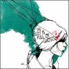
I'm not very good at reviewing artwork but here it goes! Well, it certainly is interesting but it's a little too much going on. I don't know where to look. Maybe making the title bigger and bolder over the top might make it look a little less lost in the picture? Anyway, it's a LOT better than I could do!
A hero isn’t defined by winning. Loads of heroes die in the effort. Most of them never get any recognition. No, a hero is just somebody who does the right thing when it would be far, far easier to do nothing.
I like this a lot but I feel like there's so much going on in the picture that we can't focus on one thing. I suggest cutting off the bit with the sun and the dragon, perhaps making the background color something more interesting than gray and making the title much bigger and the first thing we look at on the cover.
Have any questions, PM me.
~jas
I am nothing but a mouthful of 'sorry's, half-hearted apologies that roll of my tongue, smoothquick, like 'r's or maybe like pocket candy that's just a bit too sweet.
I must say, I like the idea of working on GIMP after drawing. *makes mental note* But like Jas said, there's a lot going on. My eyes can't seem to fix somewhere. And it leaves me searching for the title. So, I'd say make the title bolder, larger and it should be the focal point of the cover. I LOVE the idea an textures you've used, but it needs some cleaning and enhancing. Also; the mask could do with redoing. It seems plain and 2Ded, which doesn't complement the rest of your art.
So some tweaking is in order. ^^ G'luck! ~Lava
~ Pretending in words was too tentative, too vulnerable, too embarrassing to let anyone know. - Ian McEwan in Atonement
Woah! This is really cool. I like the subject matter a lot. The softness of the mask and the fierceness of the dragon are really nice. I'd smooth out your lines a little bit. The mask has some edges that could be a little bit softer. Other than that its really good. Nicely done =]