Literary Journal Cover

9 posts
User avatar
Gender Female
Points 23786
Reviews 403
Soo, these are my entries for the journal cover. I added two slightly alternate versions to my first, and nixed a third I couldn't get to work. I hope they look okay. Unfortunately, I no longer have access to the software I was using to help make them. So my apologies if they're just too dark or cluttered. I also didn't mean to make them so stark looking. (That just seems to happen with anything creative I do) xP Although a few of my viewers found not much to be wrong with the dark look, some did, and I can definitely see why. But here I am, submitting my original ideas for the heck of it. :D I wish I had the time to fix them up.

Version 1: (My original)

Image

Version 2: (I really like a dark background for some odd reason. It just strikes mature in some way. 0_o I wanted to see if I could still make it work by making it seem less intense as the first, but it appears I've failed in that x). I added pictures which sort of represent both poetry and stories, since the lit. journal is a mixture of everything. I also changed the colors to the YWS colors. Since the red was sadly mistaken for blood. D:)

Image

Version 3: (This is basically version one combined with version two. I just really liked my original a lot. ^-^ But I know everyone has their preferences. My apologies again if these are less than satisfactory.)

Image
Last edited by SmylinG on Sat May 28, 2011 10:38 pm, edited 3 times in total.
Paul is my little, evil, yellow bundle of joy.


User avatar
Gender Female
Points 8363
Reviews 182
Wow, I love it! I think that the hand print is a nice touch.

Maybe I would make the blood more realistic if possible? It is blood right? If not, I apologize :)
Because it looks kind of 2-D compared to rest of the cover.

Also, maybe move the words more to the center, because they are very close to the edge, almost touching it, and I don't think that goes well with any cover of this style.

That's it! great work!
"If you ever have a problem don't say 'Hey God I have a big problem.' Rather 'Hey Problem... I have a big God and it's all going to be okay."


User avatar
Gender Female
Points 28467
Reviews 675
Hey there Smylin!

So, I’ll cut straight to the chase and say that as far as the Literary Journal goes, one thing you’ll definitely notice is that both are rather “cheery” looking. This on the other hand is much darker and it feels very sinister. This, as a cover, would give the general impression that the contents of the journal are all rather dark. You’ll this with you look at covers for short story compilation. If they’re horror writer’s short stories, you’re going to see much darker covers. And if it’s a group of stories meant for romance readers, it will be a more romantic cover. So a brighter more youthful cover appeals to the journal.

However, as a cover all its own, you have a nice concept set up. It’s simple which follows suit with what was used on the first two covers. One thing to be watchful of as well is in the hand. The palm looks awkward. Usually it looks more “all here” if it’s a rounded but here it seems to be missing part of the hands wrist area (I have no idea what to call hand parts.)

Oh, and best of luck with the contest!

~lilymoore
Never forget who you are, for surely the world will not. Make it your strength. Then it can never be your weakness. Armor yourself in it, and it will never be used to hurt you.


Random avatar
Gender Female
Points 12193
Reviews 275
I really like this. The bold colors makes me feel like the stories will be strong, and that words are powerful.

I agree with Lily though. The other covers seem to be pretty bright and cherry. But you could still give it a shot.

Another thing that Lily said was about the hand. I agree with that to.

The only real comment I have is about the words. When I first looked at the cover I found myself going from the blood, to the hand, and then to the pen before I even noticed the words were there. I think you might want them to pop more. Make them bigger, or you could experiment with different fonts and colors.

I really do love this,

Calli


User avatar
Gender Female
Points 3888
Reviews 763
Hey Smylin'!

As a cover this is really good. I like the second one - clean,effective simple. The pen and red spots are good.

But I must repeat what the others said.

This is dark for the YWLJ cover. Make it happier and sunshinier.The hand print is a nice touch, but again too dark. If it were a mystery journal or something related to it, this would make a good cover.
As to the font, I would prefer not cursive for the main title. And it should strike out, more than the picture behind it. Try not to let it blend on the background too much.

PM me if you have a revised version up.
~
Pretending in words was too tentative, too vulnerable, too embarrassing to let anyone know.
- Ian McEwan in Atonement

sachi: influencing others since GOD KNOWS WHEN.


User avatar
Gender Female
Points 28467
Reviews 675
Hey there, Smylin! Back again per request! So you already heard what I had to say about number one but I will say some things about the other three!


Cover #2

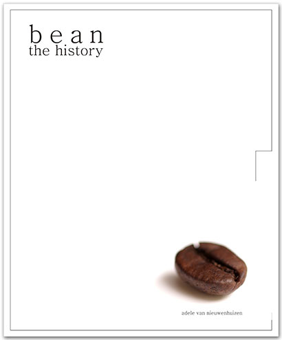
Here’s where I think you have to be careful with your simple theory. White doesn’t always equal simple or cheery. Or even neutral. White, visually, really represents blank space. Take this cover for instance. It’s very white and you really only notice the bean and the text. The same with this cover. You only notice the separate pieces, not so much the cover as a whole.

Cover #3

I’ll be honest right now and say that the blue and yellow don’t help much. They visuals and shapes still look very dark. Plus, the two faces on the side seem to simply add more clutter than is needed.

Cover #4

I unfortunately can’t say much else from what I said the first time with this one except that this feels dark as one does but now with some extra clutter.


I know and understand the you definitely have a theme and idea that you like but for the journal, it just still lacks the vibe on I think it really needs.

Good luck, Smile and if you need anything, I’m always here! *hugs*

~lilymoore
Never forget who you are, for surely the world will not. Make it your strength. Then it can never be your weakness. Armor yourself in it, and it will never be used to hurt you.


User avatar
Gender Male
Points 21355
Reviews 504
Hey.

So, these were...interesting. They are dark-ish, but, contrary to what the previous reviewers said, I think it would work excellently as a cover for a compilation of works (as long as they're not all about fairies and butterflies - we're assuming that some of them would possess some amount of darkness). It would also work as a Twilight cover, but that's beside the point.

You mentioned that you couldn't really edit this anymore, so I'll keep the critiques minimal. My favorite, by far, is the first. A black background tends to go well with a fairly simple layout, and so the extra images, even though Kafka is one, look horribly cluttered. And the color scheme is pretty strange in the second one. The only thing that seems a bit odd is the handprint. Other than that, you're golden.

So! Hope this helped.

-Kafka
#TNT

WRFF


User avatar
Gender Female
Points 6235
Reviews 2631
Hi there! Since I commented on a few other people's, I think it only fair if I come and give you some advice as well ^^

1. I love that hand print and the fountain pen is quite pretty and nicely writerly. I don't really like the black background or the red ink though. The journal should be much more cheery and friendly, particularly considering that it's for young writers and we want it to catch people's attention as something fun and awesome. Also, the writing is nearly impossible to read.

2. I like this one better as the yellow and blue are brighter colours but the comments on your text and black background above still apply here. Also, I don't like the addition of the famous writers. As a site we're modern and innovative while that just makes us luck traditional and stuff. And it's rather bland and boring to be honest. Admittedly you could do with something to fill that gap, but this isn't it.

3. Keep the white hand if you want. I don't know whether I like the yellow or white better anyway, but the red ink is just a no for me. Maybe green? I don't know but combined with your black background it just looks like it's meant to be blood which is too horror orientated.

Heather xxx
Writing Gooder

~Previously KittyKatSparklesExplosion15~

The light shines brightest in the darkest places.


User avatar
Gender Female
Points 9692
Reviews 3900
Smiley! :D

Okay, so this may just be me but... well... this seems more like a murder mystery cover for an anthology than something that would be part of the literary journal. So, for me, it's a little bit weird, especially since we don't really have that many mysteries on YWS. But, maybe I am just seeing it weirdly... that's very possible, actually.

Also, Willy is looking very slick, as always. :)

Anyway, good luck with the contest! :D
Ubi caritas est vera, Deus ibi est.

"The mark of your ignorance is the depth of your belief in injustice and tragedy. What the caterpillar calls the end of the world, the Master calls the butterfly." ~ Richard Bach

Moth and Myth <- My comic! :D


I *do* like flipping tables.
— Faye Whitaker, Questionable Content