Hey! Long time no post for me ^_^ So I've been told a lot that drawing from life will help improve me overall, so I thought I'd give it a try. I dug up an old pic of myself and used it as a reference to try and get some realistic looking features. Anyways, the drawing.
I only wanted to focus on the face, so everything else was left blank.
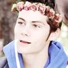
And it was taken from this pic (unedited)
Comments would be appreciated!!
The bad news is we don't have any control. The good news is we can't make any mistakes. -Chuck Palahniuk
Wow, the drawing looks really good. It actually looks identical to the actual picture (well the lighting/ colouring is different, but the structure and shape is the same).
I think it looks really good so far! However, I have two suggestions: 1) The first would be to fix up the right side of your top lip, because it looks a little too skinny. It doens't look porportionate (wow defiently spelt that wrong..) to the left side of your lip.
2)My other suggestion is to add some hair, because it looks a little weird right now without it. Although, if you were just drawing this to practice drawing faces, then it doesn't really matter. It all depends on what the purpose of this drawing was.
Overall, you are really talented! Great work
I'd like to think I'm creative... instead of just plain weird ;D
Now, art isn't my forte, but I have taken a few classes and I have artist friends, so I'll do my best.
I assume you wanted to make the skin darker than it actually is in the picture? Because, no offense, you're pretty white, and the person in your drawing looks really tan to the point of being almost Latino or something. Not quite, but almost.
Also, I don't think the eyes are dark enough. I only have the pic to go on, so I'll say that you have nice chocolate brown eyes, and they're a light hazel in the drawing--even lighter than your skin.
I think maybe there's too much lip on the right side? Because it disappears in the pic, and the drawing has full lips.
I don't know why, but the chin looks just a tad crooked. I can't really tell, though, because of the shape of your chin. It's unique-- I like it.
And the drawing's nose needs to be longer. :p
And I feel reallly bad for pointing out anything because it really is an awesome picture. ;P
Oh! You have a nice pretty eyelash peeking out over the left eye. Draw that! It's something you can add in pretty easily (right?) because it's just feather-light strands, and ....I love it. I'd love to see it on your drawing. ^_^
Overall, this was beautemous! Nice work. :3
Oh, and I do love the shading.
....and whenever I saw "right", I mean your right. Like, it would be the left side of the picture, but the right eye. Like that.
"Ok, Lolpup. You can be a girl worth fighting for." --Pengu
Okay first of all, I am insanely jealous of your digital art skills. Insanely. Jealous. Haha, this is really, very, good and I like it. Your shading is very good as well, however, I think that you are missing highlights. There seem to be quite a lot of highlights in the original picture, and not enough in the drawing.
Also, the mouth seems a little messed up. I see that, in the original, the lips are in an awkward-to-draw position, but you should thin out the left side. It's just too much lip going on, on one side, and not enough on the other. Again, with highlights, I think it would be easier to pull off the fullness of the lips. Because your head is tilted downward in the original picture, the top lip isn't visible, but because of the shading/highlighting around that area you can still tell that you have full lips, and that the top half isn't just missing. Also, you should try shading under the eyes more, because right now they look a tad flat.
The proportions and positions of every feature, I think, are close to perfect. I believe the only thing you need to fix is the shading/highlighting and you should be great!
If there's a 50/50 chance of getting something wrong go for it anyway because there is also a 50/50 chance of getting it right
I became insane, with long intervals of horrible sanity. ~Edgar Allen Poe
First of all, I must say- I usually keep an eye on your artwork, and I am intensely jealous. I've finally gotten myself a tablet, but I'll be blown if I can do anything digitally compared to your work >.<' This one is no different, and you have managed to make your self portrait expressive and pretty damn awesome.
There are only a few things that I noticed, and I may not have without your reference picture.
Your eyebrows are a placed a little oddly, they should be lower and closer to the eyes themselves. At the moment, your portrait looks a little surprised, and where the eyebrows are placed warps the perspective slightly. If you cover the lower half of the face, it doesn't look as if the head is as tilted as it is. The closest eyebrow should start just above where the shadow of the nose ends, and end a little past the eye, but still a closer height than it is currently.
The right hand eyebrow, or the portrait's left, should start directly above the eye's start because of the angle, and continue right to the edge of the face. I think here your outline on this side might just be a bit too far right, rather than the eyebrow being too short. If you actually look at your reference picture, your forehead doesn't slope much to the right at all, and the outline of the cheek comes marginally closer to where your eye is.
The jawline and chin is a little thin too, the portrait shows the outline being much closer to the lip than it actually is. At the moment the bottom part of the face looks a little thin and cramped. Also, your chin isn't quite that pointy.
The colouring of the skin I will ignore, as the photo has warped it anyway. As a general colouring, it's pretty good. I would suggest maybe shading around the eye a little more, especially on the left side (portrait's right). If you look at the reference photo, there is a shadow around the lower lid on the left most side of the eye.
I hope I made sense...
As I said, I love your artwork, and this is no exception. There is a lot of expressiveness, and the eyes are gorgeous. The nose (something I struggle with) is great and the all the features themselves are well drawn. I hope you'll do more portraits, I'd love to see them.
-Nutty
It's not easy having a good time. Even smiling makes my face ache.
Well, I'm pretty sure you didn't just make a drawing on top of the picture, since you have some mild differences with the picture -enough to tell me you didn't blatantly trace it. Awesome. b d You could continue the picture and finish it, though, since it looks sorta bald right now. Anyways, that's all I've got to say. Great work! Jenth
PS. the fact that you took a blue hue and made it a very nice skin tone was great.
Hey there =]. This is a really great... drawing? I'm not sure the media you used, it looks animated. But anyway, so I thought this was pretty great. One of the things that I wasn't too fond of was that you didn't give yourself hair! It sort of just cuts off and leaves you hanging a bit. But I absolutely love the way you did the eyes. Lovely =]