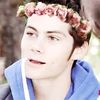
Neal Caffrey

5 posts
User avatar
Gender Female
Points 3420
Reviews 126
Okay so I found a picture of Neal Caffrey, the main character in White Collar, and then I found an awesome art pencil. Then I found *cough, looked for, cough* a sketch book and voila!
I really thought I sucked at drawing people but apparently not :3 I think this is pretty dang good. The only problem I have with it is his mouth! XD It's either too low, or his nose is too high. Either way, there's a giant gap between his mouth and nose pahahahaha. I hope you like it! :3
Image
If there's a 50/50 chance of getting something wrong go for it anyway because there is also a 50/50 chance of getting it right

I became insane, with long intervals of horrible sanity. ~Edgar Allen Poe


User avatar
Gender Male
Points 17895
Reviews 489
Micki! This is a great attempt at realism! I'm actually rather adoring this piece of work here ^_^

But, as I am one of those people who can always spot little things one may achieve with a little practice, I'll try to help this piece out the best I can :).

Now, lets start top to bottom, shall we?

Firstly, the ear is absolutely giant xD. The regular human ear stretches between the eye and the nose. Any higher or any lower is usually improper proportioning, unless the person has gigantic ears. In this case, slim 'em down and put them a little bit lower. The jawline should touch the bottom of the earlobe. In fact, in some drawings, the earlobe is actually connected to the jawline!

Next, I would like to touch upon the shape of the head. You have a very interesting and rather nicely drawn jawline in itself, but the top of the head is kind of smaller which isn't necessary correct proportioning. The human eye should be located at the halfway point of the human head. Here, they are far to far up. A good way to change this is to, before you start drawing, make a circle. Then you draw the jawline outside of the circle instead of inside. It will show you that there should be a lot more space than you might suspect there to be.

The nose is situated much to close to the eyes, yet a little bit too far off from the mouth. Push it down a bit!

The eyes themselves are just a little bit too big. If you're used to cartooning such as disney or anime, that could be why xD. This can be fixed though with a little more practice! Also, give a little more definition to the eye itself! Like add a small tearduct, or the thin lines above the eye to show the folded eyelid. It helps make the drawing in itself look a little more realistic.

The lips, which are just fanastic, by the way, should be less tilted down on the left-hand side. Bring 'em up a bit and that should be just perfect. Also, don't shade them so deeply! Really dark lips give the appearance of a womans lips which I'm sure you weren't trying to go for in this image.

The neck, in itself, is bigger than the jaw which isn't necessarily good proportioning so slim it down a bit.

The collar is a bit wonky on the left-hand side and its extremely straight.. I don't know if you were going for that, but a good way to make it look a little more realistic would be to add a light shading to show that its curving in a bit which most collars do.

The shoulder width is absolutely suberb so no complaints there. What I would like you to do, though, is work on how clothing drapes off the body. Here it appears that you added jetting lines in random places to give the appearance of wrinkles, but you didn't necessarily think of what part of the body was underneath it. Along the upper chest of a male, the cloth would be at its tautest, ne? You have wrinkles in places they aren't needed.

So pretty much you are showing potential strongly. I love the fact you attempted this! Realism, especially towards the opposite gender, is really not an easy thing to do. You showed a quick grasp towards it and some lovely aspects so I'm quite pleased with this! Keep working hard and you'll have proportioning down in no time flat!

~Walker
Suppose for a moment that the heart has two heads, that the heart has been chained and dunked in a glass booth filled with river water. The heart is monologuing about hesitation and fulfillment while behind the red brocade the heart is drowning. - R.S


User avatar
Gender Female
Points 374
Reviews 165
heey micki
I'm not going to write a whole review about this..I'm just going to say that I like this!!
The ear is a little bit too big though.
But you shouldn't change the mouth or nose. It gives him a funny face XD
nice!
-qaralynn-
"If they can't be with you at your worst, then they don't deserve to be with you at your best."
-Murtuza-

"Even though a ship won't sink at sea, it needs to be steered to get home."


User avatar
Gender Female
Points 11052
Reviews 109
Yey! I love Neal Caffrey, this is brilliant and you've got his cheeky smirk just right ;D
The shading is really awesome and i love his hand and hat, however... (yes, unfortunately there's a however) his head is too small compared to the rest of his body! His ears are way too big, you seem to struggle with proportions and i do too, it's hard to get everything right.
His eyes are brilliant by the way, you've got them right.
It's just... his head looks like a child's head stuck on a man's body, and the hat's too small! He also has cheekbones which you've not really got in, his jaw line is too squished up to the facial features. (Call me a stalker or whatever because i seem to be able to know his face off by heart paha).
Other than that, (every picture has it's flaws) it's brilliant and i can tell it's Neal Caffrey from White Collar straight away!
'This isn't funny Dean, the voice says i'm almost out of minutes!' - Castiel
~ Nothing is true, everything is permitted... Live by the Creed... Be Discreet...


User avatar
Gender Female
Points 32546
Reviews 739
Yay I love it!! Even though I don't know who this is, I get some great personality from this picture alone :D This really looks like a real guy, which is amazing. Whenever I try and draw guys they look girly, so this is really good work.
I never really noticed how big the ear was. Some people just have big ears and the lines and earlobe and everything looked alright to me.
I thought you did great on the lips; espicially where the corners met the cheek. Sometimes this area can look pointy and weird but here it looks smooth.
The eyes are very pretty and almond-like ^_^
I love the subtle shading on the neck. Also, the hands are awesome!!! Seriosly, hands are very difficult in general, plus this position was tricky. I give you real props for that!
Be a bit bolder when shading his clothes (jacket, tie, collar, hat). Make sure there are dark lines and also highlights.
The only thing that looked off to me was where his hand met the hat. For some reason it doesn't look like he's connecting with it, that he's not gripping the rim when the pose hints that's what he's doing. So there's something a little wonky about this area.
All in all, I love it! You should definately keep drawing! Buy yourself a small pack of pencils and get to work ^_^
~blacksheep
The bad news is we don't have any control.
The good news is we can't make any mistakes.
-Chuck Palahniuk


I lingered round them, under that benign sky: watched the moths fluttering among the heath and harebells, listened to the soft wind breathing through the grass, and wondered how any one could ever imagine unquiet slumbers for the sleepers in that quiet earth.
— Emily Bronte, Wuthering Heights