assorted art

15 posts
User avatar
Gender Female
Points 1226
Reviews 74
Just some artwork that I've been working on for the past few months. I don't have a scanner to scan any of this so i just took pictures of the pictures. So yeah, hope you guys like it :)

Image
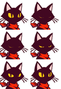
I named him Bobby Joe


Image
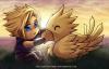
This is Eden from my novel, Kings of None (Manga Style) :D

Image
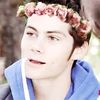
This is highly referenced picture that I stole from a book of poems i used to read all the time when I was little. I always found quietly emotional and always wondered what she was thinking about

Image
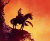
another referenced photo. I don't like the rays in the background, they take away from the piece and i know it's been cut off at certain places but it didn't all fit onto the page. poor planning on my part.
Are you a Badfish, too?


User avatar
Gender Female
Points 2829
Reviews 106
I found all these pictures really good and well displayed. I liked the color on the second one
and the great sketching on the second and first one. No criticism from me at all because
all of these are very good. My favorite was the one of the girl standing in front of the moon.
Mainly because of the hair and how realistic the end product was. I think all of these are
amazing. Keep up the good work. From CuteJackRussell
Hello,
I doubt you will take the time to look at this signature, you are all busy people and I respect that, but if you do know this. Every bit of criticism on my writing has helped and every bit of advice you have given me has also helped. So thank you, for everything.
From CuteJackRussell xoxox


User avatar
Gender Male
Points 904
Reviews 28
I love bobby joe, and all I can critique for him is that his jawbone is too slender where it connects with the rest of the skull, it should extend further back, ergh... It's hard to explain, if necessary, I can draw a picture to explain it...

For your second picture, what is that in his eyes? The little silver orbs? Well, darker than silver, but that's the impression that I get.

Your third picture, Is, AMAZING. I have no critique at all for this.

Your fourth picture, a few things are a little odd with this one.
1. I see no stirrups, and if you're leaning that far back on a horse WHILE IT'S JUMPING then you're going to need stirrups.
2. The horse's left leg, it looks too thin where it connects to the shoulder, if that is indeed the leg that I'm seeing...

Other than that, good job! Keep doing what you do!
Help, help! I'm being repressed!


User avatar
Gender Male
Points 13307
Reviews 350
Awesome! :D
I'm glad I never tried fan art for KON, it would have never turned out as nice as the one of Eden.
Anyways, I know you couldn't help the bad quality, but next time you should have pulled that camera back a little more. In fact, I really want to see these pictures fully, and larger.
I have no nitpicks or complaints at all other than the cropping and size issues.
You, my friend, are fantastico. Muy fantastico.
Whatever that means. :?
Jenth
-ж-Ж-ж-


User avatar
Gender Female
Points 1040
Reviews 58
I didn't see anything wrong with Zelda one except for the small shoulder on teh horse that has already been pointed out. In the game I don't think he has stirrups so I didn't notice. You did great on Epona and Zelda other than that . I think her name was Epona.

You did good on your artwork and I like the black and white ones. Good work hope to see more soon!
90% of writing is re-writing!


User avatar
Gender Female
Points 1226
Reviews 74
thanks for all the reviews you guys!! i'm sorry about the horrible quality honestly i didn't think i'd get very many reviews so quickly.

Your fourth picture, a few things are a little odd with this one.
1. I see no stirrups, and if you're leaning that far back on a horse WHILE IT'S JUMPING then you're going to need stirrups.
2. The horse's left leg, it looks too thin where it connects to the shoulder, if that is indeed the leg that I'm seeing...


Both in the game and the picture I used there are no stirrups, that's just how Epona's saddle is.
and I i will try to fix the leg if i ever get the chance

I'm glad I never tried fan art for KON, it would have never turned out as nice as the one of Eden.


Jenth, from you that means alot you're a phenomenal artist!


I think her name was Epona.


Her name is Epona, his name is Link :-D
Are you a Badfish, too?


User avatar
Gender Female
Points 1226
Reviews 74
thanks for all the reviews you guys!! i'm sorry about the horrible quality honestly i didn't think i'd get very many reviews so quickly.

Your fourth picture, a few things are a little odd with this one.
1. I see no stirrups, and if you're leaning that far back on a horse WHILE IT'S JUMPING then you're going to need stirrups.
2. The horse's left leg, it looks too thin where it connects to the shoulder, if that is indeed the leg that I'm seeing...


Both in the game and the picture I used there are no stirrups, that's just how Epona's saddle is.
and I i will try to fix the leg if i ever get the chance

I'm glad I never tried fan art for KON, it would have never turned out as nice as the one of Eden.


Jenth, from you that means alot you're a phenomenal artist!


I think her name was Epona.


Her name is Epona, his name is Link :-D
Are you a Badfish, too?


User avatar
Gender Male
Points 67823
Reviews 254
Hello there.
You are great at art. These drawings here are really awesome. I really loved the last two drawings.
As much as they are visible, I can see no problem in them. But as Jenth said it would be even better if you could have a look at their enlarged versions. No nitpicks from me.
Keep up the great work. :)
Are you living for the things you are praying for?


User avatar
Gender Female
Points 32546
Reviews 739
Yay! I get to finally see some of your art! :D

It was already said, but since you don't have a scanner you should take a little more care in photographing your work, it would definitely be to your benefit. I would LOVE to see more of Bobby Joe; it seems like he was cut off and that there was more to his hat and body. You also cut off a lot of hair on Eden. The third is not bad, but look for better light because it's dark around the edges, and I can't see all the detail of her feet. You already noticed the last one was a bit cut off too, but I thought it was the best photographed one. Plus, the bright colors stand out really well against the white paper.

Alright, now to review the actual art! :D

Bobby Joe- very seriously cool. I love the smirk and cigarette and cowboy hat and bandanna, the accessories really make his character. Even though I think the pic should've been pushed out a little more so that we can see the whole thing clearer, the closeness really allows us to appreciate the great detail with shading. Excellent job; I especially love how you gave him that shadow over his 'eyes'. His whole character reminds me of Bane from Star Wars Clone Wars.

Eden- the main issue I have with this is that I seriously thought it was a man. All of the features; the aggressive eyes, the long nose, the strong square jaw, and the ragged hair; makes her look like a dude x) I was very surprised to find out that this was Eden. From the story, she seems rather quiet, even vulnerable at times, and no doubt feminine, so I was shocked to see your depiction look more on the aggressive side. The pic actually looks like how I pictured Louis, definitely not how I imagined Eden. Besides that, I really like the colors you chose for this! The hair is really very nice, even thought it looks a bit man-styled. I love the different shadings you included in there; everything goes together perfectly!

#3 is probably my favorite, too (everyone seems to like this one) You're right, the pose is very interesting, and it makes me wonder what she could be thinking about. The simple background was nice, and I love how you gave everything shading to cast a sort of gray tone on the whole drawing. If I had to say something constructive on this, I'd say that the dress could be flowier and less stiff, but it looks like it was difficult to draw in the first place, having so many folds x)

Love Zelda!! This is a great drawing! You got all the proportions right, and the colors pop. The pose is great, and I do like the yellow rays, they look very exciting and give a whole burst of energy to the drawing. Without them, it would've just been the clean cardboard cutout of the characters, but the sunbeams added flair and originality. Only things I have to gripe about with this one is that it looks like there is a scribble under the 'L' and the horses butt looks very squished when I think it should round out a bit more.

Hope this helped!! It's great to see your art!! :D
The bad news is we don't have any control.
The good news is we can't make any mistakes.
-Chuck Palahniuk


User avatar
Gender Male
Points 13307
Reviews 350
Actually, Beil, it doesn't mean much.
I totally suck at anime/manga.
>w<
-ж-Ж-ж-


User avatar
Gender Female
Points 3420
Reviews 126
Oh I liked the first and the third one! They were very well drawn. The first one was a skull, right? It's small so I can't see it very well but from what I can see it's very well drawn and I really like it! (even though it's quite creepy...)

The girl, she's also somewhat creepy in a way. I think she looks very good proportions-wise. I seriously stink at proportions, so I think it's good that yours are well drawn (even if you did use a reference, sometimes the proportions are still off, but yours are good)

I think using references is a very good way to learn how to draw something. It's also good for proportions and by copying, or looking thoroughly at something, you can definitely learn how to draw things that you didn't know how to before.

I think these are very good! You should continue, I hope I can see more of your work :)
If there's a 50/50 chance of getting something wrong go for it anyway because there is also a 50/50 chance of getting it right

I became insane, with long intervals of horrible sanity. ~Edgar Allen Poe


User avatar
Gender Male
Points 9094
Reviews 120
i'm biased as Zelda is the greatest thing ever to me. I do admit the rays look a bit odd, perhaps if they rose fro the top and bottom they would look a bit better,
The second picture is nice. I think the shape of the jaw is a bit off. It slopes out a bit at the top and makes it looks almost like its a bit bloated or puffy. Aside that though the color and shading and the attenition to the hair is quite nice.
I love the first pic, there's a dark humor to the pic that really fits it, almost a Grim Fandango kinda feel (not sure if you'll get the reference).
My only real fault with the third pc are the clouds, they seem a bit flat,. I know it's supposed to be misty but they just seem a bit formless there. That said I loved the detai to the girl. Wonderful design to the hair and the clothing in particular.

Most of my issues are nitpicky. This is some very nice work you should be proud of. Well done!


User avatar
Gender Female
Points 13890
Reviews 133
Hey bElL3!
I like your art style, it is really fascinating & inspiring too. I'd consider the second drawing (Eden) my favourite of all. I like the manga style you've used, I can tell that it is very well drawn. Besides, those red and light brown highlights make the drawing even more fabulous.
-DRAWING-1: The 1st drawing is great, although it is not clearly shown because of it's small-sized so I won't be able to comment much about it.
-DRAWING-3: I love the emotional part you've mentioned about this drawing like there will be a poem about solitude next to it. The shades are great especially in the moon part. I've wished to see that in colours, though.
- DRAWING-4:I know that you've used that from a reference but I don't know why the addition of that yellow triangle is quite disappointing. Personally, I think it added nothing to the drawing but space. On the other hand, I love the colors in this drawing.
Overall, your drawings are simply awesome! I'd love to see more of your drawings.
★L9


User avatar
Gender Female
Points 3733
Reviews 1417
Hi there!

Wow...these are great! I think I looked over them about a hundred times because I loved them so much! You are so talented! My favorite is the third drawing. I like the moon in the background and the girl in the front, taking a moonlit walk as the wind blows against her hair. The Zelda drawing is good as well. It's very realistic and colorful.

Great job on these! Keep drawing! :)
Noelle is the name, reviewing and writing cliffhangers is the game.

Writer of fantasy, action/adventure, and magic. Huzzah!

* * *

"I'm writing a book. I've got the page numbers done." -- Steven Wright

YWS is life


User avatar
Gender Female
Points 1850
Reviews 82
Hi there!

Gleek here to review! I'll start off by saying how awesome these drawings are! I'm not here to point out anything, thought I might include it, but I'm here to say what I like about the drawings!

Drawing 1: I absolutely love this one. That's it. I love how "Bobby Joe" is a skeleton... and he's smoking. I love the detail you put in this! I don't think there are any pointers to point out. I love the cigarette, the face, the hat, they are amazing! This one is one of my favorites. :)

Drawing 2: I like this one. I really like the color palette you used with this one. The hair you drew for him is AMAZING, and I love the streaks of other colors you used in the hair. The scar on his face makes you wonder, "this guy's dangerous, isn't he?" , or at least, I am thinking it. The ear is pretty good, and I can easily see the earring. His face and the emotion you drew for him is really realistic. Great job!

Drawing 3: I really like this one. The girl you drew is beautiful! I love how her hair is carried by some sort of wind, and she's looking as if she's wondering about something. I agree with you! What is she thinking about? I really like the moon and the smudges and coloring you did for the craters. Although, the wisps that's with the moon kind of looks too outlined. I suggest smudging from the inside. I mean, take your finger, press it down on the outline, and go in. Awesome job!

Drawing 4: Zelda! I love Zelda! Okay, the horse and Zelda are amazing! I love the coloring! Very good! The Zelda title seems have uneven color shades. Like, Z is lightly colored red, then E is fully red. Be careful of that. I think the rays are good. I thought that I would see some pencil smudges in the rays, but I didn't see any. Great job!

So...that's all for me to say! If there's anything you don't understand, feel free to PM me! Awesome job by the way!
YOU'VE GOT THAT ONE THING


Someday, everything is going to go right for you, and it will be so wonderful you won't even know what to do.
— Hannelore Ellicott-Chatham, Questionable Content