Nostalgia

7 posts
User avatar
Gender Female
Points 23786
Reviews 403
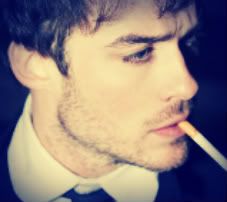
This is something I did quite awhile back. So it probably hardly deserves praise. I always get stuck on old drawings. It's hard to become inspired to draw something new for me these days.

Anyway, it's actually not a big picture at all in real life. So if you're sensing a lack of detail, that's because it's microscopic. ;) Also, it was just one of those things where simple lines were my style. I didn't want to really draw this out into something so elaborate it took away from the expression of the sketch. But that's just one artist's opinion.. . Hope you all like.
Image
Paul is my little, evil, yellow bundle of joy.


Random avatar
Gender Female
Points 938
Reviews 88
Wow. Beautiful piece of art ! I especially loved the way you drew the hair of the boy; like you can see that he got a haircut; I love the shading. Amazing :)


User avatar
Gender None specified
Points 72525
Reviews 1220
First things first: the contrast needs to be fixed. Right now, everything is so dark, it all blends into one dark blob at first glance, and that's coming from someone who has their monitor set to distinguish slight variations in contrast and saturation.

If you have Photoshop (or a similar image editing program like GIMP), I suggest going in and playing with the levels until the background is white, or at least a very light grey. That will make the actual drawing much easier to see.

That said, I'm pretty sure the alignment of the nose and lips is off. What I'm not sure about is if that misalignment is a faithful representation of the subject. In either case, the unequal distribution of shading struck me as being rather odd. His lips and ear are shaded, but not his neck or shirt, or much of anywhere else.

The lines themselves also struck me as being a bit messy and inconsistent. Using a sharper pencil and surer strokes would help with this, else there's always your good friend the eraser to the rescue. Then again, the mess might be due to dirt on the image, which could easily be taken care of by increasing the contrast as suggested before.

You did do a pretty good job on the hair, though.
Secretly a Kyllorac, sometimes a Murtle.
There are no chickens in Hyrule.
Princessence: A LMS Project
WRFF | KotGR


User avatar
Gender Female
Points 32546
Reviews 739
Hey :)

The first thing I noticed was the spacing of the eyes. For some reason, they look too far apart, and too angular. The one on the right has an eyelid where the other does not. It also appears to have more eyelashes.
On the corner of the left eye there's that line stretching out and I don't know if it's supposed to be an eyelash or what. And the last picky comment about the eyes is that they have no highlights. We should be able to distinguish some sort of pupil and some kind of light reflection.
Besides that, the only other main critique I have is that you need lots more shading to make this look realistic. I get that you want a simple, solid outline, but to me you should've taken it farther. It takes loads of time, but if you want to have an awesome result, adding details is the best way to go. Pay attention to the way the light hits his skin and try to imitate it.

Even though this may have sounded like a negative review, I liked this drawing. It has a ton of potential if you're willing to work some more on it.

Oh, and if you need inspiration try deviantart.com . It's like my favorite place other besides YWS ^_^
The bad news is we don't have any control.
The good news is we can't make any mistakes.
-Chuck Palahniuk


User avatar
Gender Male
Points 904
Reviews 28
Alright, I'll start off by saying that I'm not an artist, I just love coming to these forums because, well. Free art, right? :P

The eyes do look too far apart, the bridge of the nose looks like it is farther away from me than the actual nose, if that ameks any sense. The ear, has no actual EAR, no hole that extends further into the boy's head. The hair looks fantastic, you did an excellant job on the hair, but there is little to no shading, and what's up with his Right eyebrow? It looks deformed in some way, I'm not sure...

Other than that, it's a pretty good work of art, and looking back at my review and the picture, most of my nitpicks CAN be explained away by the photo being microscopic, but hey! I need the points, and you posted it!

Please, keep drawing, if this is an old sketch then I can't imagine how good a current sketch would look...
Help, help! I'm being repressed!


User avatar
Gender Female
Points 4822
Reviews 220
Nice, I too like to look at old pictures, my avvie is an old sketch from last year : 3 This is really good work, a nice well balanced piece. Your style is natural an honest, I really like it.

Plus: People are saying that there are spacing issues with the face. I will be different and disagree. Although there could be little adjustments this is quite a good picture. Children faces are quite different. I've drawn a lot of people from this angle and you go the right eye down quite well and the left isn't bad either. People are saying that the lips are not right either, i beg to differ but it looks this way because you have forgotten the other part of the cupids bow, a single line will balance it out and make it look a lot better.

Minus: Like the first reviewer the contrast need work. A little more detail over all would be good, you are missing some minor features but this is a n old piece and you probably already have improved.

Great work!!!
Stay gold, Ponyboy - S.E. Hinton


Random avatar
Gender Female
Points 2647
Reviews 313
I like this piece a lot and I think it's funny because I do the same thing. I did this one sketch for prom and it was all together about an inch around. It was tiny but it looked amazing. But I like it a lot and I think you pulled it off well. I love the different layers in the hair and the simplicity makes me look for something more, it catches me longer, but in a good way. It's really good. =]
TylynTyrannosaurus<3 (tydecker777)


A man hears what he wants to hear and disregards the rest.
— Paul Simon