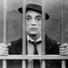
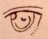
Hello everyone! It's been a while! Well, I litereally just drew this an hour ago, and I decided to post it! I'm a big fan of Band of Brothers and The Pacific, and I had a inspiration to draw this today! It's the photo in the opening credits that has all the charcoal drawings. I attached a picture along so everything makes sense. The one I drew is in the upper left corner, but I'm too lazy to crop it out.(: Comment! Trust me, it looks way better in person!
This is awesome! You need to make your darks heavier and your drawing overall grittier. Are you doing it with pencil or charcoal? Charcoal or chalk might help you reach the desired effect. Your version, interestingly, looks a lot more feminine (slender, small) was that intentional?
"The most incomprehensible thing about the world is that it is comprehensible." — Einstein
I agree with Inkwell. To achieve the texture that you want to capture you're medium should be charcoal. Also, a more profound chin and a broader nose bridge would make your figure much more masculine. However, overall it is still a very good work of art, good job!
With Friends and Courage one can stand against all foes, for neither man nor God can conquer those who are not alone - Cameron Turnbull
My camera (my phone actually) shrunk it, so that's why it has the feminine look to it. :\ But, yeah, I get what you mean. I did use pencil since I had no charcoal.(:
Hey, overall quite nice. I agree with the others charcoal would be a better medium. You should get some it's quite cheap compared with other artists material like gouache which usually is about forty dollars for a lousy tube. But per usually I like to critic art so I'm going to try and squeeze every flaw out.
1.it's generally out of proportion.I to have a little trouble with this. Sometimes when something is really challenging I draw a grid over both pictures. Working on a smaller scale really helps. People tend not to really look at how things are formed. Give it a good stare. See how the helmet is wrong, makes him look like he has a con head.
2. You got the expression down pretty good but the face to was out of proportion and to 'neat'. This is a gritty picture don't get down and dirty. Draw what you see, every line. Sometimes I just scribble and it ends up looking great in the end.
3. The nose should be wider ( yes noses are very hard to draw). I must commend you on getting the mouth almost right, very good job. Also the jaw should be more cut and the face seems a little long.
remember don't be afraid to let yourself go! Keep up the good work!
I suggest making the line of shadows less 'uniform' and make the nose, at the nostrils especially--broader. You could also do an overcoat of charcoal, perhaps, or gray-tone pastels. For the black swishes around the head, you might want to try paint. Get a jagged-tipped brush, maybe.
Also, when it comes to faces, you might want to try and find one of Jack Hamm's books at your library.
All in all, it's pretty decent; but it seems to 'neat' and too feminine. But, still--great job using the photo. I have a horrible time going from photo to drawing. Normally I just work with what's in my head.
'This must be Thursday,' said Arthur to himself, sinking low over his beer. 'I never could get the hang of Thursdays.' — Douglas Adams, The Hitchhiker's Guide to the Galaxy