Random Edited Pics

6 posts
User avatar
Gender Female
Points 914
Reviews 18
And here are some of my edited pics:

A Thoroughbred at Keeneland Race Track in Lexington, KY
Image

One of my favorite dogs - Cloie, an Aussie. I really like this one for the lighting and that she looks like she's waiting for someone or something.
Image

A ladybug taking off (I have a confession: this pic was a complete accident :P )
Image

One of the only trees that survived a brush fire near my grandparents' house in Florida
Image

And finally: my friend's eyes
Image

Hope you guys like them; critiques please! :) More to come tomorrow; I've got like a billion more I want to post. :P
"Stop being defined by what people think of you." - Glee

"Dare to be different; if you blend in, no one will ever notice you. It's the unique ones they remember."

Please review one of my writings (preferably All I Know of Hate) and I'll return the favor! :)


User avatar
Gender Female
Points 28282
Reviews 884
First one: I love horses, and this is a classic pic.

Second: Definately my favorite. In fact, I love this picture. It has those rich, warm autumn colors and a beautiful light. Also, you're right, the dog looks like she's waiting for somebody. If this is where you live, I'm INSANELY jealous.

Third: This has a neat crisp but blurry effect, but I don't think it's as good as the other two.

Fourth: I like the color editing, it's really unique. There isn't much to it, though, I would've liked if there was more of a focal point (like a person or something).

Fifth: If that's your friend's real eye color, then she's got gorgeous eyes (jealous again :D ). It's a nice picture, too.
Reading is one form of escape. Running for your life is another. ~Lemony Snicket


User avatar
Gender Female
Points 22451
Reviews 498
Hello there. :)

First: I really like this one. There's not much that I don't like when it's in black and white. I love the eye, and the reflection in it.

Second: Love the colors and the light. I guess it was rather spontaneous, but it doesn't look like it. Again, great job.

Third: This one is probably my least favorite out of the lot, but it's still good. I like the contrast between the background and the ladybug... But. It doesn't quiet speak to me... It may be the fact that I've seen so many pictures like this before.

Fourth: The contrast here is great again. Although I feel like you could make the tree seem even more important. Maybe crop a little bit of the bottom to the tree seems closer? I don't know, it's just an idea.

Fifth: They say the eye is the window of a soul. I think you've captured it well, but it's nothing I haven't seen before. I know, eyes are the part of a human body that I like the most, and I love to draw them and try to capture the emotions in it. So I won't bash at you for it, I'm just saying. :) I think it's great.

Good job, and keep working!

-Other One
Behind every mask, lies a man that can't live in his own skin. - Woe is Me <3
Need a reviewer? I don't bite, I promise. :) ---> viewtopic.php?f=188&t=76466


User avatar
snailsareslimy
Gender
Points 0
Reviews 0
Hello! :)
I was going to review these last night, but I was too tired :P
Anyway!
#1.
I love the editing you've done here. It's perfect for the photo, and really spot on. The details picked up are insanely good too! One of the two issues though:
Cropping. You clearly crop these photos as they're supposed to be a 4:3 ratio (like the one with the tree). I'd really advise against cropping. Although you haven't cropped too much, it's still a shame. I'd really advise, from now on, keeping to the correct aspect ratio, and if you are cropping, ensuring that it'll crop to the right aspect ratio (by selecting original or something like that, I don't know what you use to edit...). They make photos look a lot more professional, rather than amateur (don't worry, I did this at the start too :P then I was told about it, and I realised that they were right).
Back to the photo, as that was just a general comment, I also maybe would have liked to see more of the horses head-its ears? it's nose? They're beautiful animals, and although this shot is certainly unique, a little bit more of the horse in it would really make it for me. Of, if you wanted it to be like that, maybe getting a little closer? Just an opinion though :P
#2. I love the tones in this one! They're so warm and cosy <3. Although, I wish you would have been closer to the dog, because you could have got some wonderful bokeh with the trees in the background, and the perfectly in focus dog in the foreground! (PS: beautiful dog!)
#3. I like the colours here, but it's not as good as the other two unfortunetly. Sometimes motion blur works well for photos, but in this one, it just screams to me "too slow of a shutter speed". Of course, the focusing on the plant is spot on, and there's some really rich bokeh going on, so good job on that!
#4. Probably my least favourite. The photo itself isn't all that bad. Nice positioning of the tree, a decent about of colour. But who things annoy me about this photo- the editing and the focus.
The focus is just too... well, the whole thing's in focus. And some DOF would have been nice to see here. But that can easily be fixed by just using aperture mode and putting it as far down as you can (a lower f number), so there is more DOF.
The editing, well, I don't like it very much. The vignetting does nothing for this photo but distract the eye, rather than focus the eye into the picture. The colours are too oversaturated - too harsh. I'd decrease the saturation a little, and just play around with contrast. I'd really try to soften the image, so it's easier to look at.
#5. I'd love to see the whole photo of this, rather than a strip. Nice attempt at editing, although the left eye (at the bottom of the iris) seems a little dodgy. I like the model though - her facial expression (of what I can see), the direction of the eyes, the hair - everything is really well done. The focusing's spot on too!

Overall:
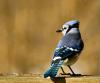
Okay. You know I'm a bit of a fan already (you have a Sony a330 DSLR! come on, instantly cool). But I think you've learnt a lot from these photos before you took/edited the Blue jay one.
Just remember - cropping non aspect ratio isn't always the best thing to do
and over-editing can spoil a great photo.
You have so much potential here, and you seem passionate about photography, which is great to see. I really think you're going to go far - you have the camera, you have a great photography eye, all you need is to refine a few things, and you're up there with the best!

I really hope to see more from you! Oh, and if you've got any problems with what I've said or anything, feel free to PM me :P
(also, sorry if this review seemed reallyyyyy harsh D: I honestly didn't mean it to come out so badly! I guess I just really want to give you a lot of feedback, because I know you're good :P)

-snails-


User avatar
Gender None specified
Points 37290
Reviews 367
Hullo, Gen! Doing well, I hope? :)

You hit a soft spot on me with the first photo! That lovely Thoroughbred looks almost identical to my old horse, Decker (bless his soul, the poor old guy). Now, as for the actual photo, I truly like how you cropped it, and also how you seemed to have edited it. The tones are lovely - very subdued, lots of grays and whites and blacker type of colors. I love the reflection in the horse's eye, as well, that is just wonderful.

The second photo is beautiful as well. The soft autumn tones are perfect, as is the soft, golden light coming in from the left of the photo. I also like the chosen depth of focus in this photograph. However, I do have one teensy, tiny nitpick. It seems you, when editing, went ahead and used a vignette on the borders of the photographs, am I correct? Sadly, I think the darkened edges caused by the vignette (especially on the left side by the fence) slightly ruin the tones and appearance you have in this photo. By the way, cute dog! I have an Aussie as well, and they are just lovely dogs (though, they do insist on 'herding' the neighbor's younger children).

The third picture does not really live up to the others in this set. I understand it was an accidental picture, and that's alright - the photo just didn't turn out to well, as the ladybug probably caught you off guard. However, I just want to point out that the ladybug is completely blurry, which ruins a great opportunity for a great photograph. Somehow, I also dislike this photo because of how green it is. I think the green color is truly overwhelming. Good try, though!

This next photo is way over-edited. I can already guess how you edited it by just looking at it. Let me guess, you bumped up the saturation levels, added lots of contrast, and a dark bordering vignette. Or, something close to that, yes? Well, it makes the photo look entirely fake and isn't even pleasing to the eye. I suggest you pull out the original and re-edit, because right now, this photo is too fake. You have to be careful when editing, always keeping a fresh eye and making sure your photos don't appear overdone. I think it's time to head back to the original photo and try again, keeping it more natural and serene looking - we don't need this over-saturated/contrasted mess!

The final photo you edited on Picnik, huh? I know because I used that little butterfly design in the corner on one of my edits, too. However, I would like to say this photo looks sloppy. Like, your thought process was something as follows: Hmm, why not do black and white...ooh, selective color, let's add some butterflies. Almost like the photo was so sloppy unedited you tried everything you could to change it using filters and edits to draw the eye to her eyes and away from the messily taken photograph. I do not like selective color (never have, never will) so maybe I am a tad biased when I say it ruins this photo even more.

Overall, you need to be more careful not to over-edit your photos, because an over-edited photo has always (in my mind) represented more of a bad graphic manipulation because of all the changing the photographer did to the photo. I don't see an over-edited photograph as a photograph any more. I see it as a manip, because over-edited photos generally look nothing like their originals, am I right? Still, though, you have some talent emerging!

Keep photographing! I hope this helps.
xx Mizz
"Chase your dreams, and remember me, speak bravery,
Because after all, those wings will take you up so high."
-- Owl City, "To the Sky"
✯ ✯ ✯


User avatar
Gender Female
Points 2608
Reviews 86
Hi there. These photos are awesome, so well done. :D

#1 - This is really beautiful. Although, I wish there was more of it's nose in the photo. But, other than that, I do really adore this. Love it!

#2 - I like the angle of this picture, and the colours, but to be completely honest, I couldn't really tell it was a dog. If your caption hadn't said so, I would have been stuck. Maybe I'm just dumb. xD

#3 - I like the colours. But sometimes photos like this don't work. The ladybug is too blurry.

#4 - I like this photo. Alot. The colours mix well. It's awesome! :D

#5 - Very cool.

Overall:
You have a good idea. You obviously have a knack for this, so keep it up.
Keep snapping.
Born.
:D


We are all broken. That's how the light gets in.
— Ernest Hemingway