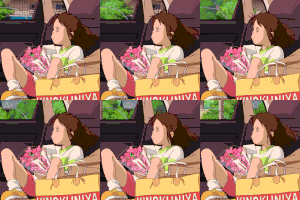
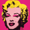
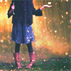
Heya everyone! I haven't made a post on here for a while so I decided I would, here are photos of my work from DeviantArt. Sorry about the size of the photo, I know it's big but I dunno how to resize it (I'm too much in a hurry on other things). I decided to remove the watermark because everybody seemed pissed about it, lol. I hope you like them!
I like the first one but the random color splash in the background is distracting and draws my attention away from the whole photo. The second one is okay but a bit pointless because I've no idea what it's supposed to mean. It might mean something very important to you but I just don't get it. Other than that, it's pretty good! I really love this last one though! The colors are so pretty and amazing. All the people in the water and stuff makes this seem like it should be a vacation poster.
That is all. Haha, keep snapping! These are great.
Hi. Ducky here. I'll be reviewing your pictures today. I'm not a big fan of the color splash in the first one. I think it distracts from the picture with how bright it is. I think that this is a good idea, otherwise the photo MIGHT be a tad bit boring, but maybe in a less noticeable color? The second one is good quality I guess, but otherwise it's sort of just another picture. I wouldn't say it's pointless because you probably had SOME reason to take a picture of it, but I don't like it much. And the third one is amazing, It looks very... well, it looks really good, alright? haha. I like the colors and everything. So yeah. Hope this helped! Ta-ta! xD
Ducky
Writing's a socially acceptable form of schizophrenia E.L. Doctorow I've always believed that writing advertisements is the second most profitable form of writing. The first is ransom notes Philip Dusenberry I'm so clever that I don't understand a single word of what I'm saying Oscar Wilde
Hi VitaminCake! Hmm, let's see. The splash of color in the first picture can be pretty distracting, and I think we all agree on that point. As Sillyducky recommended, I might make the transparency of the color higher or turn it to a blander color altogether.
As for the second photo, I'm really not sure. It's really hard for me to tell how much of it is a photo and how much of it is edited. What is the point of it? I mean, what were you intending for the reader to get out of it when you snapped the shot?
Did you edit the third one? It looks so natural, yet it looks so impossible, as well. If you edited this, then I really must applaud you on your good job. It looks like the kind of thing you would find on a calendar.
So, the first one is nice. I like the random colors that jump out but I think the big bag of color in the front is very distracting and since it's so bright, it actually kind of hurts my eyes >.< The second one is kind of boring. Is it a cut out T with some sparkly stuff in the middle? I don't have much to say about it besides what it means. But moving on to the third one, I absolutely love it. The colors the water, it's very beautiful. I agree with Abby on it though, it looks edited but natural, yet impossible XD Very fantasy. Nice. Anyways, good shots!
~Shear
There are three rules for writing a novel. Unfortunately, no one knows what they are. -W. Somerset Maugham
Hey Vit, Overall your photagraphy is wonderful. My problem is though that I don't see a connection between the pictures. They are three amazing pictures that just don't look like they belong in the same collection. And also I don't see a point to the second picture. To tell you the absolut truth, I don't think that picture would fit in anywhere unless your collection were focused aroung the alphabet. lease do not take this to haeart but that picture just looks weird. Good luck -Brook