Hello everyone! I'm not sure I should be putting these up, because it's been a while since I touched a few of them and now that they are in front of me, I see all the things that are wrong... But anyways, I'll let you decide. I would like a review, if it's not too much to ask.
His face is... Messed up? If i might say.
Last edited by theotherone on Tue Nov 16, 2010 1:30 am, edited 2 times in total.
Behind every mask, lies a man that can't live in his own skin. - Woe is Me <3 Need a reviewer? I don't bite, I promise. ---> viewtopic.php?f=188&t=76466
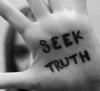
The first one is absolutly gorgeous! Do I even have to mention it? (I <3 Alex Evans) But you should probably finish the background with the words I see down there so we can have a full view
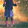
The second one... do I have to say it again? Nahh, I think you can figure out the repetion or else I'll end up saying it every new paragraph I make So, back to the subject, the pants are amazingly done. Pretty good, it could be a photograph. And I love the little swirlies you added
The third one, what can I say? It's my avatar so I can't really complain, can I? It looks pretty much the same!
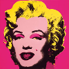
and finally, the last one: Love the color, the guy's shirt and of course, the wings. BUT (yes, I found a "but") I think maybe his head looks a bit smaller in comparison? Almost like he's farther away... but he shouldn't.
That's all I got to say You're really good at drawing! Keep it up!
Okay- I'm just going to start out by saying that these are a whole lot better than anything I could ever draw. Now that that's out the way, I'll give you a review.
You have a great style in drawing, and a wonderful eye for shading, but there were a couple of problems. Some parts were super detailed and were exact to the dot, while others looked not quite misshapen, but getting there. For example- the first one. It was spectacularly done, but the nose was a bit off, while the duct tape next to it is so much more detailed. And I can understand that the tape has more shading to it, but I would consider trying to have more consistency in shading them- you want them to be at the same level.
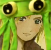
The eye picture bothered me- it's first of all just a really difficult picture to draw, but there's no pupil, and the shading from reflections should be lighter.
With the third picture... you know what I'm about to say.
The fourth picture was pretty great- you're excellent at defining a source of light. The hand is excellent. I would consider darkening the wings, as they're the thing that seems like they should stand out. Also, her neck seems a bit wide, especially when compared to her body. Otherwise, nice job.
So- great drawings altogether. Looking forward to seeing more from you.
The title pulled me in, the pictures are what made me stay, Hello, I'm Emaly and I'll be your reviewer today!
(Hehe See what I did there, do you see it? Yes? No. Yes I am a fail.)
Let me start off with, Uh wow. This is better then my ART TEACHER's drawings, and he teaches the darn subject! You, my friend, have talent. Oh! And that guys face didn't seem messed up or screwed up to me. I like that saying in the first picture *thumbs up*. *Clicks like a million times over on the way out.*
"Even in the end --even in death-- I can't hate you." - Neri Hereford's last words.
"The Gods demand blood, for they... do not bleed." Jaska.
The first picture with the tape over the mouth is a bit of a cliched idea, I'm not really sure what to think of it. I guess it just feels like I've already seen that image before, which isn't a good thing. It needs some kind of twist to make it stand out.
The second I like. I agree that the face is a little distorted, but that's something that will improve with practice. I really like the style of this one. I particularly like the way it has a stiff black boarder, but also has colours that seem to spin off randomly. It's a nice contrast.
The third is, again, a done idea, usually something done in photography. I do like the idea of such a clear reflection in someone's eye, but it could be done better. Maybe if it was coloured it would be more vivid. Also, the iris seems as if it's looking forward towards the audiance, but the eyelashes are thick, which makes it look like a side-view.
The last one is interesting, I like the idea of it. I'm not sure about the people though. The person on the left has a small head and is much thinner than the one on the right, which makes him seem a lot younger. As for the actual drawing of this, it's really good. The detail in shading on the faces and clothes is brilliant. The expression is vivid, even though the faces are so obscured.
These are all really good, especially for someone of your age. Don't be scared to experiment and try new things.
Hi Theotherone! I must say, these are absolutely beautiful, though I might make just one little tiny recommendation; perhaps you could make the eye in the third drawing a bit glossier, because it was difficult for me to distinguish whether the images on it were a reflection or a part of the physical eye, itself, if that makes any sense. It also looked like the person had two sets of eyelashes; one surrounding the eye, and one floating oddly on the eye.
Hey Other! Pink here, dropping by for a quick review
1. Super cool. I really like the shading on this one and the depth is nice too. I wish you could have darkened his eye a little because it looks more creepy than cool right there. Also, maybe some more shading near the edge of the face so it gives the face some more volume and shape. Not too sure, I can't tell with the picture but it's still coolio :3
2. I honestly adore this one. It's really good and I love the shading on the pants, I always have trouble with clothing, I'm good but it take me so long and it angers me quite so. I think you need to complete his feet though, haha. Otherwise he looks a little weird, don't ya think? Anyways, I like the different colors in the back, it brings the picture out but in a sense, it does pop out a little. But it doesn't grab the attention focus from the main subject since it's small. So good work!
3. Cool eye. I think I've seen this one as an avatar for someone on YWS. Although, I can't remember who that was lol. Anyway, I think should have cleaned the edges on the eyes a little. It's a bit rough, if you know what I mean.
4. I like this one too. In fact, I like them all, haha. My main problem with this one is that I think the hand on the back of the neck is slightly smaller than regular. Also, their heads seem too big, maybe that's just me though. Overall, you still did a good job and I'm quite surprised by your talent! Nice work! Keep it up,
~Pink
There are three rules for writing a novel. Unfortunately, no one knows what they are. -W. Somerset Maugham
Man, you sure have talent! I especially like the first and second drawings. I loved the shading, they way you drew the clothing, and the fringe in the first is incredible! It looks so real!!! There are a couple of things - in the third picture, I got a little confused. No offence or anything (I mean that sincerely), but I what sort of like - is that an eye? As in, at first I wasn't sure what it was. It's probably just me, but as the edge of the eye was not pointed, I had my doubts. A round eye? But I do like the way it's sort of like a porthole, looking out. (I'm probably being stupid, but can I see a railing through the eye?) Also, in the last picture (which I very much like - the clothing, hair and limbs/faces are truly incredible) there is something about their proportions. As in; the girl's right shoulder seems to be nonexistent, and her head and neck are creepily bigger than the boy's. Oh - never mind about the eye - I just realised it's drawn from an angle *slaps forehead* Apart from those, these are extremely good. I reckon you have potential. God bless, and sorry for the useless review, Ignis
P.S - I just realised they have wings. Aren't the boy's wings a bit small, though? Sorry.
The POTATO of DOOM
A thousand times it calls your name A thousand times you hear it And fools are those who heed its call But fools are those who fear it.
Yes, I am aware that the last drawing has its problems... Now. But I can't really work on it though. I'll keep my proportions in mind for the next one.
For the ones that are confused with the eye, look at Truth's avatar (the first reviewer). That's the picture I reproduced. Anyways, thanks for everything.
-Other One
Behind every mask, lies a man that can't live in his own skin. - Woe is Me <3 Need a reviewer? I don't bite, I promise. ---> viewtopic.php?f=188&t=76466
Hallooooo! Jashy here just dropping by to review you. =))
First, you've got talent! :O your drawings are great! But I do have some nitpicks for yah. hihi...
1. IS SIMPLY AWESOME...sorry for repeating that, it's just that it is. LOL The hair was great! The shadings of the packaging tape as well. =P Though I do hope that you shot it with a flat angle. I mean, you took it from the lower part which didn't obviously distorted the pic but still did, sooo...yeah...But goody for you, no nitpicks in this one. XD
2. Still love this. The crinkles on the jeans was detailed. How you do that? I hate drawing clothes. XD But you did it just fine. Though the left leg looked a bit smaller than the right. I couldn't tell if it was just the shot. Anyway, what was he doing?? O_o I can't tell really. I'll tell you what I think (but please don't crack up): it was as if he was eating up a lizard. XD starting from the head I mean. Oh yeah, I almost forgot. The choice of colors was good...with the curly stuff abstract thingies. XD
3. I am not so fond of. I couldn't tell what you were trying to show in the pupil. It was blurred...and so not apparent. Though I like the idea of reflection, but it was messed up. So I guess you should try drawing this again to perfection. XD
4. The proportions were--not so good. O_o the girl's head was too big and the angle was not properly shown. Her neck was too big as well--for her arms and everything else. But the shadings were good. I am impressed with the texture. The clothes were perfectly drawn. I just am not fond of the proportions. But whatever. You're still good!
I had so much fun looking at your sketches! KEEP DRAWING! Hope you post more. =)))))))
~~ JAsh ♥
“I believe in Christianity as I believe that the sun has risen: not only because I see it, but because by it I see everything else.”
Your really good at drawing, their very detailed and I love the shading. The first one was very nice the first time I glanced at it I actually thought it was a picture not a drawing, which means it is really good. I like the saying "excuses are useless" and I totally agree. The second one I like that the boy is in black and white but there are spirals that add a nice color splash, and I like that his face is kinda messed up, it could represent alot of things, I like the mess up face and I think this is very good. The third picture is MY FAVEORITE but, I've always had a fascination with drawing eyes, I think eyes tell alot about a person and almost always reflect their mood. I think you did very good with this one and I wish I had your talent:P The fourth picture I'm confused, is that 2 boys or a girl and a boy, or two girls? I'm just very confused, but it looks very good what does "golden wings" stand for? (: Your a very good artist, dont say these arent good their spectacular silly goose!
Nice, reminds me of something i did a long time ago, but your work is a lot better. Your stuff is pretty dam good so i don;t really have much to say.
1. I really like this, it's almost perfect. Only issues i have the right side of the face, where is the other part of the nose? or is it just a bad picture of the work? Also i don't like the hair, i just don't but don't fix it because it's just me.
2. Good to see you use color ! Very well done! the figure is drawn very well. But the color needs work, a fails to shine next to the amazing figure, needs to be brighter, neater and more complex but it really depends on what role you want the color to play eg. as the focus or as something complimentary.
3. Love this, great idea. My only issues are that the water line and scelra should be more defined, they seem to segue into each other and that's no good, just clean up the shading and line around that area. Also the there are to many lashes for it to be realistic, especially on the bottom.
Great work, i really had to fight hard to find things to say. Amazing.