So here's just a little of what I've been doing while I've been away from YWS for so long. It's an assorted number of linearts and inks, with the colored stuff mainly diluted colored inks. Ocstop was done with felt-tipped pen, though.
Positively love! What does the elfish writing on the last picture mean? My favorite one was the last one then the astronaut then the bamboo. The trees and the owls were really cute too. I loved the way you drew the tree with the lone fruit. Way cool! You're really talented. Keep up the good work!
AMAZING!! Woah!! You're really good!! x) Keep it up!!
I dare you to move I dare you to move I dare you to lift yourself up off the floor I dare you to move I dare you to move Like today never happened Today never happened... Before. ---Dare you to move by, Switchfoot---
And I shall just nitpick on the ones that weren't my faves. The tree, is my fave. I'm always drawn to such ink art and this is very good. Now, onto the others.
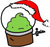
#1. Has a Roald Dahl/Dr. Seuss feel. My major problem is that their ears are too animal-ish rather than bird-y. Just a minor thing that bugged me. Bamboo: The milder lines actually gives it a great effect. Stop Sign : Reminds me of Kamas and Chicken Little! Cute! Astronaut: Everything's good except for the head, which is oddly proportioned. The hood thing should be more round to make it look better. Good detailing though. Last one: I love the way you've drawn it, but somehow, I don't seem to enjoy the picture as much. (This is a first time reaction, so I don't know what to make of it.) But I think, that the story of it is sort of cliched, yet it has been executed well.
Cheers, ~Lava
~ Pretending in words was too tentative, too vulnerable, too embarrassing to let anyone know. - Ian McEwan in Atonement
Thanks for the compliments, guys! The Elvish script says, "Watching the sunset together..." the joke was that my friends and family all thought the translation would reveal some love-secret of mine, but really, it's quite boring. My dad told me that the owls looked like bats for the ears, all except for the thinnish, tall one on the next-to-lowest branch and the smallest one below that one. The astronaut's head seemed fine to me, since the most glaring problem (at least to me) was his stubby legs. They should be much longer than his arms. Oh well, just pretend he's a monkey. Also, his two upheld fingers are weird. Thanks again!
I fail at art reviews, so this is just a comment thingy.... sorry.
I just want to say that I adore your drawings... They're always so quirky and are guaranteed to be original. It's creepy because they always look like published illustrations, which is certainly a good thing, by the way. The colours always coordinate perfectly and look really nice.
whoa man, whoa. your line work is really amazing, especially for the Hansel and Gretel house; the line variation was perfect. I would have just hoped you would have done the same thing for the picture you did for your friends story, you know, made the main subject a little more outstanding by giving them bolder lines. It took me a second to distinguish which subject was foremost in that picture. But it still stands that you have superb attention to detail with pens and i especially love your trees! The only thing I would have to say I would like you to improve upon would be your people: if references would help, use them, but just please remember your proportions, even if drawing in cartoony styles a few of our natural humanistic ratios should be maintained, or else they end up looking awkward with long arms or big heads etc. But I'm sure everyone has trouble with this now and then, even after years of practice... but still... practice... Keep up the wonderful line work!
Yesterday is history, tomorrow is a mystery, but today is a gift; that is why it is called the present.
Wow! Your art is insane!! (but in a really awesome, super cool way ofcourse ) How long does it take you to draw these? Anyways, my favourite is the Candy house... it's so cute and detailed. Also the astronaut is incredible! Sorry if I'm not helping much in terms of telling you what's wrong with your pictures... but I really have nothing to complain about Keep it up! ~Kay
Duct tape is like The Force: It has a light side and a dark side, but it hold the universe together
Skins, you just about accused me with plagiarization! *gasp* Lol, don't worry, these are all original artworks (though I'm not saying they're not clichéd ones) that really took my sweat and blood to create XD Rellety, I'm horrible with human proportions. Take a look at the few humans here and you'll see that they all have their backs turned (Except for the astronaut, but he's all screwed up around the legs). Point is, I'm horrible at humans. I should take a course in anatomy or art or something, but my resources are, as of now, rather limited. *Sigh* Darth, each one of these took from fifteen minutes to an hour to two or three days. The Candy house took me two days, but in total probably one hour. The longest one here was probably the lineart bamboo.
1: Good, good. Compared to your usual work, it seems quite immature. Probably because I'm a fan of your black and white drawings, mostly. Don't get me wrong, it is good, just not as refined as some and I think you can do better. 2: This proves my point. It is incredibly detailed and beautiful and I would like to live there forever and ever. Some lines are a little too faint, so try and darken them up a bit. 3: Gah, okay, un-proving my point and saying that this one is my favourite. It's not the best technically speaking - but the idea and possible story behind it (which I'm just making up) are amazing. It has quite an ethereal feel to it, and is quite beautiful. 4: Curly curly curly and, ooh, ringbinder? xD Love this one too - the black and white with one colour is lovely. 5: Simple, good, nice. 6: Here, I think it's your shading that's shown in a very good light. Some of it is very subtle, but really effective. The whole thing has a very cartoon-y, but at the same time very real feel. Probably because it's an extremely careful cartoon. Although I do think you could have drawn the audience with a little more detail. 7: Phwoar, love it. Although, to me, the dragon looks old and tired rather than as though he wants to ferociously tear down buildings. 8: Eee, fishy! I like this one because although it's not technically great, you've got a great expression on the fish. 9: Don't like this one that much. The idea is nice, but the stop sign is oddly drawn and the octopus isn't very realistic. 10: The detail and shading on parts of this are really very nice. But try and get proportions correct, ja? 11: It's cute. Again, not my favourite - I prefer your wackier drawings. But it's nice.
You really are talented, Jenny. Most of these are top-class.
"It is curious how often you humans manage to obtain that which you do not want."