I really enjoyed looking at these, and here are my comments in a bit more depth:
1. I think this one is very interesting as the reflection is amazing and it all flows really well! 2. This one does have the potential to be a good photo but I think that it's just a bit to blurred. If it wasn't so blurred it would look much better. 3. My favorite!!! The colours flow well, the angle is superb. Well done!! 4. This one almost looks like a painting. I love how the leaf looks a bit out of place, which is a good thing in this case! 5. Woah, I love how this is crowed with different colours and objects. However some bits look blurred. 6. I love this one too. Just looks so cool!
Well done and keep clicking (I know that you already have xD)
~Tamara :)) xx
Someone told me there's a girl out there, with love in her eyes and flowers, in her hair.
Good pictures. You definitley have talent. Keep it up. Now onto some comments.
1. Good angles and composition, but the lighting isn't great. It is difficult with these nature shots, so I would suggest you edit them with some s/w like Photoshop. 2. The place looks gorgeous yet, as a piece of art, it's boring. It looks more like an 'I saw this when I went somewhere picture. 3. Good. And great colours used. I just wish the leaf at the right wasn't there as it distracts me. 4. Very good. Just crop a bit of the water, else the photo seems to make me want more to0 be seen. 5. Aye, you have a good eye for photos! I love the colours. You should've focused more on the red leaf though. 6. I'm not really a fan of this. It's not taken well. I.E, the angle looks forced and it's all blurry.
Overall, you've done a great job. Keep clicking. ~Lava
~ Pretending in words was too tentative, too vulnerable, too embarrassing to let anyone know. - Ian McEwan in Atonement
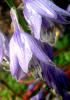
Very pretty pictures. 1. Good angle 2. Not my favorite but still it's pretty. 3. Simple but still nice. Nice close up. 4. This one is my favorite. I like how the water looks all wavy. 5. ooh colorful. 6. This one is my favorite, too. It's a nice angle.
You're new? Great seas! Why haven't you gone to the Buddy System yet?
OMG You are soo good!!!! I love these. Where did you take the waterfall one??(Thats my favorite) but they are all really good. I love the way that you caught the water waves in picture number 4. And I also like the mushroom. I took a picture of one once(i also posted it) and it turned out pretty good and this reminded me of it. I love them!
Always and Forever
Hate is a strong word, but Love is thrown around like nothing
1) This one is my favorite, I think. I like that you've caught the reflection of the sky, but ommitted it in its original form. It makes the photograph more interesting, and dampens the generally repetetive nature of reflection photographs. The one thing that bugs me is that you have blown out your highlights, and that makes it seem unbearably bright in places.
2) This is okay. The subject is nice, but it's so dark and over-saturated that it just seems dark. There are no bright spots to direct the eye and hold it, and so there is a wandering effect that just ruins the effect of the photograph.
3) I like the closeup, here, but I think you could use a little more clarity. It just seems muted to me, as though your focus got stuck somewhere. Otherwise, it's a neat little photograph. I don't think it's terribly creative, but it's not achingly cliched either.
4) You've set up your subject much better, here. This photo has what most of the others lack--simplicity. And while I think the subject is relatively common and straight forward, you have certainly executed it nicely.
5) I don't like these last two, but be aware that these are just my opinions. I don't think you're a bad photographer by any stretch, I just am not a fan of these in particular. This one, firstly, is too busy. It's blurry in the lower left, and that one giant highlight just kind of smears the whole image and takes away the contrast you have tried to create with the single red leaf. It just seems like there is too much motion in this photo.
6) Actually, looking at this one more carefully, it's not a terrible image. I think the angle is indeed forced, and that takes away from a lot of the impact that it would otherwise portray. I like the hanging focus, where you've focused on something behind the foreground. If you rotated the whole thing clockwise I think it would be better. Also I think you have a shade too much blue, here. Adjust your camera settings so you have a little more red to counteract that low-light reaction.
Very nice!
Paramedic Writer Crazy Nije vas zahvatila druga kušnja osim ljudske. Ta vjeran je Bog: neæe pustiti da budete kušani preko svojih sila, nego æe s kušnjom dati i ishod da možete izdržati.