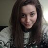
My Bayonetta drawing, and surprisingly, it only took me a few hours. Anyway, comment whatever, i'm not bothered about ways to improve it, but i'd just like to see your opinions. :p
Bayonetta :)
Bayonetta.jpg (75.94 KiB) Viewed 221 times
'This isn't funny Dean, the voice says i'm almost out of minutes!' - Castiel ~ Nothing is true, everything is permitted... Live by the Creed... Be Discreet...
Awesome drawing! It's really good to me, can't really find any major flaws to it. I haven't played Bayonetta, but I have seen videos of it. Good job keeping that awesome I-can-kick-your-a**-no-sweat quality about here.
"This is a song for a scribbled out name That my love keeps writing again and again And again"
A couple things bother me about this drawing, which is otherwise interesting and relatively straightforward as a portrait.
Her nose is crooked. I think you have tried to effect a partly quartered view, which is a great idea in theory as long as the line of the nose is straight. As-is, the shadows strike me as a little unnatural, due to the curvature you have effected here.
It also looks like you may have neglected your guidelines =) The angle of the eyes doesn't seem to match up with that of the nose, although it seems relatively lined up with the mouth. The nostril on the right is too low and it makes her face seem crooked (same for her ears, only in reverse. As a general rule of thumb, ears extend from eye to nostril. The ear on our left is much too high, and it makes the angle seem anatomically incorrect, though in other senses it is not). Cheekbones, too, don't line up, and give us a crooked sensation.
Her shoulders look nice, only it looks like you've squashed the shoulder to our right so that it will fit on the paper. It should extend much farther (you should be able to set two more heads across a person's shoulders--one on each side). Other than that, I like your work with the clothing.
Her hair is nice, but it's difficult to distinguish from her clothing because you haven't preserved your direction here. Mostly, I think you could improve this by ensuring that your pencil strokes exist in line with her hair.
Lastly, I think that the eye on our left is larger than the one on the right. They also, generally speaking, don't match the curvature of her face, and it makes the whole image seem a little flat.
This is really a nice, solid drawing! Good work!
Paramedic Writer Crazy Nije vas zahvatila druga kušnja osim ljudske. Ta vjeran je Bog: neæe pustiti da budete kušani preko svojih sila, nego æe s kušnjom dati i ishod da možete izdržati.
mm... thanks... i know, i was using a reference, and i think her ear was up there anyway. I noticed that about the nose, and thanks overall anyway. Your review helps.
'This isn't funny Dean, the voice says i'm almost out of minutes!' - Castiel ~ Nothing is true, everything is permitted... Live by the Creed... Be Discreet...
The first thing that strikes me as odd are the glasses. They aren't symmetrical and they don't have the lines that signify the presence of glass lenses. Good job with the hair. The body and detailing are very good too. You just need to mainly work on the facial features and proportions. Try practicing faces, to improve. I'm sure there are tons of good tutorials online.
Keep drawing and posting them here. Cheers, ~Lava
~ Pretending in words was too tentative, too vulnerable, too embarrassing to let anyone know. - Ian McEwan in Atonement