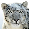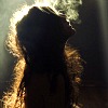
Hello! So I really liked all of these, especially the one of the storm. The only suggestion I have for that one is to maybe crop out the right part of the pictures with the lights and stuff. That way, the focus is more on the clouds. I also like how in the picture of the cat, its eyes are so blue! I've never seen a cat with such beautiful eyes. I'm not really sure what the spiral picture was of, but it looked cool nonetheless. I liked how "Unspoken" and "Dirty Words" were in black and white. It added to the drama of the pictures and they seemed very emotional.
You did a great job on these, Maybe.
*likes*
Embee
One good thing about music, when it hits you, you feel no pain. - Bob Marley
These pictures are really great! I'm not really great at reviewing photography but I really liked these, particularly the last one. I loved the light and exposure on it.
I also liked the way that "Unspoken" and "Dirty Words" are in black and white.
Anyway, well done! These were really great. *Likes* ~Lydia
Maybe, these pictures are brilliant! Wonderful job, here. My favorites are "Unspoken", "Spiral", and "Here Kitty Kitty". Unspoken is a beautiful piece, with a story behind it; it makes me think. Spiral is just plain beautiful. I also live the kitty, it has wonderful blue eyes that you really brought out in your picture. Great work! -Mizz
"Chase your dreams, and remember me, speak bravery, Because after all, those wings will take you up so high." -- Owl City, "To the Sky" ✯ ✯ ✯
Omfg these are awesome! My definite favorite is the Breaking Storm, how you captured the clouds is beautiful. Here Kitty Kitty is great. Love where you angled the cat, and it has the most gorgeous eyes ever! The rest are as magical as well, you really captured everything fantastically. Can I ask you a favor? PM if your up for my challenge -fRiEs
If you love something, let it go. If it was meant to be, it will come back to you.]
I completely adore these pictures. I'm just wondering, do you use something like photoshop to add a filter or emboss effect? On some of them it definitely feels like you have. The best thing about these pictures is the colour. They're by far more vivid than I'd imagine seeing them in real life and that almost makes them appear surreal which I enjoy quite a lot as it's you putting your arty twist on it. I like how in each you've chosen a subject and made the background fairly blurred that appeals to me quite a bit because it gives a focus as well as a mystery behind it. The only one that doesn't really do it for me is the Storm one. I think you've got a good picture of the landscape there but there isn't really a subject. I mean sure, there's a lovely colour of the sky, but that light that's breaking through the clouds with the magnificent white, well I just feel you should bring that to life more. For example, toning down the surrounding clouds a little with a filter and then perhaps embossing the light with a very light yellow to make it stand out more. It then might appear more as the 'eye of the storm'. You know?
Anyway you're better than I am, so you're probably better at deciding how to improve it! Hope this helps though, Ben
As usual your work is gorgeous! I'm thoroughly impressed by your work every time.
#1. The shadow removes some emphasis on the lizard, because the left side of his face is the same colour so you lose some of the focus and vibrant colours of that little lizard. If you could edit it, make the shadow just a pinch lighter it would fix that tiny little nit pick.
#2. Blurry, too much movement going on. It's kind of lost any sort of power due to that movement blur which is too bad. Your also positioned a little bit too far to the right, so we see the wall in the back and the necklace around (your?) model's neck.
#3. Love love love this one. You've balanced the black and white really well, and the concept is fresh and interesting. I think though, you should of caught the thumb in the picture.
#4. The colour of the clouds are really nice, but the horizon is crooked, and the little lights on the right are a little distracting. You might want to edit them out and straighten out your horizon.
#5. The light, colours. Love everything, no complaints I really like this one.
#6. The lighting/ exposure is a hint too low in this one. If you could bump it up just a bit, but otherwise, you've balanced out this picture really nicely, and the angle is really nice
#7. No complaints for this, besides the fact that the concept is a little bit boring. It's not exactly the most interesting.
You're quite the photographer! I enjoyed these very much, thank you
Kamas
"Nothing is permanent in this wicked world - not even our troubles." ~ Charles Chaplin
1) This photograph has a great angle, and the curve of the shadow makes the image interesting. Incidentally, it also makes the picture look sharper, and although I love the compositon here, I think it's difficult to feel the dimension in the lizard's face. Everything is so sharp, the subject gets a little lost among the business.
2) The off-center feel of this makes the movement apparent, and the composition is nice (though not spectacularly original). It's super blurry, though, and that takes away a lot of the impact, for me. Otherwise, this is one of the more interesting photographs you have here.
3) I don't like this one as much. It isn't terribly original, and your model's expression is almost uninteresting (I say almost, because there is some feeling there. It's just not enough to draw the viewer in). The message you are portraying seems muddy, lost in the forced nature of the photograph. However, it isn't compositionally lacking, I wouldn't say. Only not personally compelling to me!
4) This is gorgeous. You have a great sense of momentum as the storm rolls in from the left, and the light is positioned just right so that the interplay between the clouds and the ground lights is perfect. This really highlights your ability to compose an image, because even slightly off-center this would quickly become boring. "Just another sky picture." Which it isn't! Well done!
5) This one is beautiful. Something I think you have done really well here is ensure that the object being photographed is not recognizable. It encourages us to examine more closely, and it pulls the viewer in much more effectively than it would if we could immediately recognize the image as something familiar. The simplicity is refreshing.
6) I'm going to disagree with Kamas, here. I think you've taken a subdued photograph, and I think it is more effective this way: a little darker, a little smoother, a little softer. Any more exposure and you risk blowing out the depth you've created. The blue eyes creates a beautiful balance with that awesome dark shadow beneath the chin. This one might be my favorite.
7) This one is interesting, but I've seen this concept and I don't endorse it, really. Your execution is fine, it just doesn't have the pull of the others.
All-in-all, this are fantastic! You have some very, very nice work here.
Paramedic Writer Crazy Nije vas zahvatila druga kušnja osim ljudske. Ta vjeran je Bog: neæe pustiti da budete kušani preko svojih sila, nego æe s kušnjom dati i ishod da možete izdržati.