Hellu, ultraviolet! I shall review your drawing today!
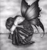
First of all, I really like it! It's better than anything I could draw (I'm more of a animal/weird creature artist ). I like her pose, and her hair is the bomb! And the details on the jeans add just a little to it. She looks like some other drawn character, but I can't place who that would be.... Anyway, onto my suggestions!! 1) Try not to use lined paper. If you absolutely have to use it, that's okay, but try to use blank paper. The lines just take away from the actual drawing (in my opinion). 2) Her right shoulder looks a little weird.... I think maybe it might be just a little bigger then the other? I'm not quite sure.... I'm horrible at drawing human bodies and anatomy, so I can't tell you how to fix it . So sorry! Maybe someone else on YWS is a better artist then me and can tell you. 3) The wall (I'm assuming that's what it is) at first looks like a tree branch or something because the shading on the "wall" isn't very clear. It's just kinda scribbled on there. Maybe try shading a little more to make sure you see that it doesn't look like she's sitting/almost falling off a tree branch (or something else in mid-air).
Please keep in mind, these are only suggestions! Like I said before, I'm not an artist, especially when it comes to people, so I could be wrong on all those suggestions haha. Hope I helped at least a little, though!
Keep up the good work! I'll be looking for more of your art . ~~Lee-Anna
P.S. Sorry if this review was horrible! It was one in the morning and I was half asleep haha.
Please forgive me if I over-edit anything of yours.
I like it. The hair is probably my favorite feature about the whole drawing. As for the whole 'calm and tranquile' goal, you're very close. You see, when I look at it, I get the impression that this girl is thinking about something very serious. She's passive, but she's not exactly calm.
I think it might help if you changed the shape of her mouth a bit, so it doesn't look so harsh. I'm not saying she needs a big grin or anything, but maybe something a little more relaxed.
Overall, its an amazing drawing! Far better than anything I could do. It just needs a little treaking I think. =)
"What if evil doesn't really exist? What if evil is something dreamed up by man, and there is nothing to struggle against except our own limitations? The constant battle between our will, our desires, and our choices?" Libba Bray (Rebel Angels)
-Whoa. I love the seaweedish feel/flow to her hair. Beautiful!
-Good job on the pose.
-I love her facial expression and how her eyes are closed.
Cons:
-Her arms are too short. Stretch them out. (Haha, I can see that you've been having trouble with arms! But compared to last time, these arms look so much better.)
-She's unnaturally thin, and her whole body (stomach, etc.) seems flat and 2 dimensional. And perhaps widen her waist?
-It would be nice if you could start getting some shading and textures going in her clothes to make things a tad bit more interesting.
Overall:
I can tell you this: she does look very serene, hehe.
Hey! Thanks for the review. I'll keep it all in mind for future drawings. Don't think I'll fix one though; I kind of have to be in a groove for it to make it work. I'm glad you like the hair! I was soo... worried that it wouldn't look right, or bad or something.
Again, thanks for reviews and comments.
loveness, ultraviolet
"Blah blah blah. You feel trapped in your life. Here is what I am hearing: happiness isn't worth any inconvenience."
I do think she looks serene; her expression is more relaxed than it is sleepy, angry, disappointed, etc. Nice work pulling that off!
One thing I would change about it, however, would be her left cheek (on my right). I think you should make it a little more hollow; right now it looks like she's jutting her jaw forward, and it takes away from the realistic-ness of her face. If you took away some of that fullness and maybe added some shadows, you would have a completely different, less amateur drawing on your hands.
"You laugh at me because I'm different. I laugh at you because you're all the same."
You were successful, in my opinion. This is a somewhat serene but also kind of cute drawing. The only thing that I would change in this picture is her shirt. You see her hair is blowing (unless it's just really, really wavy) and maybe it would look better if her shirt wasn't so straight and was being just a little bit blown also?
Otherwise, it's really cute.
~Heather
[Griffinkeeper] 10:45 pm: The guard appears "We have weasels now!" [Firearris] 10:45 pm: askes the guard for the weasel! [Griffinkeeper] 10:45 pm: The guard gives Firearris the Weasel. [Firearris] 10:46 pm: aquires the weasel and renames it "Cat" Take that, Lumi.
Well, I'm surprised nobody else noticed it (and maybe it was merely accidental on your part) but the lines flow in the same direction as the wind. Nice work on that! Also, it was hard to tell that she was leaning against a wall, since the line isn't exactly straight, and her posture doesn't really lean backwards like it should, Y'no? In fact, the only reason I saw she was leaning was because the left hand disappeared behind the big black thing (which, at first, I thought was the horizon, as if she was on a plain). Her hair...I know the others liked it, but it doesn't go for me. It looks too cartoonish to go with the rest of her. And finally, yes, I think it does look serene, but only to some extent, since the high wind (what else could lift that mass of hair to almost a 90 degree angle?) adds a boisterous and wild element to the picture.