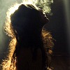
Nice. It's just like Sin City, where certain elements are in color, but other parts of it are black and white. It adds to the beauty of your flower. But what about that little flower down at the bottom? He's being left out! I feel like there should be more color temperature to the blue and the red. They don't have enough color for me, you know? Oh, well. Gold Star. Keep... drawing.
And the angel said unto him, “stop hitting yourself, stop hitting yourself.” But lo, he could not stop, for the angel was hitting him with his own hands.
I've never reviewed a picture before, so here we go.
I'm a sucker for those "everything is black and white except for THIS" types of pictures. And this one has two. The difference between the pink and the blue is really cool. Other than that, I'm not sure what else to say. Good job.
Hey, Ras! KD here to review...how about...the second picture? Not bad, not bad. But the first one is way better. The leaf looks fake, and pops out at you. In a bad way. Overall, this is okay. Tex's photo is awesome, but it's not the greatest photo to specifically color splash. The color splashing didn't really enhance/make this photo more interesting at all. Here are some very good color splash examples. When you color splash, you generally don't want to pick flowers as your subject. You want to pick something more...interesting, or you want to color splash flowers in an especially interesting way. Hope I helped!
Alright. If you asked Texanwriter beforehand, I'm okay with that. Always make sure to properly credit
I definitely think that the colour editing is much better in the first one. The green is too bright and contrasting compared to the pale colours. So the contrast it creates draws the eye away from your main focus.
Now. In these kind if pictures you always have to be really careful about balance. You can't have too much colour, or black and white, and the tones have to go hand in hand. You did a pretty decent job here, seems like a bit of a fluke due to the size of the picture, but I think you could of cropped out a bit of the stem, or rotated the picture so that it wasn't so left-side heavy.
Hope that helps.
Kamas
"Nothing is permanent in this wicked world - not even our troubles." ~ Charles Chaplin
I agree, the leaf on the second picture looks fake and draws attention from the main focus, the flowers. I love the photo. How everything is black and white except for hte flowers. It reminds me of blue and pink cotton candy for some reason O.o. You did really well, espehcially since I couldn't even work those high tech computer programs. The only thing that's bugging me is the TEXANEDIT in teh corner. Well done!
Ciao!
ThisMonthsDisneyFilm:BeautyAndTheBeast
~Is It Wrong That I Find TheBeastMore Attractive As An Actual Beast Then His Human Prince Form?
It suddenly struck me that that tiny pea, pretty and blue, was the Earth. I put up my thumb and shut one eye, and my thumb blotted out the planet Earth. I didn't feel like a giant. I felt very, very small. — Neil Armstrong


 Keep... drawing.
 But the first one is way better. The leaf looks fake, and pops out at you. In a bad way.