
Okie dokie. I'll start with your first image. The shapes and colors are very interesting. Attention grabbing for sure. The only thing that I can say is there is a lot of negative space on the edges. Perhaps maybe filtering a little bit of the color into the space or just cropping it a little on the sides. it helps balance everything out.
Second image is pretty much epic. I think you win with that one.
Third one is good too. Only suggestion is thinking of a different color for the face. The gray blends into the background so much and makes it almost vanish. You want to try and keep the human's face as a central point when drawing people. That way the eye goes from the head and works down so they get all of the person and not just pieces. Make it pop. A flesh color or something would probably take care of it.
Fourth image is my favorite. For this I suggest the same as I did for the first. Trim just a little on the sides and I think it would pop more.
That's all I have, I really like these. All done with Photoshop, yes? You have a good grasp of color and I like your use of it. Keep it up.

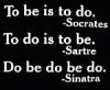


 And so is the third, and the fourth... May I note that the third picture reminded me much of MJ in thriller? I dunno why. XD And the fourth picture is simply breathtaking. Look at all that blue. Oh wow.