Went to Devon. Took remarkably few photographs. I apologise if any of the horizons are slightly crooked; I usually use a program to fix that but it's not working on my computer. As soon as it's running I'll fix them.
Not sure about the third one, but I like the second, probably only because it was the view from my room. Meh on the first. What do you think?
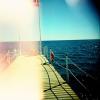
The Sea.
Rocks.
Kite Surfers.
-Amy
"It is curious how often you humans manage to obtain that which you do not want."
Pic 1: I like the sky but it's all just a little plain.
Pic 2: Again, a bit dull.
Pic 3: This one I like a little more than the other two because it adds some interest, but you really can't tell very easily what the kite-fliers are. Maybe if it were bigger?
In general, these pics just need something to really spark your interest and draw your eye. There's a lot of potential around the ocean, I feel like there was a lot more you could've focused on. In any case, these are nice.
Reading is one form of escape. Running for your life is another. ~Lemony Snicket
These pictures are all quite lovely. I love pictures of the sea/ocean.
I liked picture one for its coloring. It has a lot of different hues. However, it looks a little flat. Maybe if taken from a different angle?
Picture two was my favorite. I don't think it needed anything to make it look better.
Picture three was nice as well, and it had more points of interest, but maybe a stronger point of interest instead of all of those little dots in the back ground. (Yes, I know they are kites)
I would definitely like to these pictures enlarged! Some details:
Pic 1...This one is very charming. The blues and oranges compliment each other very well. (Obviously, they're complementary colors.)
Pic 2...This one is my least favorite. I think it's because there's such a large contrast between the rocks and the water. Perhaps if it were in black and white it would appeal to me more.
Pic 3...My favorite. You've captured so many layers, sky, clouds, trees, water, sand. And in the midst of it all there are people flying kites! I actually like the fact that the kites aren't the main subject of this photograph. Instead they're more like footnotes. I really really wish it were larger so I could see the details.
Keep taking photographs!
"Don't tell me the moon is shining; show me the glint of light on broken glass." - Anton Chekhov
Hey Amy! I'm just going to point out a few nitpick-y things that bothered me, then give my overall thoughts on each picture, okay?
Blue- I don't like that part of the cloud. It's distracting. I understand that there would be practically no photo left if you cropped out this part, but in future photos, if you catch things like that, try shooting the picture from a different angle or location. Purple- I don't know what that brown strip in the water is, but it's really disgusting and distracting. It could have easily been cut out of the picture.
However, if you exclude the minor nitpicks, this was actually a very nice photo. It gave me a serene, almost warm feeling. The kites are at such a perfect distance that this seems like it be on the cover of a magazine.
My Rating: 9/10
Red- If you look carefully, you can see curves which don't flatter the straight, almost geometric angles of your photo. A good way to fix this would be to shoot it a bit from the side. Black- What is that, the tip of a fence? That little thing just sorts of pops out and takes our attention away from the rest of the picture. Since it's small, it could easily be cut out. Green- See above.
Eh, I didn't like this photo too much. I can see what you were trying to do, but it just comes off as a lazy attempt to copy better photos of the sea.
My Rating: 3/10
Red- The edge of the rock just looks like it's had all the solid sucked out of it. The curves at the illusion of tilt to the photo that makes my head spin. Green- If you look closely, there's a place where top of the picture curves and gives way to a dark line thing. I don't know what that is, but it's distracting. Yellow- That little thing is so random. I understand you may not have seen it, but whenever you take pictures, make sure to zoom in to see if you can notice things like that. If you do, take them from different angles. Blue- See above. If you look hard enough you can catch these little things, and crop them out of the photo when you put these on the computer.
This was better then your last photo, but not as good as your first. The curved and tilted angles I don't think you intended to have make me a bit dizzy. You felt a little bit more unique in the picture but it still comes across as a copy.
My Rating: 5/10
That's it for now, dear. Just remember to look for the little annoying things so you can crop them out of your pictures right away.
Catch ya in chat.
-Elinor xo
All our dreams can come true — if we have the courage to pursue them. -- Walt Disney
These are lovely, your photography is steadily improving.
#1. The colours are lovely, but it's just not interesting. You've tried to incorporate layers, but it's flat. The tip of the post that is at the bottom of the picture is distracting. The whole feel of this picture is one dimensional. I would of switched it up and gone for a less generic angle.
#2. Again lovely, but washed out (no pun intended.) In this case I would of played with the saturation, contrast and exposure to play out the fine details in the rocks. That definitely would of made it more interesting, but it's like a one tone palette at the moment.
#3. This one is easily the best. You have the layers of the horizon, and the colourful kite sails adds a real pop. Again, fiddle with the contrast a little itty bit. Make distinct lines between each layer.
Fantastic job Amy, it's great to see you improve so much.
Kamas
"Nothing is permanent in this wicked world - not even our troubles." ~ Charles Chaplin
I loved the second and the third one, but the first was a bit ugly and dull. The idea and thought of the first picture was good, it just . . . didn't turn out right.
Love the second and third though. Seriously. :} *like*
I loved the first picture. You pictured the ocean reflecting the color faded of the sky. I like the fading blue to white of the sky. It's really nice. As of the two pics, I's quite picturesque but as what I've seen of Elinor's comment I would agree about it. but don't worry I liked it.
Keep it up!!!
"Life is a poem keep it in the present tense."-Sherrel Wigal
Okay, so picture number one is easily my favourite. It has a nice blend of color with the shades of sandy orange and the blues and white. It’s a very warm tint on an otherwise cool pallet.
Number two, I’m not so fond of and that probably mostly comes from how white everything is. The water is washed out (as well as the outcropping of land in the background) and the sky is so pale that there doesn’t seem to be a whole lot to look at except a relatively empty picture. However, the rocks are a welcome sight and the texture that they bring is charming.
Number three I like a lot as well. However, the image is so small that it’s a bit difficult to even see the finer details of the image. But the clouds are breath taking here and the soft color of the sand against the darker blue of the sky is a nice contrast.
Oh and congrats on the JM’ing. I’ve been gone for a while and Kamas just filled me in!
*tosses cookies and runs away*
Never forget who you are, for surely the world will not. Make it your strength. Then it can never be your weakness. Armor yourself in it, and it will never be used to hurt you.
I'd have to say that picture 3 was my favorite. The way that the sun was shining down through the clouds added to the gorgeous reflection in the sand won me over. The second photo did seem pretty washed out, but I think it wouldn't have looked so bland if the rocky shore hadn't had so much of a contrast. All in all it seemed like a pretty fantastic day at the beach.
A man can change his stars. William Thatcher ~ "A Knight's Tale"
Just because I'm losing, doesn't mean I'm lost ~ Lost! by Coldplay
Well, everyone's nitpicked it, so I'm not going to repeat any of it.
Just a little something that nagged me: On the last one (Kite Surfers) I think you could do with adjusting the levels and colour because though I like the feel of it, it needs a bit fine-tuning.
That's it.
~Lava
~ Pretending in words was too tentative, too vulnerable, too embarrassing to let anyone know. - Ian McEwan in Atonement
I think these are awesom. The little things that Elinor pointed out as distracting, but to me they are the imperfections of nature, the beauty of being different and imperfect in a way. Great job on these. I have no nit-picks, complaints, anything. Congrats on the great photos.
I only like the first one, so that's what I'm going to talk about.
I love it. I love it, love it, love it. It's brighter in the center than on the edges, like I always try to get in my photos and almost never achieve. It looks so professional! Did you alter the contrast, or is this raw? I seriously looks like you raised the contrast just a tad - for the better, of course.
The cloud is absolutely perfect for this. I kind of smears out to the right, which is distracting, but you don't notice unless you're analyzing the photo. Otherwise, the cloud is wonderful.
I only have two nitpicks. One, there's a bird on the water. It looks like a tick. Second, if you cropped out the fence and sand at the bottom, it would bring more of our attention to the water, ripples, clouds, and area in the distance.
The lighting is so wonderful. I just really love this picture. And I have to ask, did you edit this, or is it raw? I'm really curious.
I also like the third picture, but the hump of a hill is really distracting for me. The lighting is great and, the more I look at it, the colors are, too. I just can't get past the lump.
Great photo, that first one. Don't stop snapping those pictures!
-Tex
Religion without science is lame; science without religion is blind.
Two things are infinite: the universe and human stupidity; and I'm not sure about the the universe.
Education is what remains after one has forgotten everything he learned in school.
These were beautiful.. it's refreshing to see "beach pictures" that actually have some originality to them. I do kind of wish that they were bigger though. :/
I loved the first and third, but wasn't crazy about the second. The colors are very nice, as are the focal points and perspective. Overall, great job.
We shall not cease from exploration, and the end of all our exploring will be to arrive where we started and know the place for the first time. — T.S. Eliot