Okay, so here I am. Going to add one of my very very bad pictures...for critiquing! Hehe *nervous laugh* I'm not the best drawer and don't even know why I am posting this but, I am. I didn't place much shading in it, okay none at all but just forget that part. And so onward to the...very bad..picture.
Attachments
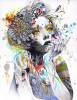
Neko which is rather gothic.
CCF05042010_00000.JPG (38.02 KiB) Viewed 532 times
Oh this is really good, although i have to strain my eyes to see it. Could you try and sharpen the lines? it would make it a lot clearer and easier for me to review. This is very good anyway. Quite cute.
Anyway, keep drawing!
~MysticalBlood
'This isn't funny Dean, the voice says i'm almost out of minutes!' - Castiel ~ Nothing is true, everything is permitted... Live by the Creed... Be Discreet...
Hi Apple. I don't think its bad but neither its anywhere near good. The portion of her neck and chest is way too smaller and awkward then the upper one. Had you drawn and posted the face with this cut hairstyle, it would have been better. her eyes are so different and ....amazing. Hope I helped!
"Next time you point a finger I might have to bend it back Or break it, break it off Next time you point a finger I'll point you to the mirror"
Hey there, Apple, let me see what I can do... 1) It seems too far to the left. Try rescanning it and including that portion, unless it was cut off by the edge of the paper. 2) It's far too light. Most photo editing programs (even the most primitive) include options for increasing the contrast of pictures, essentially 'darkening' it. 3) The 'ears' seem to form right out of her hair, and it took me a little while to differentiate the two. You can fix this by drawing in the hair and fur at different angles to each otehr, or by making the fur shorter than the hair. Whatever you do, I feel that you must create some sort of boundary between the ears and hair, but be careful not to make it too obvious. 4) The eye is made up of many different compartments, obviously to represent the refractions of light on the eyeball, but when it is uncolored as it is in your picture, I can't see which should be the reflections, and which are parts of the eye that are actually visible. try shading it in, if you aren't going to color it. 5) The nose seems a bit stubby, but that might possibly be purposeful. 6) The upper lip is missing entirely, and, with it, the nose bridge (the portion of the face below the nose and above the lip). I suggest you draw it in.
Overall, it's a rather good piece of art, since I could never do something like this (I can never use a pencil properly, just pens). I have many other things to say, such as the disproportionate head, the puny neck, the over-prominent 'neck-bones', etc. But I refrain from doing so, as I'm fully aware that it was done as an anime, and such allowances must be tolerated with your selected genre of art. PM if any of that may or may not have possibly confused you. Jenth.
Hey! first I just wanted to say that I really had a hard time seeing it. I would suggest that you go over it in pen, darken up the lines, or just color it. One thing I didn't like about the drawing was the nose. It really didn't seem to fit properly. The eye and the mouth seem to be done very well, but the best part looks to be the clothes. Although you didn't draw all of her body the bit of clothing we can see seems to be drawn very well.
~Day
"If the king doesn't lead, how can he expect his subordinates to follow?"
This just seems like a doodle to me. I think that the lines need to be darker and more defined. Shading would be a must to make it look really good, trust me I have learned this over time. Her lips are a little messed up and her eyes are a little crooked. I would suggest coloring it if you don't shade.
Keep Drawing
-Flower-
My reality comes to a close as I once again realize that you don't love me, and even if I love you with my everything you will never care.
First off, just because I want to be positive and don't feel like pointing out a million things that are wrong, I'm going to assume that the proportions are as they're supposed to be. For the unrealistic proportions, they're very good. Her head is balancing on a toothpick and her eyes are ginormous, but for the genre, that's acceptable, even wanted sometimes (I don't think I could've used more commas).
Second, I love this! It's so cute! I'm not much for 'cutesy' stuff, but I like this! I like how you didn't do a full-fledged, realistic portrait. There are some people on here who can do that and do it well - I'm not one of them - but this is refreshing because it's cute and simple yet still of quality.
As to what could actually help you achieve what you were trying (I think) to do.
The right half of her jaw is wonky. Left half, perfect, but the right half looks like a squiggle. I can see you were giving her an actual jaw - which looks really nice - but I think the right half could mirror the left half more. For that, all I can suggest is stocking up on erasers and sitting down with time on your hands.
The thing that's confusing with the collar bones is that they're too high up. Your collar bone isn't on your neck, it... Well, if you draw a line from one shoulder to the other, they go right above that. So they need to go about her nose height lower, and longer. Since you drew them on the neck, they're shorter than they should be. Look in the mirror and feel your own collar bones to see what I mean.
On the topic of her nose, I like it. It's a nice change from the little upside-down V that you see everywhere. However, one side is different than the other. Figure out which on you like best (personally, I like the left, but it's up to you) and have the other mirror it.
The lips are a little off center, and things like that make a difference. Her hair is awesome, and I love. Her. Eye. And I think that it's great that you gave her an emo hairstyle, because if I had drawn this and given her two eyes, one would be on her forehead and the other on her cheek bone, so. It looks great. I like her shirt, too.
Overall:
This is really cool, and you do have talent. It just needs a wee bit 'o touching up. I like it without shading and color, because it kind of adds to the emotion. I'm not sure what kind of emotion it adds, but this is a real, meaningful piece the way it is. Maybe the way it looks kind of washed out adds background... I dunno. Anyway, keep it up! I hope to see more of your work.
-Tex
Religion without science is lame; science without religion is blind.
Two things are infinite: the universe and human stupidity; and I'm not sure about the the universe.
Education is what remains after one has forgotten everything he learned in school.
Hey Apple, I really love your drawing!! To me it looks a looks like a sketch because the lines are quite undefined but that is ok. Maybe you could add some shading to your drawing to make it look even better but I can understand if you do not want to (anime picture). What I really like is the eye. You have mastered the unique art of drawing anime characters eyes perfectly! Well done to you. I love to draw myself. Maybe I should put up some of my drawings... Thanx for a great drawing, watchmeburn
"The early bird gets the worm, but the second mouse gets the cheese."
This is nothing but talent, its amazing. You would either use a program to colour it in or just use colour pencils ( program would be better since if you make a mistake you can undo) Then it would look epic. It looks kinda wolfy too. ~Liquid
There is no good and evil, there's just perspective
I really like this. The expression on the face is lovely. Though shading would be good and you could use the eyes a little bit more to show emotion. The ears are cute, and I like how the hair flows yet is fierce in a way. I really do like this. Well done!
This one is good.... Just one tiny problem there that the smile slight tilted... Is that intentional?? By the way i love your avatar... Keep up the good work... PM me for anything...
Are you living for the things you are praying for?