Look at this!

26 posts1, 2
User avatar
Gender Female
Points 890
Reviews 12


User avatar
Gender Male
Points 2702
Reviews 867
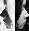
I like it, but I think the shading on the cheeks is a little to hard. You might want to make it just a little lighter, there also is a smudge on the neck that should also be corrected.
Moderator Emeritus (frozen in carbonite.)


User avatar
Gender Female
Points 890
Reviews 13
You could get more depth if you defined the lines around the eyes and ears... and shaded it according to lighting instead of simply according to skin, because your shading tells me nothing about the configuration of the face... also,is you'd have put half as much darkness into the mouth as you did with the cheeks it would have looked nicer, along with shading... In fact, the better part of your shading appears to be rather superfluous. Define the lines more nicely, shade according to lighting, add more highlights to the eyes and hair, and defined the hair line with short vertical strokes of the pencil to make hair as opposed to one long, horizontal line, which gives the impression she is wearing a wig, which I am assuming was not your attention. Otherwise, though, it was quite nicely done, the lines themselves were done, you just need to find a way to enhance that.

-Empty
Words are spilling out like endless rain into a paper cup, they slither while they pass. They slip away across the universe... Pools of sorrow, waves of joy are drifting thorough my open mind possessing and caressing me..


User avatar
Gender Female
Points 6523
Reviews 657
Ditto Griffin.

I really like the composition, especially the contrast of her face and hair. Her nose looks really well shaped as well. Is this in charcol?


User avatar
Gender Female
Points 890
Reviews 51
The features are very good, but the shading needs work. The way it is right now, there is no light source. Meaning, I can't tell which direction the light is coming from. Once that is established, the shadows can be done to give depth to the face. Judging by the light in the eyes, I'd say the light was coming from the viewer's left. There should then be a highlight on the forehead, cheekbone, chin and side of nose on that side. There should be more shadow on the other cheek, especially a shadow cast from the nose. The hand should also have more shadow as it is being blocked from the light by the face. Also, the hand looks a little too big. Very nice face though. Great eyes. Nice expression.
I reject your reality and substitute my own


Random avatar
Gender Male
Points 890
Reviews 109
I agree with Carmina.
Where's the light source?
ANYWHO
I think that her left hand is a bit too long, like it's longer than her head... Or it's just me...
I alost think her eyes are a bit out of focus, like her left eye is too far right... Or MY eyes are out of focus...

OVERALL VERY NICE!!!


Random avatar
Gender Male
Points 890
Reviews 681
www.saveloomis.org
drwing the figure
look for the head references, youll enjoy the read and the references.
You shouldn't judge a book by it's cover, instead, you should read every single book to see what every book is about before you even come close to judging its viability.


User avatar
Gender Female
Points 1090
Reviews 173
The eyes are beautiful, as is her expression! Nice!

Others have seen it: the area you could most improve in is shading. In addition to what they said, try to make your shading smooth; the strokes look a little rough (I can seen individual pencil/charcoal lines across her cheekbones). Another way to make it look smooth is by using an eraser to lighten areas. You can define her lips with shading...give them shape through lights and darks. You did wonderfully with her eyes. A note: the shading on her cheekbones is usually lighter, rather than darker. It would be closer to the light, so brighter and a contrasting dark shadow beneath, depending on how high/sharp they are.

This is well done, and you'll only get better. It's great that there's always room to improve. I always feel that way. :D

~Jacquie~
SPEW to You


User avatar
Gender Female
Points 23425
Reviews 566
Lovely...though I agree with others, the hand looks rather big.
Matt.


User avatar
Gender Female
Points 890
Reviews 12
jennafina wrote:Ditto Griffin.

I really like the composition, especially the contrast of her face and hair. Her nose looks really well shaped as well. Is this in charcol?
no its pencil


User avatar
Gender Female
Points 6165
Reviews 665
Didn't know there was that much involved in drawing a face :shock:
when there's nowhere to go, it's time to grow up.


User avatar
Gender Female
Points 5890
Reviews 145
The ears are a tad small, but I think it's gorgeous! Is it Arwen?
"You can go a long way with a smile. You can go a lot farther with a smile and a gun." -Al Capone


User avatar
Gender Female
Points 890
Reviews 241
I think it is the best picture here! Mostly because I draw rather like that. Lots of hair. Maybe you shuold lighten up the shadeing.
Adults are just obsolete children, and to hell with them!
-Dr.Suess

Deadpanners are backtalkers!

badonkadonk
Atheism is a non phophet organisation


User avatar
Gender Male
Points 890
Reviews 375
this is really good work, it is very realistic, and i like realistic; i think the shading is fine, but it would look a litle bit nicer if u did lighten up on the shading. a question i would like to ask is if that is any specific person or just a random awsome drawing.

overall great work :D
Life's a B*tch, slap it upside the head.

Dargquon Ql'deleodna: (n) "Dar-qu-on Kel-del-ode-na" something i made up that sounded cool, partially based off of the Drow Drizzt Do'Urden's name style


User avatar
Gender Female
Points 890
Reviews 12
Dargquon Ql'deleodna wrote:this is really good work, it is very realistic, and i like realistic; i think the shading is fine, but it would look a litle bit nicer if u did lighten up on the shading. a question i would like to ask is if that is any specific person or just a random awsome drawing.

overall great work :D
Well it was just this model I found in a magazine. And thanks so much \:D/
I'd rather be hated for who I am, than loved for who I'm not-Kurt Cobain


Everything has to be taken on trust; truth is only that which is taken to be true. It's the currency of living. There may be nothing behind it, but it doesn't make any difference so long as it is honoured. One acts on assumptions. What do you assume?
— Player (Rosencrantz & Guildenstern Are Dead by Tom Stoppard)